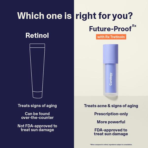
A split-screen comparison ad layout evaluating the differences between over-the-counter retinol and prescription tretinoin for skincare marketing.
Free credits included. No card required
This skincare treatment ad creative effectively uses a side-by-side comparison strategy to clarify complex purchasing decisions for the user. By framing the tretinoin vs retinol ad creative as a clear binary choice, the brand lowers the mental friction for potential customers who are currently confused by various active ingredients.
This structure works for most skincare brands because it positions their specific product as the superior, science-backed solution against a generic alternative. Using Promer AI to replicate this comparative layout allows ecommerce teams to highlight specific product advantages in an objective, clean, and highly readable format that typically resonates well with information-seeking shoppers.
A strong comparative creative doesn't just list features, it tells the customer exactly why their current choice is falling short of the intended result.
Pro tip
When using a comparison hook, always ensure the 'generic' side highlights a common pain point that your product specifically solves. This turns a simple educational chart into a direct conversion funnel that targets customers currently searching for alternatives.






Promer helps you find the pattern, adapt it to your product, and create your own version in minutes.






