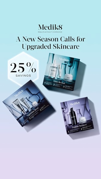
This ad features a vertical 9:16 layout showcasing three distinct skincare product kits with a bold 25% savings callout in a clean, professional aesthetic.
Free credits included. No card required
This skincare set ad creative utilizes a clear, minimalist grid layout to emphasize the seasonal offer. By pairing high-contrast product kit photography with a prominent '25% Savings' badge, the ad creates an immediate sense of value without distracting clutter.
For most skincare brands, this structural approach works because it balances aspirational product presentation with a rational, performance-driven price incentive. Teams looking to replicate this clean visual hierarchy can use Promer AI to maintain brand consistency while testing different offer thresholds or seasonal campaign headers.
Great ads start from a clear structure that places the benefit front and center, ensuring the viewer understands the value proposition within a single glance.
Pro tip
When using a diagonal grid layout, ensure that your product images share a consistent lighting profile to prevent the ad from appearing disjointed. Use background gradients that match your primary brand color to tie the disparate product elements into a single, cohesive visual story.




















Promer helps you find the pattern, adapt it to your product, and create your own version in minutes.






