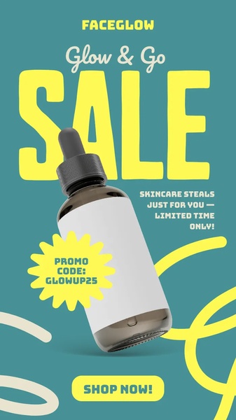
A high-contrast vertical ad creative featuring a skincare serum bottle centered against a deep teal background with prominent yellow promotional text.
Free credits included. No card required
This skincare serum ad creative uses a high-contrast color palette and direct typography to command immediate attention within a crowded feed. By isolating the product against a bold teal background and using a vibrant yellow for the primary sale messaging, the layout eliminates visual clutter, ensuring the viewer focuses exclusively on the core offer and the limited-time nature of the promotion.
The effectiveness of this pattern lies in its ability to prioritize clarity over complexity, a vital strategy for most ecommerce teams aiming to reduce bounce rates. Using Promer AI to analyze such structural decisions allows brands to replicate the impact of clean, offer-led design while maintaining their unique brand identity across varying product categories.
Great ads start from an idea, a feeling, or a structure, not a blank design.
Pro tip
When using bold typography for a sale-driven ad, ensure your primary offer—like the promo code—is visually distinct from the secondary text. This hierarchy guides the user's eye from the 'What' to the 'How' without causing cognitive load, which is crucial for maintaining conversion velocity.
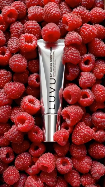
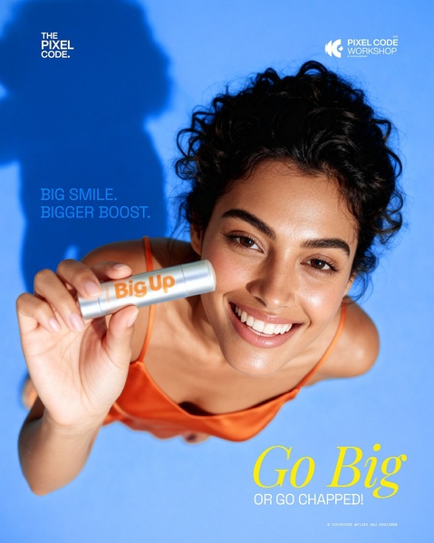
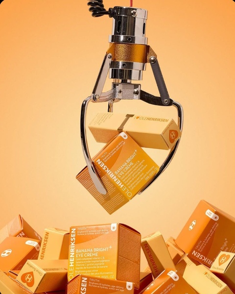
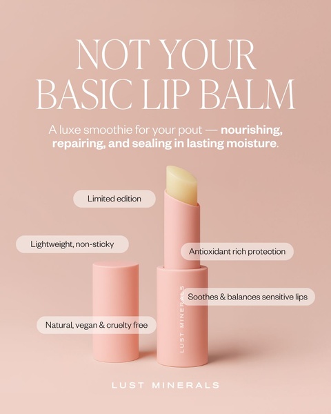
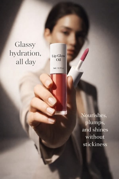
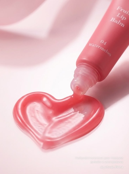
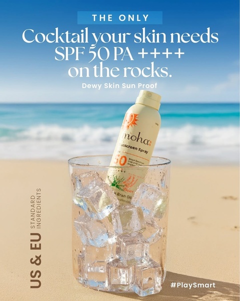
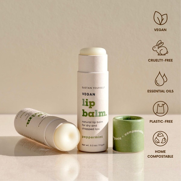
Promer helps you find the pattern, adapt it to your product, and create your own version in minutes.






