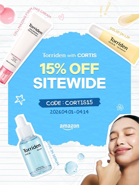
A 3:4 promotional graphic for a skincare brand featuring three distinct product bottles, a clear discount offer, and an engaging lifestyle image.
Free credits included. No card required
This skincare product ad creative leverages a clean, collage-inspired visual style to make the offer feel accessible and light. By placing the 15% off incentive front and center within a blue, torn-paper texture, the ad immediately anchors the user's attention on the value proposition while using the peripheral product shots to build brand recognition and context.
This structural clarity works well for most ecommerce teams because it reduces cognitive load, allowing the viewer to understand the incentive and product category in under two seconds. You can easily replicate this performance-driven layout using Promer AI to maintain high brand consistency while testing different discount offers for your own product line.
Great ads start from a clear hierarchy of information that prioritizes the incentive without sacrificing product visibility.
Pro tip
To boost engagement, match the background texture to your brand identity rather than sticking to a standard white background. Small changes in texture, like the lined paper used here, can subtly increase retention by making the ad feel more like a native content piece.




















Promer helps you find the pattern, adapt it to your product, and create your own version in minutes.






