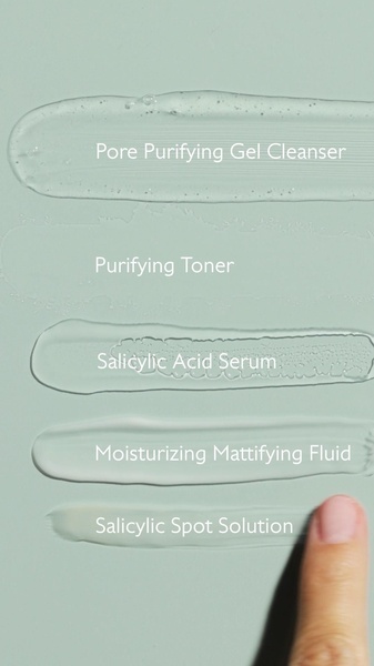
A vertical 9:16 layout displaying five distinct skincare product textures side-by-side on a uniform green background.
Free credits included. No card required
This skincare line ad creative succeeds by stripping away excess marketing noise to focus entirely on the physical characteristics of the formula. The minimalist texture-led hook provides an immediate sensory experience that establishes product quality before the viewer even reads the labels. By aligning the product textures against a uniform sage green background, the creative creates a clean, clinical aesthetic that builds instant trust in the efficacy of the lineup.
Using a structured, multi-product layout like this is a proven pattern in Promer AI for high-converting beauty brands. This approach works because it communicates the breadth of a regimen in a single glance, which typically increases engagement for brands selling multi-step routines. For most ecommerce teams, presenting the product texture as the hero creates a scroll-stopping moment that functions well on mobile-first platforms where quick visual recognition is essential.
Great ads start from an idea, a feeling, or a structure, not a blank design.
Pro tip
When using a texture-heavy hook, vary the viscosity of the products shown to build visual interest. If your products all look identical, swap one for a cross-section or a swatch application to avoid creative fatigue and keep the eye moving down the frame.




















Promer helps you find the pattern, adapt it to your product, and create your own version in minutes.






