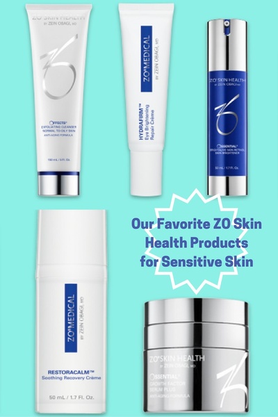
A flat-lay product collection showing five different skin care bottles and tubes on a bright cyan background, centered with a text highlight.
Free credits included. No card required
This skin care product ad creative leverages a clean, high-contrast grid to present multiple items simultaneously, signaling a complete regimen. By grouping related items in a structured layout against a bold cyan background, the ad minimizes visual clutter and forces immediate focus on the product range.
For most brands, this structured approach helps communicate the depth of a product line without overwhelming the viewer. You can replicate this organizational pattern for your own catalog using Promer AI to maintain consistent brand aesthetics across diverse product sets.
A winning ad structure relies on balancing visual clarity with a specific, articulated customer outcome.
Pro tip
When using a grid layout, ensure your products share a common color story or packaging design to maintain visual harmony. If the packaging varies, use uniform drop shadows or consistent lighting during the design phase to keep the ad feeling premium and cohesive.




















Promer helps you find the pattern, adapt it to your product, and create your own version in minutes.






