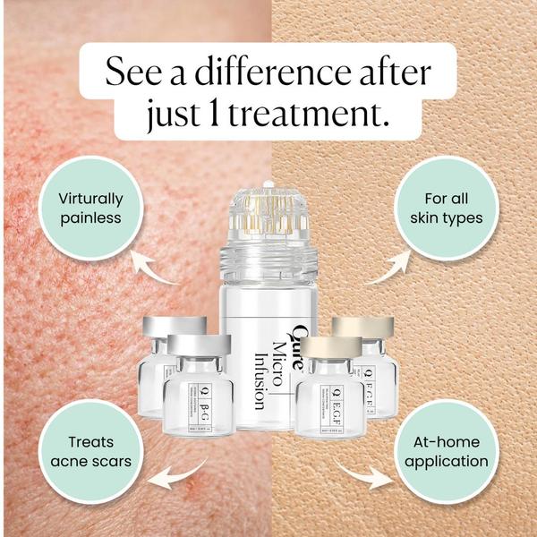
This ad features a split-screen visual comparison showcasing the skin-transforming effects of the micro infusion system alongside key product benefits.
Free credits included. No card required
This Micro Infusion ad creative leverages a split-screen visual to provide an immediate before and after comparison that demonstrates product efficacy at a glance. By combining a clear value proposition with four distinct callout bubbles, the design effectively manages cognitive load to drive consumer interest in complex skin treatments. The pattern hinges on placing the tangible promise of skin improvement directly next to the product hardware, creating an instant connection between the tool and the result.
For most skincare teams, adopting this structured layout allows you to move away from text-heavy designs that suffer from ad fatigue. Utilizing Promer AI to analyze these visual components helps ensure your own creative variations retain the same hierarchy and clarity that this successful example demonstrates, depending on your specific product positioning.
Great ads start from an idea, a feeling, or a structure, not a blank design.
Pro tip
When using a split-screen approach, ensure the texture on the left side is high-resolution enough to convey the 'before' state clearly. If the skin texture is too blurry, the viewer will not perceive the efficacy of the treatment, which is critical for medical or cosmetic skincare ads.




















Promer helps you find the pattern, adapt it to your product, and create your own version in minutes.






