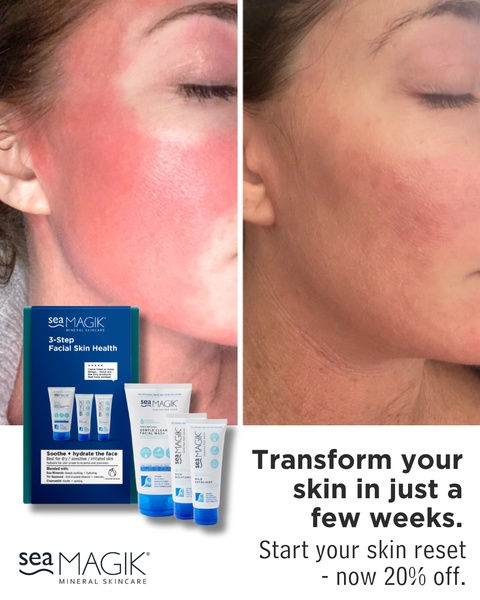
A split-screen comparison showing significant skin redness reduction using a three-step mineral skincare regimen.
Free credits included. No card required
This facial skincare ad creative leverages the power of a visceral, split-screen visual comparison to provide instant proof of product efficacy. By anchoring the entire strategy in a clear before and after transformation, the ad immediately signals a solution to a specific pain point—skin irritation—without requiring a long-form explanation to capture attention.
For most ecommerce teams, displaying tangible results is the most effective way to lower acquisition costs and build immediate consumer trust. Utilizing a tool like Promer AI allows you to replicate this structured comparison for your own products, ensuring that your creative remains focused on high-conversion storytelling rather than generic aesthetic choices.
Great ads start from an idea, a feeling, or a structure, not a blank design.
Pro tip
When using a before-and-after visual, ensure the lighting conditions in both images are as consistent as possible to maintain credibility. Avoid over-editing the 'after' photo, as an authentic, slightly imperfect shot often converts better than a heavily retouched studio image in the beauty space.




















Promer helps you find the pattern, adapt it to your product, and create your own version in minutes.






