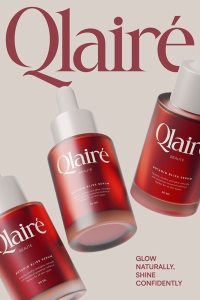
This creative showcases multiple face serum bottles floating in a clean, high-end environment with elegant typography focusing on brand identity.
Free credits included. No card required
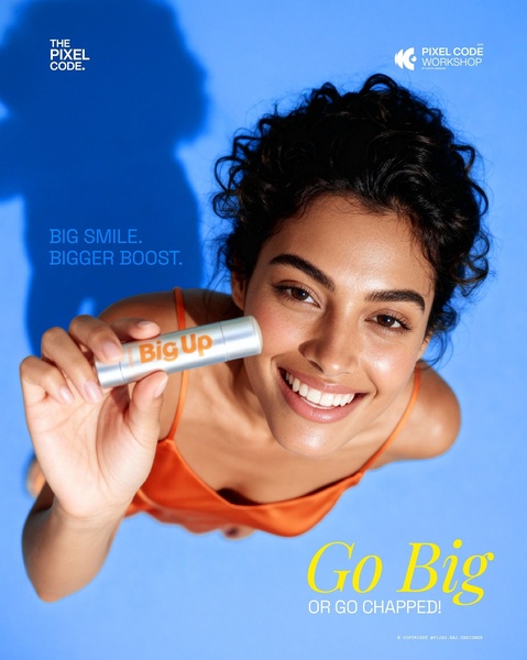
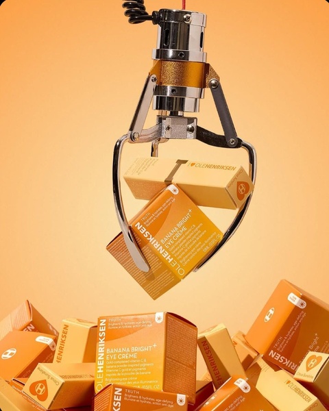
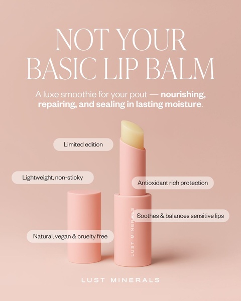
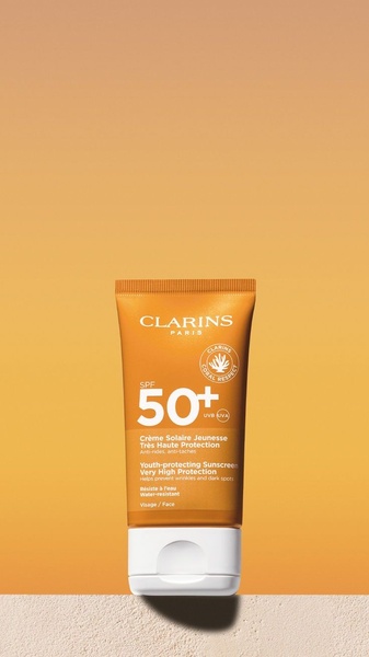
This face serum ad creative utilizes a sophisticated visual hook by grouping multiple product units in a floating composition to establish a premium, high-end feel. The strategic use of minimalist negative space and consistent color palettes creates an aspirational mood that resonates deeply with beauty consumers. By removing unnecessary background clutter, the focus remains entirely on the product design and the clear, readable brand name, which serves as a powerful anchor for brand recognition in a saturated feed environment. In most cases, this cleaner, more editorial approach helps premium beauty products stand out against standard aggressive sales imagery, allowing the product's packaging and visual identity to do the heavy lifting of building consumer trust. Using Promer AI to analyze and replicate this high-end structural balance allows performance marketers to iterate on successful aesthetic patterns without reinventing the layout from scratch.
A truly high-converting creative builds authority through visual intentionality, not just feature listing.
Pro tip
When using a floating composition like this, ensure your product labels are perfectly legible even when resized. A common mistake is using too much text on the bottle; keep it minimal to maintain that premium, clean look that high-end beauty consumers prioritize.

Promer helps you find the pattern, adapt it to your product, and create your own version in minutes.






