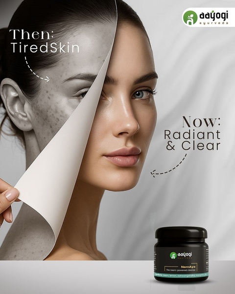
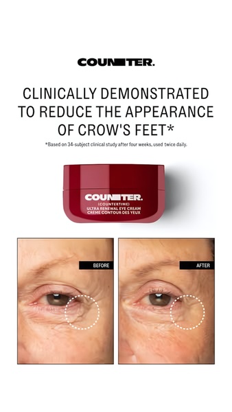
A split-screen comparison creative for a face cream showing a tired skin texture on one side and a radiant, clear complexion on the other.
Free credits included. No card required
This face cream ad creative leverages a classic visual contrast technique to immediately communicate product efficacy through a literal before and after comparison. By peeling back the 'tired' skin to reveal a 'radiant' result, the imagery acts as a non-verbal argument that validates the product's value proposition within milliseconds of scrolling.
Such high-contrast structures are often effective for skincare because they provide tangible proof of outcomes, allowing users to project themselves into the desired result. Using Promer AI, advertisers can replicate this split-screen layout to maintain consistent brand messaging while testing different ingredient callouts or skin-type hooks for their own unique products.
Great visual ads rely on the immediate clarity of the transformation story rather than complex design elements.
Pro tip
When using a before and after hook, ensure the lighting in both halves of the image is professionally balanced to avoid looking like an unrealistic filter. A slight adjustment in contrast can highlight texture differences without appearing deceptive to your audience.


Promer helps you find the pattern, adapt it to your product, and create your own version in minutes.






