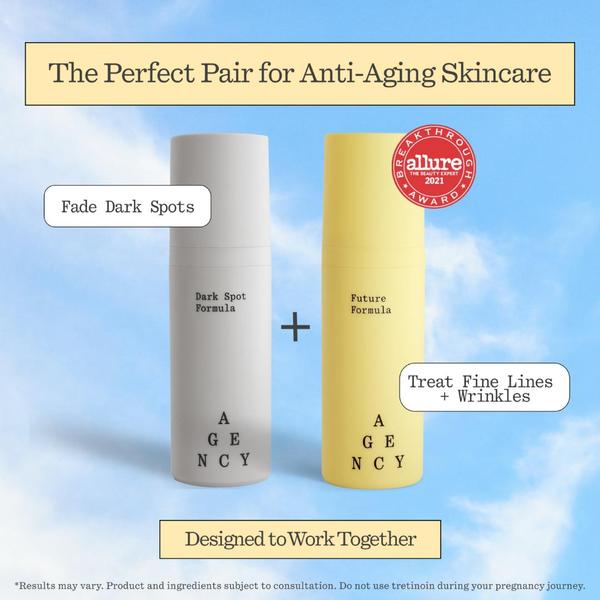
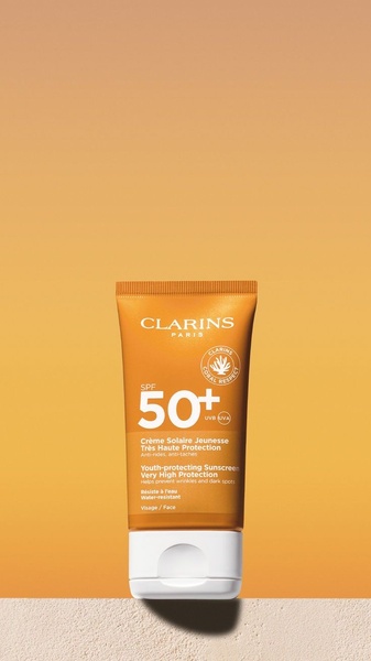
A square 1:1 format ad creative showcasing two skincare bottles against a bright sky background to illustrate a dual-benefit anti-aging regimen.
Free credits included. No card required
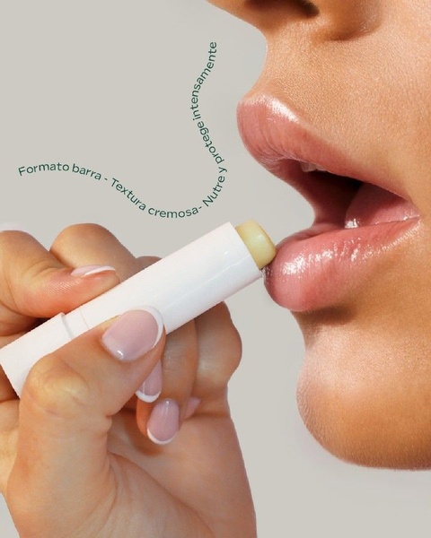
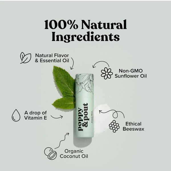
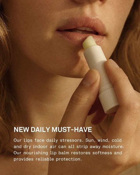
This anti-aging skincare ad creative uses a minimalist pairing strategy to communicate complex product benefits instantly. By placing two distinct formulas side-by-side with clear text annotations, the creative allows the viewer to absorb the value proposition of each item in a single glance without overwhelming them with dense information. Visualizing the synergistic relationship between products effectively lowers cognitive friction and increases potential conversion for skin regimen bundles.
This structure works for most ecommerce teams because it creates a sense of completion for the consumer, suggesting that a single solution is better than two. When you use a platform like Promer AI, you can systematically test this pairing layout across different color palettes or benefit claims to identify which specific pain point triggers the highest engagement for your audience.
A clear, structured visual representation of your product pairing is often more effective at driving education-led clicks than complex lifestyle imagery.
Pro tip
Use contrast in your product packaging colors to signify different benefits just as this creative does with its gray and yellow bottles. This visual cue helps customers understand that each product serves a unique purpose in their routine before they even read the text.
Promer helps you find the pattern, adapt it to your product, and create your own version in minutes.






