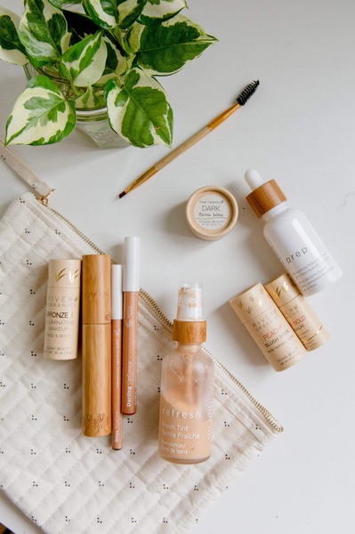
A top-down aesthetic flatlay showcasing a full regimen of natural skincare products arranged alongside a clean canvas pouch and organic foliage.
Free credits included. No card required
This skincare ad creative leverages a clean, minimalist flatlay to build instant visual authority for the brand. By utilizing neutral earth tones and natural elements, the composition establishes a sense of quality and organic trust that resonates with skincare buyers, making Promer AI an ideal partner for scaling these brand-focused assets. The power of this layout lies in its organized, clutter-free presentation that allows the product packaging to speak for itself.
For most skincare brands, this visual pattern works because it mimics the user's aspirational routine rather than appearing like a traditional sales pitch. It avoids overly busy design elements, which in most cases, keeps the focus strictly on the product line. This approach typically performs well in feeds where users value aesthetic consistency and brand transparency.
Effective product visuals start from a clear sense of brand identity and a structured arrangement, not just a random assortment of items.
Pro tip
Vary your flatlay by adding one 'hero' element that breaks the symmetry, such as an open cream jar or a swatch of product texture. This slight disruption creates a focal point that draws the eye, preventing the image from feeling too static or like a generic stock photo.




















Promer helps you find the pattern, adapt it to your product, and create your own version in minutes.






