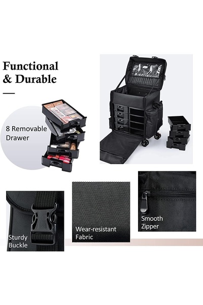
A feature-focused grid layout highlighting the functionality, durability, and storage capacity of a professional cosmetic trolley case.
Free credits included. No card required
This Cosmetic Trolley Case ad creative leverages a clean, grid-based visual strategy that prioritizes functional utility over lifestyle aspiration. By isolating key components—the drawers, buckles, fabric, and zippers—the creative allows the viewer to mentally audit the product's quality in seconds, which is a highly effective way to overcome purchase hesitation for complex storage items.
Visual clarity acts as a trust signal for high-consideration purchases, and this specific layout excels by removing background noise to focus purely on tactile product truths. For most ecommerce teams, Promer AI provides a structured way to recreate this level of component-based storytelling, ensuring that your own product features are highlighted with the same professional precision to drive conversions.
A winning ad is built on a clear, repeatable structure that allows the product's primary utility to speak louder than flashy design.
Pro tip
When using a grid-style layout, always lead with your strongest feature in the largest focal point. Ensure your text callouts are brief and directly address a common pain point, such as 'durable' or 'organized,' to satisfy the user's intent immediately.




















Promer helps you find the pattern, adapt it to your product, and create your own version in minutes.






