Most advertisers using AI for Meta ad creative make the same mistake: they generate twenty versions of one idea, a new background here, a different headline color there, and call it a creative test. Meta's delivery system no longer treats that as twenty ads.
These 14 examples of ai ad creative for meta ads are grouped by concept instead of by product, because concept is what Meta's ad retrieval now sorts on. They cover social proof, scarcity, problem and solution, before and after, education, lifestyle, product hero, and offer-led creative across Facebook and Instagram placements.
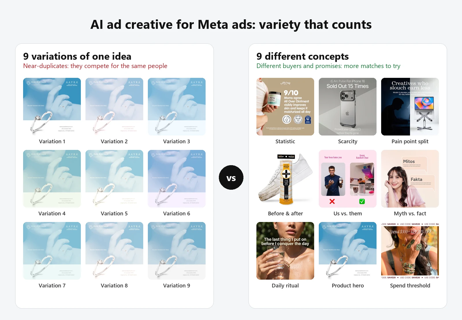
AI ad creative works on Meta when each asset carries a genuinely different idea, a different buyer, promise, or proof, not when it multiplies one idea into many near-identical files. Since Andromeda, the volume that matters is the number of distinct concepts in an ad set, not the number of variations.
Each example lists its placement, ratio, and hook type, followed by the ingredients that make it work. After the examples, you'll find how to match each concept to a Meta placement and how to build a diverse set from a single product.
Key takeaways
- Meta's Andromeda retrieval system picks a few thousand candidate ads from tens of millions before ranking, so creatives that look and say the same thing compete with each other instead of reaching new people.
- The 14 examples below span 9 concept families. A test built from 3-5 of these families gives Meta more to work with than 15 color or headline tweaks of one layout.
- Feed creative in this set leans on 1:1 and 4:5, while Stories creative uses full-screen 9:16 with text kept away from the top and bottom edges.
- Proof-led concepts (statistics, review counts, before and after) only work when the claim is real; AI makes fabricated proof easy to produce and costly to run.
- Advantage+ creative enhancements adjust an existing asset (brightness, crop, text variations), but they don't invent a new concept for you.
What makes AI ad creative work on Meta in 2026?
Meta described Andromeda in a December 2024 engineering post as the retrieval stage of its ads system, the step that selects "from tens of millions of ad candidates into a few thousand relevant ad candidates" before ranking models decide what to show. The same post names the reason it was built: generative AI tools were expected to make the number of ad creatives in Meta's system "grow significantly."
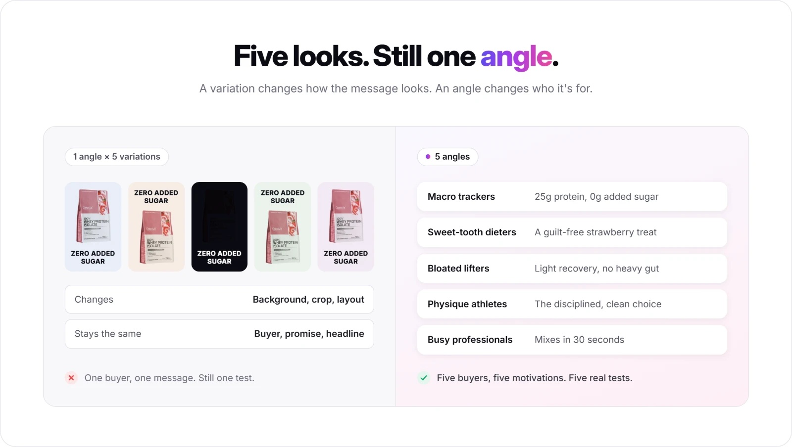
That has a direct consequence for AI-made creative. When an ad set contains ten files built on the same visual, the same hook, and the same promise, retrieval has little reason to treat them as different options for different people. Ten files built on ten different ideas, a statistic, a split-screen pain point, a lifestyle ritual, a discount threshold, give the system ten genuinely different matches to try.
Meta's own generative tools sit inside Ads Manager as Advantage+ creative: brightness and contrast adjustments, image expansion, text variations, music, and image-to-video. These help an asset fit more placements, but they work on the creative you upload. The concept, who the ad is for and why they should care, still has to come from you, which is where a structured ad creative testing process earns its place.
14 AI ad creative examples for Meta ads, grouped by concept
Every example below runs on Facebook and Instagram placements. Each one lists its placement, ratio, and hook type first, so you can match the concept to your own product before you look at the image. A "Try AI Ad Clone" button sits under every creative if you want to jump straight into recreating it.
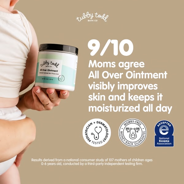
1. "9 out of 10 Moms Agree" Statistic Hook (Social Proof: Statistics)
Placement: Facebook, Instagram | Ratio: 1:1 | Hook type: Statistic lead
An infant skincare ointment leads with a 9/10 consumer-study figure, backed by pediatrician-tested and eczema-association badges, all in soft beige and mint. The study methodology sits in small print at the bottom of the frame.
Winning ingredients:
- A specific number as the headline, which reads faster than an adjective-led claim
- Certification badges that add third-party proof in the same glance
- A methodology line in secondary text, which makes the statistic more believable
2. 16,700 Five-Star Reviews Bracelet Bundle (Social Proof: Review Count)
Placement: Instagram, Facebook | Ratio: 4:5 | Hook type: Social proof claim
A five-piece gold bracelet set sits on a white cylindrical stand under a headline built on its review count, with "5 Piece Bundle Deal" spelling out the offer underneath. The review number comes before any product detail.

Winning ingredients:
- Consensus first, product second, which lowers the risk for a buyer who doesn't know the brand
- High-key studio lighting that keeps the gold texture as the only color in the frame
- A 4:5 portrait crop that takes more of the Feed than a square
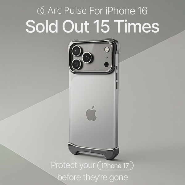
3. "Sold Out 15 Times" Phone Case (Scarcity and Bold Claim)
Placement: Instagram Feed, Facebook Feed | Ratio: 1:1 | Hook type: Data-driven scarcity
A minimalist studio shot of a phone case carries one bold line about how many times it has sold out, with a short nudge at the bottom to get one before the next restock runs out.
Winning ingredients:
- An inventory fact turned into proof of demand, which works as scarcity and social proof at once
- A gray-on-gray palette that leaves the headline as the only high-contrast element
- A landing page that must confirm the claim, or the click is wasted
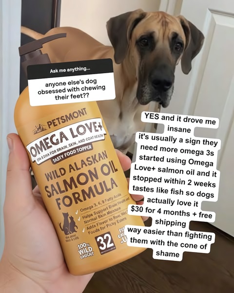
4. Salmon Oil Q&A Sticker (Problem and Solution: Native Format)
Placement: Instagram, Facebook | Ratio: 4:5 | Hook type: Q&A overlay
A hand holds a bottle of pet salmon oil under an Instagram-style question sticker asking how to stop a dog from chewing its feet. The answer names the product and a timeline for results.
Winning ingredients:
- A platform-native sticker that reads like a post from a friend, not a brand
- A pain point phrased the way an owner would actually ask it
- A held-in-hand shot that feels user-made while keeping the label readable
5. Slouch vs. Posture Laptop Stand (Problem and Solution: Split Screen)
Placement: Facebook, Instagram | Ratio: 1:1 | Hook type: Pain point framing
The left half shows a dark, slouching silhouette at a laptop; the right half shows a bright, ergonomic desk with the stand raising the screen. The copy ties posture to work performance and adds a 60-day guarantee.

Winning ingredients:
- Dark-to-bright lighting that makes the "after" feel like relief before any copy is read
- A larger benefit (career, energy) attached to a small utility product
- A guarantee that removes the last objection in the same frame
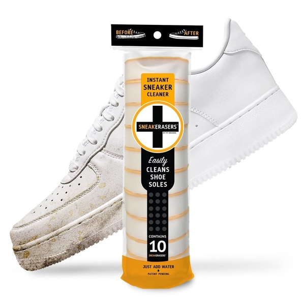
6. Sneaker Cleaner Before and After (Visual Proof: Instant Result)
Placement: Facebook, Instagram | Ratio: 1:1 | Hook type: Problem-solution visualization
One sneaker, half dirty and half clean, sits on a white background with "Before" and "After" labels at the top. The cleaner's pack stands in the middle as the dividing line.
Winning ingredients:
- The product as the physical divider between problem and result
- Two-word labels that guide the eye in under a second
- Identical lighting on both halves, so the difference reads as the product's work, not a photo trick
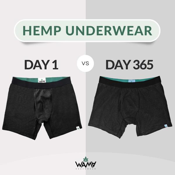
7. Hemp Underwear Day 1 vs. Day 365 (Visual Proof: Durability)
Placement: Facebook, Instagram | Ratio: 1:1 | Hook type: Visual evidence
The same pair of hemp underwear appears side by side, labeled Day 1 and Day 365, with almost no visible change between them. The "proof" here is what didn't happen.
Winning ingredients:
- A time anchor that answers "how long will this last?" without a word of body copy
- A before-and-after structure turned around, where the absence of change is the selling point
- Muted gray with one green accent, so the garments carry all the attention
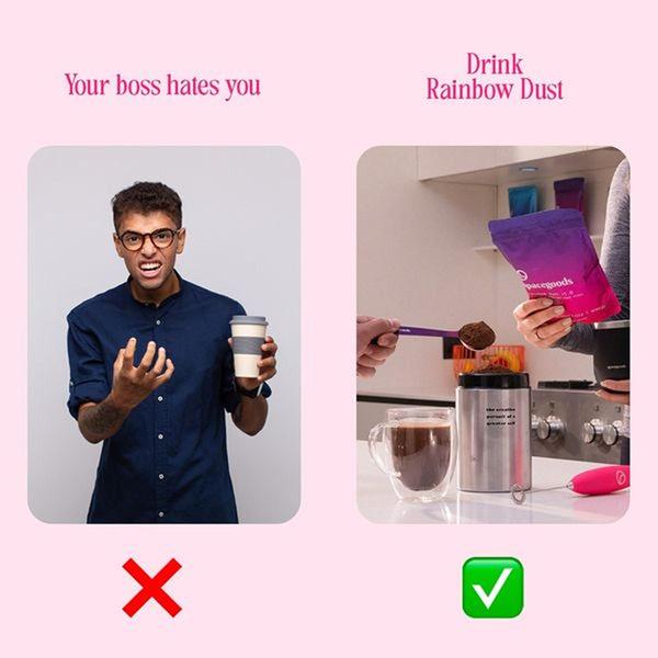
8. "Your Boss Hates You" Drink Powder (Us vs. Them)
Placement: Instagram Feed, Facebook Feed | Ratio: 1:1 | Hook type: Pain point with negativity bias
Two panels on a soft pink background: the left one, marked with an X, shows a bad morning under a "Your boss hates you" line; the right one, marked with a checkmark, shows the drink powder as the better routine.
Winning ingredients:
- A provocative, relatable headline that stops the scroll before the product appears
- X and checkmark icons that do the comparison work without explanation
- A plain "bad" side and a brighter "good" side, so the contrast stays obvious
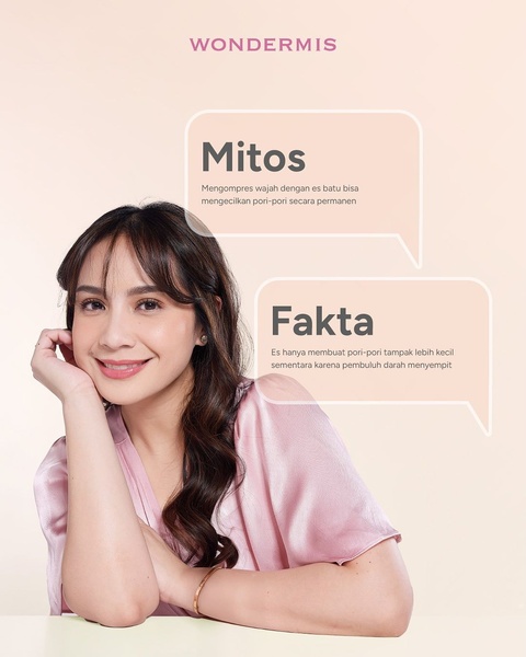
9. Myth vs. Fact Skincare (Education: Single Post)
Placement: Instagram, Facebook | Ratio: 4:5 | Hook type: Educational debunking
Two speech bubbles in beige and soft pink set a common skincare myth about pores against the actual explanation. The brand positions itself as the source of the correction before it sells anything.
Winning ingredients:
- A myth the audience already believes, which earns attention through recognition
- One myth per creative, so the message stays readable on a phone
- A calm palette that signals expertise rather than a hard sell
10. Microneedling Story Sequence (Education: Stories)
Placement: Instagram Stories, Facebook Stories | Ratio: 9:16 | Hook type: Educational breakdown
A multi-frame vertical sequence walks through what microneedling is, how the device works, and which skin concerns it targets, then closes on an "ask your question" frame that invites a reply.

Winning ingredients:
- One idea per frame, which suits the tap-through pace of Stories
- Benefit labels placed directly on the face model, so the outcome needs no extra copy
- An interactive final frame that turns a viewer into a conversation
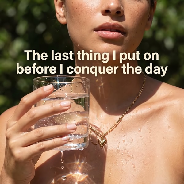
11. "The Last Thing I Put On" Heart Necklace (Lifestyle: Daily Ritual)
Placement: Instagram, Facebook | Ratio: 1:1 | Hook type: Personal ritual
A tight, naturally lit crop shows a gold heart necklace on someone holding a glass of water, under a first-person line about the last thing they put on before starting the day.
Winning ingredients:
- A first-person line that places the product inside the buyer's routine
- Identity over specs, which suits an accessory with few functional claims
- Natural light that keeps the gold texture visible on a small screen
12. POV Summer Dog Cooling Bed (Lifestyle: Seasonal POV)
Placement: Facebook, Instagram | Ratio: 1:1 | Hook type: Point-of-view lifestyle statement
A carousel-style layout shows a dog cooling bed by a pool and indoors, under a "POV: ready for summer" overlay. Bright blues and beige reinforce the cooling benefit before it is stated.

Winning ingredients:
- A seasonal hook that makes the product feel timely, with a winter version easy to swap in
- Multiple settings that show versatility in one asset
- A cool color palette that does the "cooling" claim visually
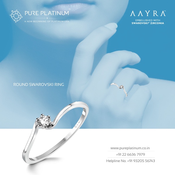
13. Minimalist Ring Hero on Soft Blue (Product Hero)
Placement: Facebook, Instagram | Ratio: 1:1 | Hook type: Visual minimalism
A single ring sits in the lower third of a soft-blue frame, with only the brand and product names as text. The empty space does as much work as the product.
Winning ingredients:
- Rule-of-thirds placement that draws the eye to the stone
- A monochrome background that signals premium without saying it
- A useful counterweight in a test set full of text-heavy proof and offer ads
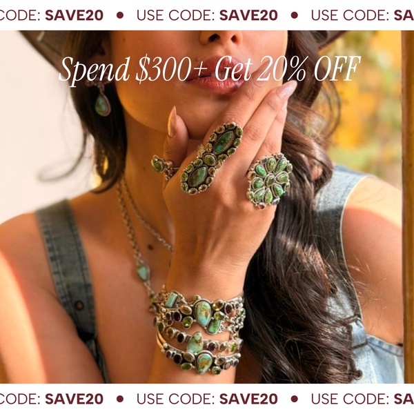
14. "Spend $300+, Get 20% Off" Jewelry Set (Offer: Spend Threshold)
Placement: Instagram, Facebook | Ratio: 1:1 | Hook type: Monetary incentive
A macro shot of turquoise rings and bracelets carries a spend-threshold offer, with the discount code repeated at the top and bottom of the frame.
Winning ingredients:
- A threshold offer that raises order value instead of discounting one item
- Macro photography that keeps the craftsmanship visible behind the offer
- A repeated code, so the offer survives wherever the eye lands
How to match Meta placements to these creative concepts
Concept and placement are separate decisions. A strong idea in the wrong ratio gets cropped or letterboxed, and Meta's automatic crops can cut off the exact line that carries the hook. Meta's ad specs list 1:1 and 4:5 for Feed and 9:16 for Stories and Reels, and the 14 examples above split along the same lines.
Split-screen layouts (examples 5, 6, 7, and 8) are the riskiest to stretch into 9:16, because the two halves either shrink or stack. Rebuild them as top-and-bottom comparisons for Stories and Reels instead of letting automatic cropping decide. For full-screen placements, keep headlines and codes away from the top and bottom of the frame, where profile names, captions, and buttons sit.
If your workflow is Facebook-first, Promer AI's AI Facebook ad generator page walks through how one product becomes Feed-ready and Stories-ready creative.
How to turn one product into a diverse Meta creative set with Promer AI
The examples above share a structure, not a product. A statistic hook, a split-screen pain point, or a ritual line works for any category, provided the claim is one you can actually back up. The work is picking 3-5 concepts that are genuinely different for your product, then executing each one well.
Promer AI, an AI ad maker built for ecommerce, starts from the product rather than a blank canvas. Three features cover the steps from concept to Feed static to Reels motion.
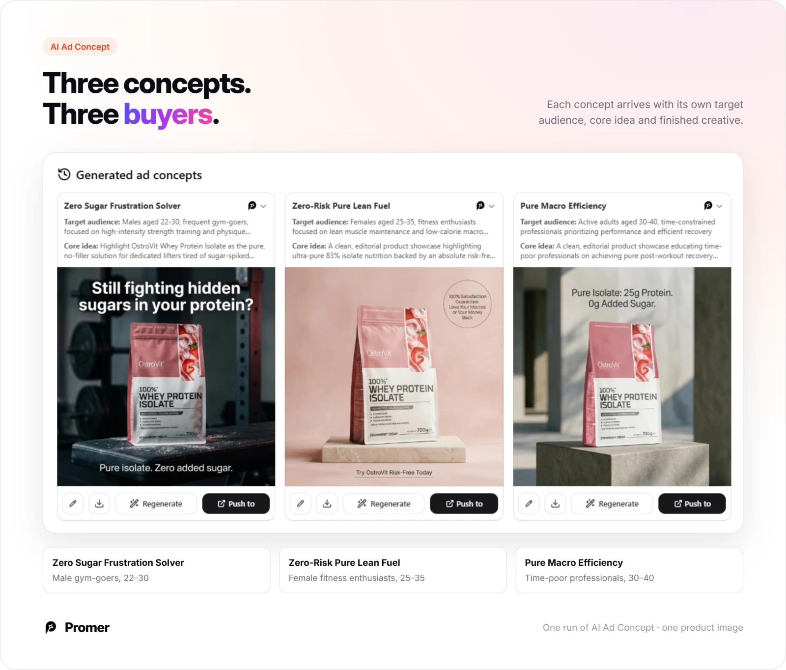
AI Ad Concept: Several different concepts from one product
Promer AI's AI Ad Concept reads your product into four editable fields (highlights, ideal customer, pain point, and need), then generates several concepts in one run. Each concept arrives with its own target audience and core idea, which is the Andromeda-friendly kind of variety: different buyers and different promises, not three colors of the same pitch.
AI Ad Clone: Borrow a proven structure for each concept
Once you know which concepts to test, AI Ad Clone is the fastest way to execute one of the 14 structures above. Pick your product, select the reference ad you want to recreate, and the AI suggests a headline, body text, and CTA you can edit individually before generating. Choose 1:1 or 4:5 for Feed and 9:16 for Stories at this step instead of cropping afterward.
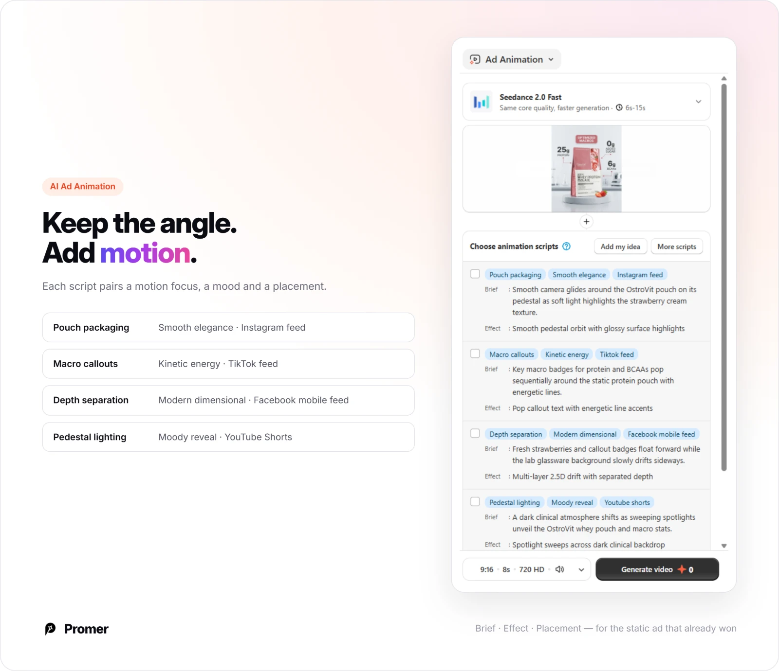
AI Ad Animation: Take a winning static into Reels
When a static concept wins in Feed, AI Ad Animation suggests animation scripts with a brief, an effect, and placement tags, so the same idea can run in Reels without a reshoot. It counts as a new format for a proven concept, not a new concept, so pair it with fresh concepts rather than using it to fill the set.
Review every generated creative before it runs. AI-generated ads can have mistakes, and on Meta specifically, check that every statistic, review count, badge, and price matches what you can substantiate, since these claims are what the proof-led concepts depend on.
Common mistakes with AI ad creative on Meta
Counting variations as concepts. A new background color or headline font on the same layout is one concept. If every ad in the set would get the same one-line description, the set has one idea.
Letting automatic enhancements rewrite brand creative. Advantage+ creative enhancements can change crops, brightness, and text. That is fine for a disposable test, but check the previews before launch for brand-sensitive assets, and turn off the specific enhancements you don't want.
Generating proof you don't have. AI can produce "9 out of 10" headlines and certification badges in seconds. Running claims you can't back up creates policy and legal risk, and the concept fails the moment the landing page doesn't match.
Building only for Feed. A 1:1 split-screen squeezed into Stories loses the comparison that made it work. Plan at least one native 9:16 asset per concept you expect to scale.
Judging a concept on one execution. A weak headline can sink a good idea. Give each concept two or three executions before you drop it, and keep the next round of concepts genuinely different from the last.
FAQs about AI ad creative for Meta ads
These are the questions advertisers ask most often before building AI-generated creative for Facebook and Instagram.
What is AI ad creative for Meta ads?
AI ad creative for Meta ads is image or video ad content generated or adapted with AI tools for Facebook and Instagram placements. It ranges from Meta's built-in Advantage+ creative enhancements, which adjust an asset you upload, to tools that generate full concepts, copy, and visuals from a product.
How many creatives should I put in a Meta ad set under Andromeda?
Meta doesn't publish a fixed number, and the count matters less than the variety. A practical starting point is 3-5 genuinely different concepts, each with two or three executions, rather than many variations of one idea. Agency guidance of 10-15 assets per campaign is common, but those are practitioner recommendations, not Meta figures.
Does Meta penalize AI-generated ads?
There is no Meta rule that ranks AI-generated creative lower because it was made with AI. AI creative still has to follow Meta's ad policies, and Meta adds AI disclosure labels in some cases. Performance comes down to whether the concept fits the audience, not how it was made.
Should I opt out of Advantage+ creative enhancements?
Opt out of the individual enhancements that change what your brand can't afford to have changed, and keep the ones that only help fit placements. According to Marketing Brew, Meta said in 2026 that advertisers who opt out keep that preference for future campaigns and that opting out carries no delivery penalty.
What aspect ratio should I use for Meta ad creative?
Use 4:5 or 1:1 for Facebook and Instagram Feed and 9:16 for Stories and Reels. If a concept will run everywhere, build a native version for each instead of relying on automatic crops, especially for split-screen and text-heavy layouts.
Can AI ad creative replace a creative strategist?
No. AI shortens execution and makes it cheap to test more concepts, but someone still has to decide which buyers, promises, and proof points are worth testing, and read the results honestly. That decision is the part Andromeda rewards.
Summary
The 14 examples of ai ad creative for meta ads above cover nine concept families, from statistics and scarcity to rituals and spend-threshold offers. The pattern behind all of them is the same: one clear idea per asset, built for the placement it will run in.
Under Andromeda, that discipline matters more than volume. Pick 3-5 concepts that are genuinely different for your product, execute each one in the right ratio, and let Meta find the people each one is for.
Sources
- Meta Engineering: Meta Andromeda: Supercharging Advantage+ automation with the next-gen personalized ads retrieval engine - https://engineering.fb.com/2024/12/02/production-engineering/meta-andromeda-advantage-automation-next-gen-personalized-ads-retrieval-engine/ - accessed 2026-11-04
- Marketing Brew: How Meta's AI push is changing ad creation - https://www.marketingbrew.com/stories/2026/04/07/meta-ai-ad-creation - accessed 2026-11-04