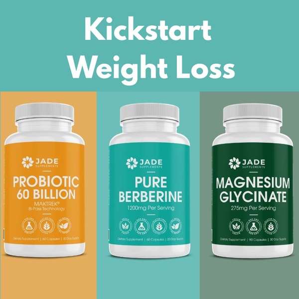
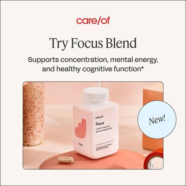
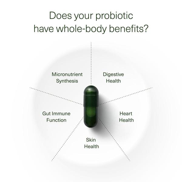
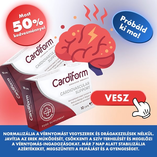
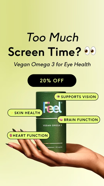
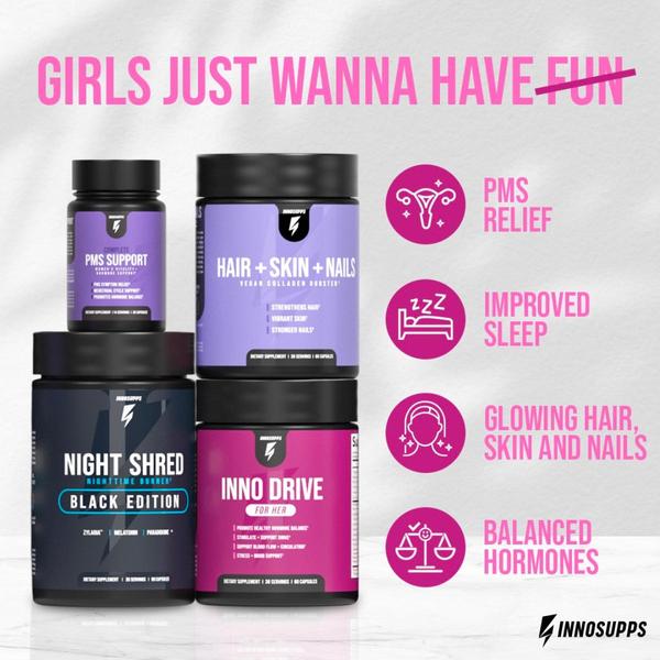
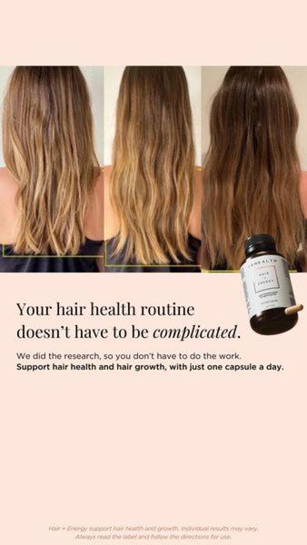
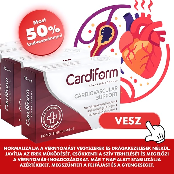
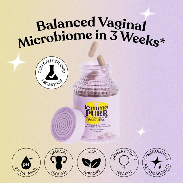
A square-ratio ad creative featuring three different dietary supplement bottles side-by-side against a color-blocked background with a clear benefits-driven headline.
Free credits included. No card required
This dietary supplement ad creative utilizes a highly organized visual hierarchy to simplify complex product offerings for the consumer. By pairing a direct, punchy headline with a balanced three-column layout, the brand establishes immediate clarity and aesthetic consistency that reduces decision fatigue for potential buyers. Presenting multiple products side-by-side in a color-coded grid works because it visually validates a complete health ecosystem, allowing the customer to perceive the value of a full regimen rather than a single bottle.
For most ecommerce teams, this pattern is effective because it moves the user from confusion to comprehension in under a second. You can leverage the Promer AI platform to analyze how your own product photography can be repurposed into similar structured grids, helping you scale your creative variations while maintaining brand integrity across every iteration.
Great ads start from an idea, a feeling, or a structure, not a blank design.
Pro tip
When using a multi-product layout, ensure your text-to-visual ratio remains balanced to avoid triggering negative feedback in ad platform delivery systems. Place your most compelling product in the center and use the flanking products to support the primary benefit headline.



.jpg)


.jpg)

Promer helps you find the pattern, adapt it to your product, and create your own version in minutes.






