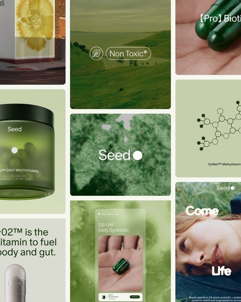
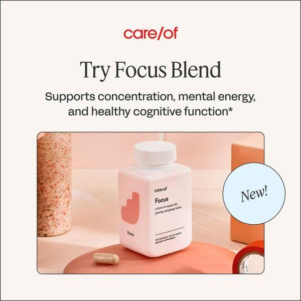
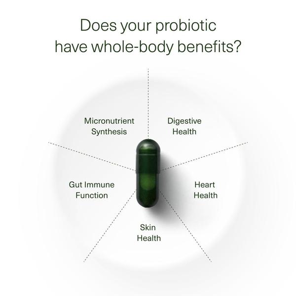
A high-concept grid layout featuring a probiotic supplement bottle, scientific molecular diagrams, and lifestyle imagery to establish brand authority and product safety.
Free credits included. No card required
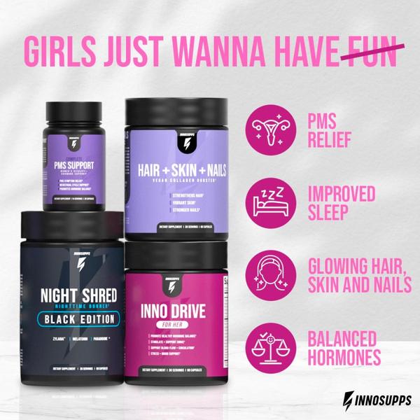
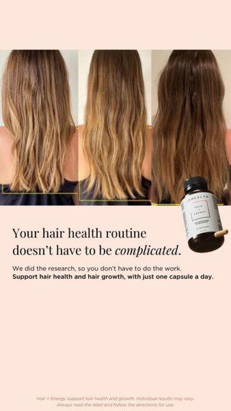
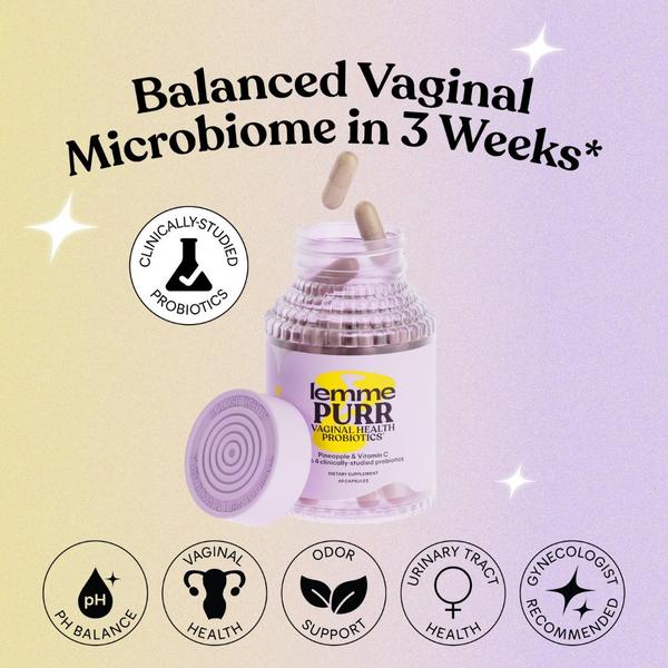
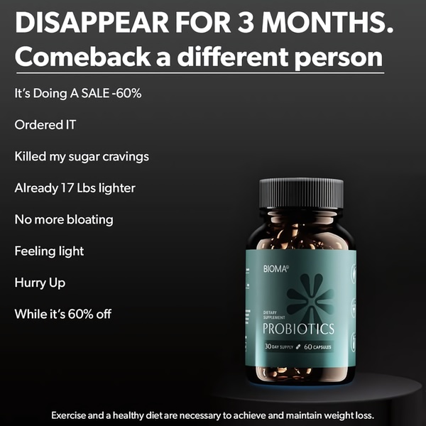
This probiotic supplement ad creative leverages a multi-panel grid to deliver a dense amount of information without overwhelming the viewer. By balancing lifestyle photography with abstract scientific imagery, the brand builds a narrative that suggests both safety and performance. The choice of a muted, monochromatic green color palette signals natural origins, helping the product stand out in a typically cluttered health feed.
This structure works for most ecommerce teams because it moves beyond a single-product shot, allowing the consumer to visualize the scientific rigor behind the supplement. You can easily replicate this high-authority, multi-layered visual strategy using Promer AI to ensure your brand's unique assets maintain this consistent aesthetic across all ad variations.
A cohesive visual grid captures more interest than a single image by inviting the user to explore the brand's identity through multiple interconnected lenses.
Pro tip
When using a grid layout, ensure that the most important element—like the product bottle—occupies the central or largest panel to provide an anchor for the viewer's eye. Test one variation with a lifestyle image in the center and another with the product as the hero to see which drives higher engagement.



.jpg)


.jpg)

Promer helps you find the pattern, adapt it to your product, and create your own version in minutes.






