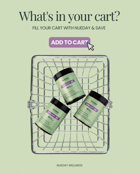
A minimalist, high-contrast ad featuring Debloat Me supplement capsules inside a shopping basket to prompt immediate cart completion.
Free credits included. No card required
This Debloat Me ad creative uses a minimalist, product-focused strategy that mimics the user's shopping journey to build familiarity and intent. By visually placing the product directly into a digital shopping cart, the ad bridges the gap between the consideration phase and checkout. This approach leverages the simple visual cues of a cart to trigger a psychological nudge toward completion, making it highly effective for retargeting campaigns where the user has already demonstrated initial interest.
For most ecommerce brands, this pattern works because it removes cognitive load by simplifying the offer to a single, recognizable action. You can easily replicate this visual structure using Promer AI to maintain high production quality across your own product variations. This strategy typically performs best when targeting abandoned cart audiences who just need a clean, direct reminder of the value sitting in their queue, rather than complex or busy creative.
Great ads start from an idea, a feeling, or a structure, not a blank design.
Pro tip
When using a shopping cart theme, ensure your call-to-action button color matches your brand palette exactly to maintain a seamless transition from the ad to your store. For maximum effect, test this creative specifically against users who visited your product page but did not checkout in the last 7 days.




.jpg)



.jpg)

Promer helps you find the pattern, adapt it to your product, and create your own version in minutes.






