


Ice cream is the only food whose proof shot is a race against time
Every food category in this library has a signature proof shot - the cheese pull for burgers, the overhead pie for pizza, the cross-section for cookies. Ice cream's is different from all of them, because it's the only one built on the product actively destroying itself in real time. A drip running down a cone, a scoop softening under a warm light, chocolate coating cracking to reveal a melting center - the melt isn't a flaw the ad hides, it's the entire proof of freshness and indulgence.
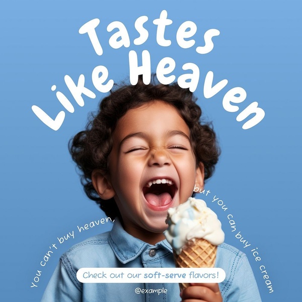
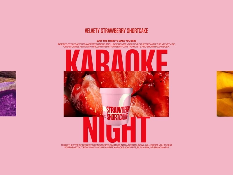
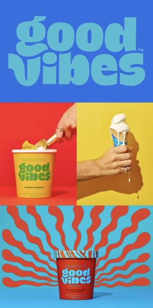
That built-in urgency also explains why ice cream copy leans on feeling more than almost any other food category. "Tastes Like Heaven," "good vibes," a karaoke-night party theme - the product itself is simple, so the ad's real job is attaching a specific mood or memory to it. Nobody needs convincing that ice cream tastes good; they need a reason this particular scoop is the one that matches how they want to feel right now.
Underneath the emotional layer, ice cream splits sharply by format. A premium bar or stick (chocolate-coated, cinematic dark lighting, a splash shot as it's bitten into) sells an indulgent, adult treat with almost the visual language of a fragrance ad. A tub, pint, or scoop-shop cone sells accessibility, sharing, and everyday joy with brighter colors and a more playful tone. The same brand rarely needs both structures for the same product line, but a company selling across formats needs to switch registers completely between them.
Ice Cream Ad Examples and Templates: Two Completely Different Playbooks
Each of these commits fully to one register - indulgent and sensory, or playful and accessible - rather than trying to split the difference.
Chocolate Ice Cream Bar - Sensory Product Hero
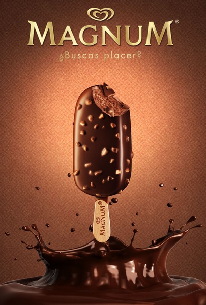
- Hook type: Sensory Product Hero
- Theme: Luxury Sensory Appeal
- Platform: Instagram, Facebook
A chocolate-coated bar dead-center against a warm bronze backdrop, with a liquid chocolate splash at the base. The dark, metallic palette and the motion of the splash push this firmly into adult-indulgence territory - closer to a fragrance ad than a snack ad.
Ice Cream Cup Stack - Visual Hero Shot
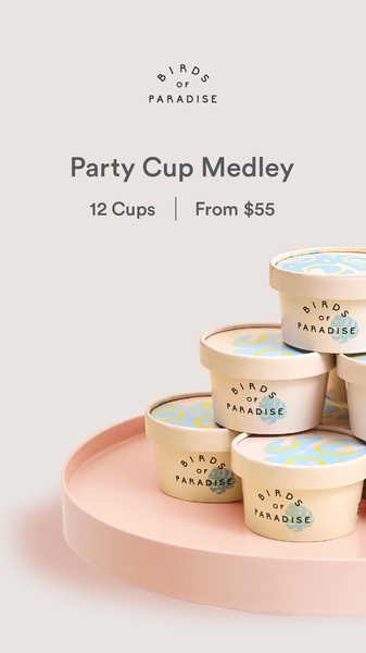
- Hook type: Visual Hero Shot
- Theme: Minimalist Product Hero
- Platform: Instagram, TikTok
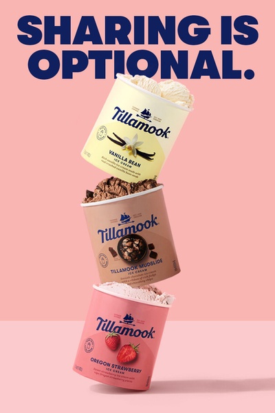
A stacked arrangement of branded ice cream cups on a soft pink tray, shot against a neutral background. Notably, this is a shareable, multi-serve format - but the ad borrows the same restrained, premium visual language as the single-serve bar rather than a playful, party-ready look.
Caramel Drizzle Scoop - Sensory Appetite Appeal
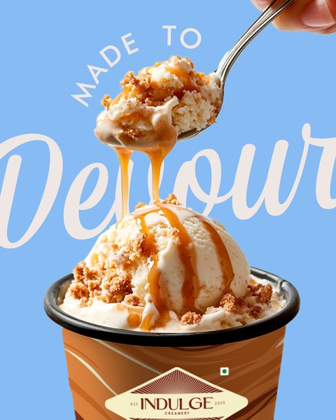
- Hook type: Sensory Appetite Appeal
- Theme: Sensory Product Hero
- Platform: Instagram, Facebook
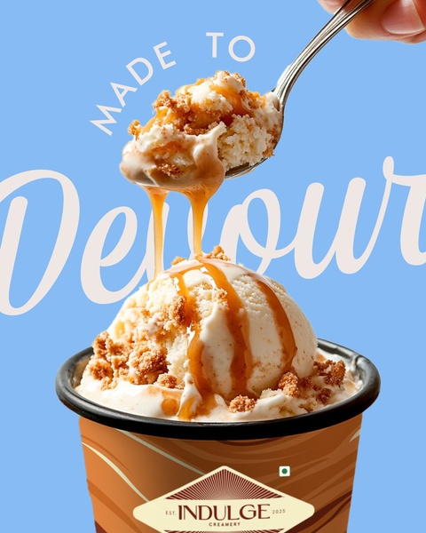
A macro shot of a spoon lifting a scoop topped with caramel, set against a clean light-blue field. One understated word - "Devour" - does the entire copy job. Like the bar and the cup stack, this leads with texture and craving rather than variety or price.
Ice Cream Menu Grid - Menu Offer Reveal

- Hook type: Menu Offer Reveal
- Theme: Playful Menu Showcase
- Platform: Instagram, Facebook
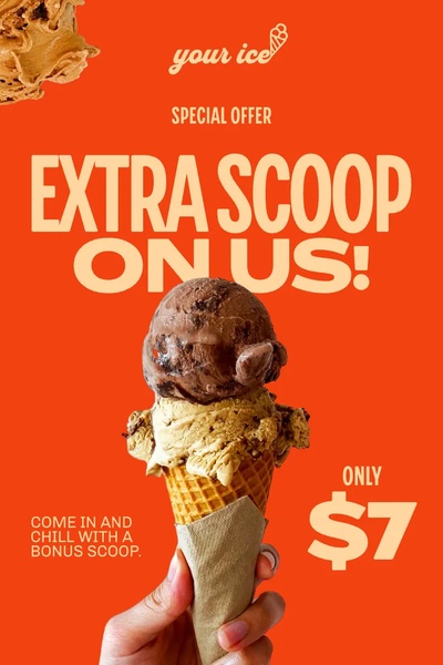
A four-quadrant grid of ice cream and milk-based drinks, hand-lettered type, visible pricing on each item. The only one of the four built around variety and choice instead of a single indulgent moment - closer to a scoop shop's in-store menu than a hero product shot.
What These Ice Cream Ad Examples Actually Lead With: Indulgence Over Variety
Three of the four ads above - the bar, the cup stack, and the caramel scoop - lead with a single sensory hero shot: one product, one craving, minimal text. Only the menu grid leads with variety and price. That split is not an accident of this particular sample; it reflects where most ice cream advertising budget actually goes.
The interesting detail is the cup stack. It is structurally a shareable, multi-serve product - the kind of format that would usually pull toward the playful, accessible register described earlier. Instead, the ad treats it with the same restrained, premium visual language as the single-serve bar. The format didn't decide the register here; the brand did.
That is the actual decision an ice cream advertiser has to make before a shoot or a generation session: not just "what format am I selling," but "which register am I willing to commit to for this specific creative" - because the two rarely blend well in a single ad.
If one of the four registers above already matches your product, Promer AI's Ad Clone recreates that structure around your own flavor and format instead of starting from a blank layout.
FAQs about Ice Cream Ads
Why does the melt matter so much in ice cream ads?
Because it is the fastest available proof that the product is fresh, cold, and being eaten right now. A drip, a soft edge, or a cracking chocolate shell all signal immediacy in a way a static, untouched scoop cannot. Most other food categories try to hide signs of decay - ice cream is the rare case where visible change is the entire selling point.
Should an ice cream ad lead with mood or with the product itself?
Both, but mood decides which visual treatment the product gets. The product itself rarely needs explaining - everyone already knows what ice cream is and that it tastes good. The real creative decision is which feeling this specific ad is attaching to it: an adult, indulgent moment, or a shared, playful one. That choice then determines the lighting, the palette, and how much text the ad needs.
Can a shareable format like a tub or a multi-pack still use a premium, indulgent visual style?
Yes - the format and the register are two separate decisions. A multi-serve product does not have to look playful just because it is meant to be shared. A premium, restrained visual treatment can work for a shareable format if the brand is positioning itself on quality rather than convenience or fun - it just means committing to that register fully rather than defaulting to bright colors because the product is multi-serve.
Is a menu-grid format better than a single hero shot for ice cream?
It depends on whether the goal is one product or the whole range. A single hero shot sells a specific craving and works well for a flagship flavor or a new launch. A menu grid sells choice and works better for a scoop shop, a multi-flavor line, or a brand where price comparison across options is part of the decision. Most ice cream brands need both at different points in a campaign, not one or the other permanently.
How do I create an ice cream ad from my own product page?
Paste your product page and Promer AI reads it, pulling out the flavor, the format - bar, tub, scoop, or novel flavor - and the occasion or mood it fits. It then writes the headline, body, and CTA on top of the structure you picked. Review before it runs, since generated creatives can have mistakes. For comparison, Promer AI's food ad creatives library covers formats where the proof shot works completely differently, such as a burger's stack or a pizza's overhead pie.
How Promer AI Builds Your Ice Cream Ad From the Flavor, the Mood, and the Format
Knowing whether to lead with the melt, the mood, or a specific occasion still leaves the headline, the visual direction, and the CTA unwritten. That's the part Promer AI's AI ad generator handles from your actual product page rather than a blank brief.
Paste your product page and the AI reads it, pulling out the flavor, the format (bar, tub, scoop, novel flavor), and the occasion or mood it fits. It then writes the headline, body, and CTA on top of the winning structure you picked.
If you have a product but no direction yet, Promer AI's Ad Concept reads your page and builds ad angles from your product context before any design begins.
Review before it runs - generated creatives can have mistakes.
If your menu also includes something meant for sharing rather than solo indulgence, the same library covers pizza ad ideas built around a group occasion instead of a personal one.







