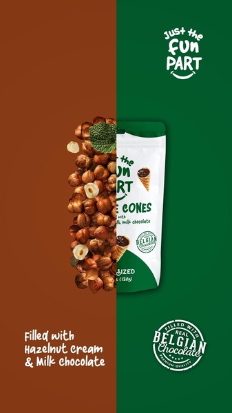
A split-screen composition featuring a heap of raw hazelnuts on the left and a branded cone package on the right.
Free credits included. No card required
The split-screen composition provides an immediate, high-contrast look at the hazelnut cone by separating raw ingredients from the finished product. This approach signals freshness and transparency, focusing the viewer’s eye on the core components before the branded packaging appears.
Great product ads lead with the raw sensation of the ingredients before revealing the identity of the brand.
Pro tip
When using a split-screen design, ensure the colors on both sides are complementary to maintain a premium feel. Avoid cluttered backgrounds on the ingredient side to keep the viewer focused on the quality of the item itself.




















Promer helps you find the pattern, adapt it to your product, and create your own version in minutes.






