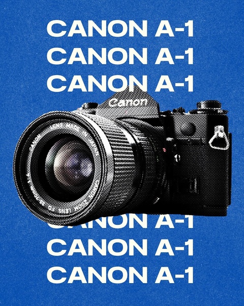
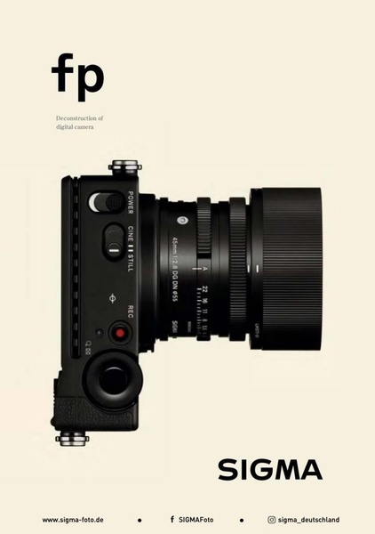
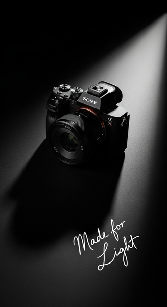
This creative displays a single camera product against a bold blue background, with the product name repeated multiple times in clean, white, sans-serif text to emphasize the identity.
Free credits included. No card required
This creative uses a high-contrast pattern of repeating text to establish instant brand recognition for the camera. The bold, centered typography creates a rhythmic visual structure that forces the eye toward the product in the center of the frame, ensuring the item remains the sole focus of the user's attention. By relying on a clean layout rather than complex imagery, the ad achieves a high-end feel that works exceptionally well for lifestyle hardware. Creating similar high-impact visuals is now accessible through Promer AI, which enables teams to replicate these structural design choices using their own catalog. In most cases, this pattern works because it removes all peripheral distraction, allowing your primary product to dominate the creative space with authority.
Distilling your creative down to a singular repeating design element provides a bold, authoritative path to capturing attention.
Pro tip
When using repetitive text as a hook, ensure the font choice aligns with the maturity level of your brand. A sans-serif font typically conveys a modern, technical aesthetic, while a serif font might lend a more vintage or premium feel to your product photography.





Promer helps you find the pattern, adapt it to your product, and create your own version in minutes.