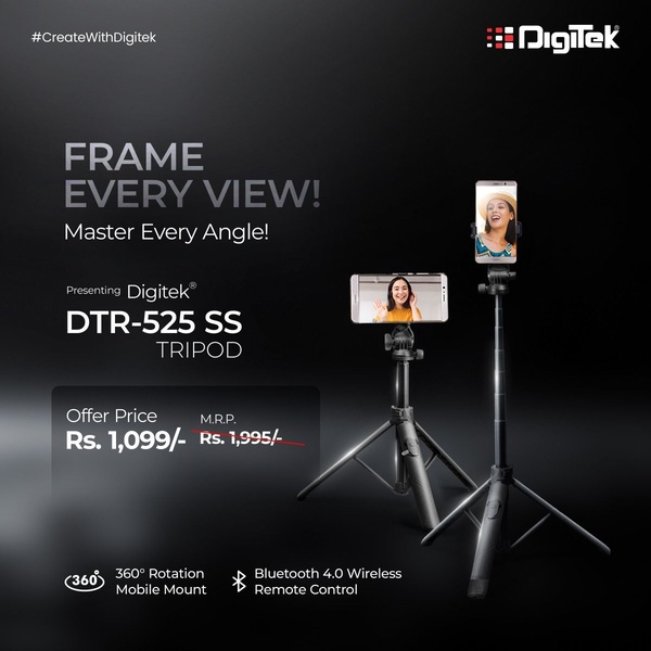
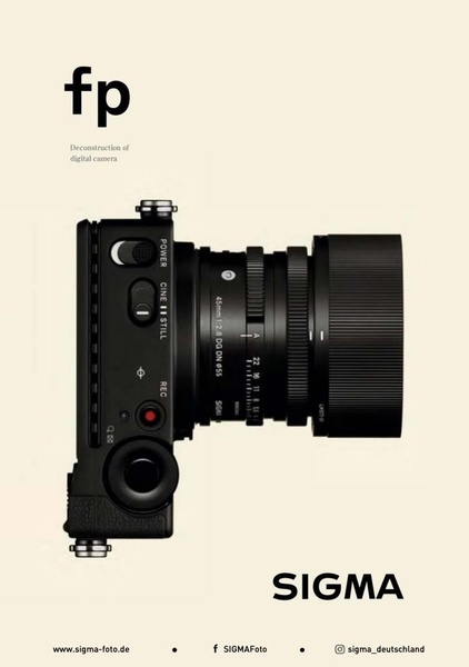
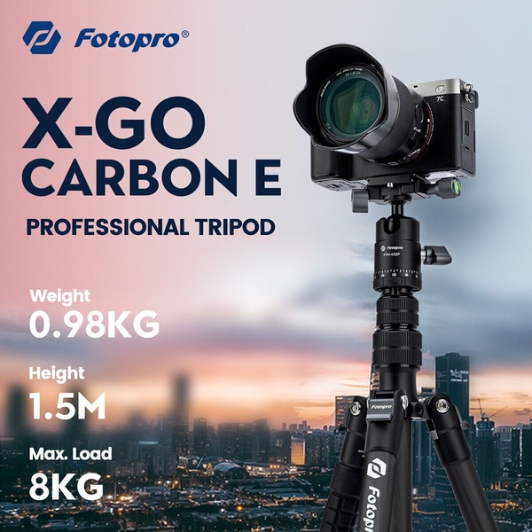
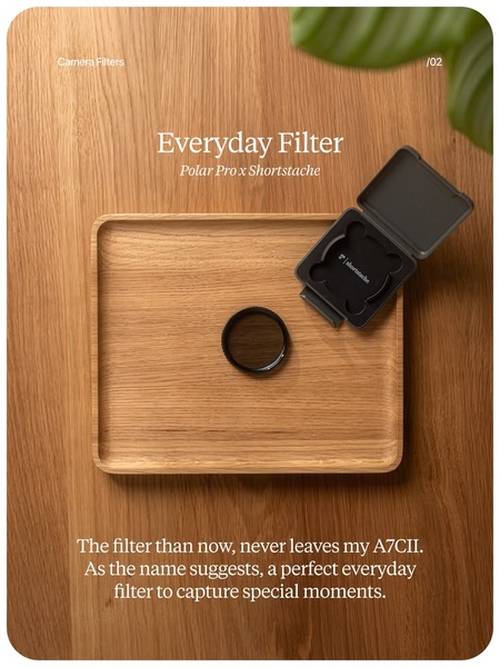
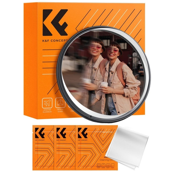
A 1:1 ratio sale ad featuring a camera product with a clean, centered layout, high-contrast text, and a distinct promotional offer.
Free credits included. No card required
This camera ad leverages a high-contrast minimalist layout to ensure the product remains the focal point while the 50% off offer provides immediate value. The design uses a clean visual hierarchy that directs the viewer's gaze from the bold promotional text directly to the high-quality product imagery.
Such a structured approach is highly effective for ecommerce brands as it removes cognitive load, allowing the consumer to quickly process the benefit. Using Promer AI, you can replicate this clean, balanced aesthetic for your own product collections without needing complex design software.
A clean, deliberate structure works better than a crowded canvas when your goal is to highlight a single, premium product offer.
Pro tip
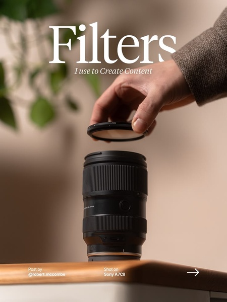
When using this layout, ensure your product photo features a depth-of-field effect similar to the original to maintain the professional, high-end feel. A cluttered product image can disrupt the minimalist aesthetic and reduce the impact of the bold typography.


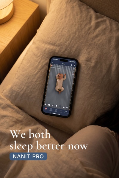

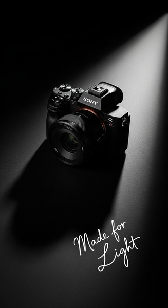
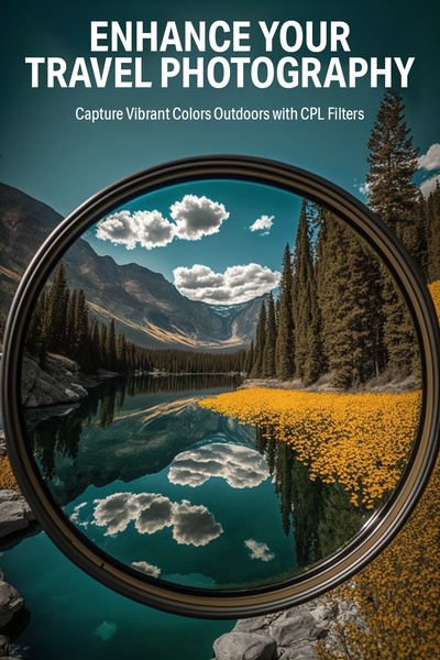
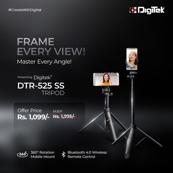

Promer helps you find the pattern, adapt it to your product, and create your own version in minutes.