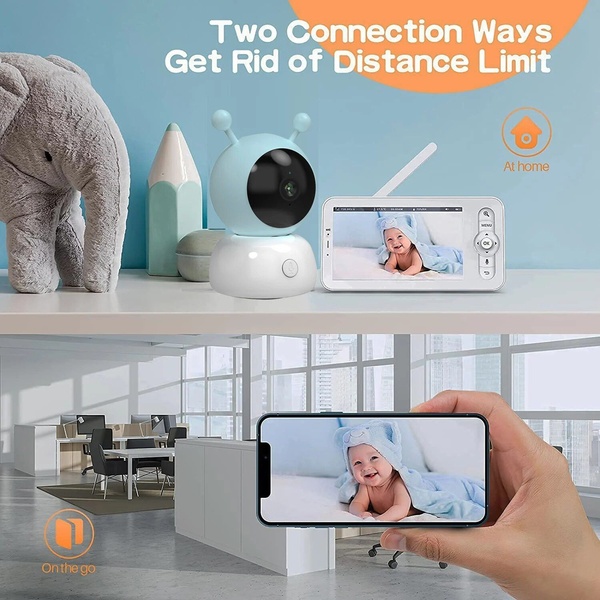
A split-screen visual demonstrates how the baby monitor provides both at-home monitor screen viewing and on-the-go smartphone connectivity.
Free credits included. No card required
This baby monitor creative uses a clear split-screen layout to instantly communicate the product's primary value proposition of seamless connectivity anywhere. By contrasting the at-home dedicated screen with the on-the-go mobile app, the creative removes the mental friction of choosing between hardware or phone monitoring, addressing two core customer use cases at once. The ad succeeds by focusing on the 'always-on' peace of mind rather than listing technical specifications.
For most ecommerce brands in this category, showing the product in actual use environments like an office or living room is more persuasive than a plain white-background shot. Using Promer AI allows you to rapidly test different environmental backdrops and UI snapshots to see which connectivity context resonates most with your target demographic's specific daily routines.
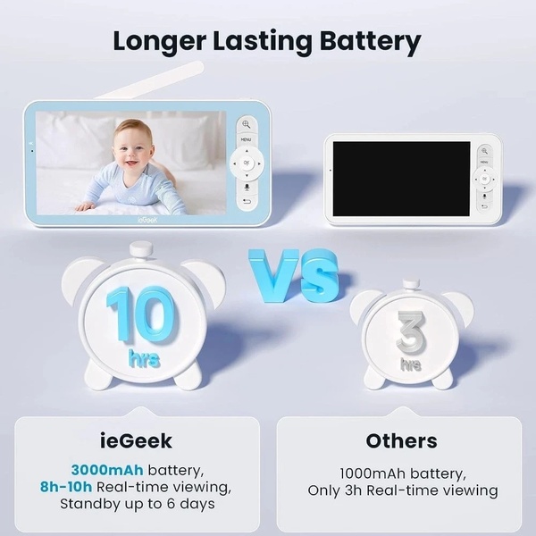
A high-performing product ad visualizes the solution to a pain point in a single glance.
Pro tip
When testing split-screen layouts, try one variation where the UI on the devices is highly visible and another where the environment takes center stage. This helps you identify if your audience is more convinced by the software interface or the lifestyle benefit of being connected.














Promer helps you find the pattern, adapt it to your product, and create your own version in minutes.