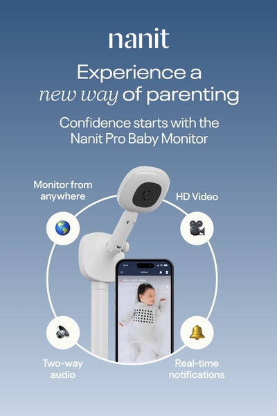
A clean, benefit-focused display of the baby monitor showing the hardware alongside mobile app capabilities through a circular feature breakdown.
Free credits included. No card required
This baby monitor ad succeeds by using a clear, diagrammatic layout that physically connects the hardware to its specific digital benefits. By anchoring the product in the center and using radial callouts, the creative guides the viewer’s eye immediately from the camera hardware to the primary user benefits. This visual hierarchy prevents clutter and makes a complex tech product feel simple and approachable.
For most ecommerce brands, Promer AI users find that this 'center-product, radial-benefit' pattern is highly effective for explaining software-connected hardware. It allows potential customers to digest features like 'real-time notifications' or 'two-way audio' as tangible solutions to their parenting pain points, rather than just abstract technical specs.
Great ads start from an idea, a feeling, or a structure, not a blank design.
Pro tip
When using a diagrammatic hook, ensure that your icons are uniform in style to avoid visual dissonance. If your product is meant for parents, keep your color palette soft and desaturated to maintain a sense of calm and safety, rather than opting for high-contrast or aggressive brand colors.

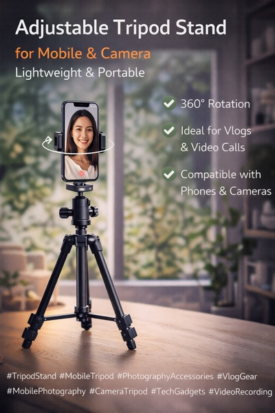






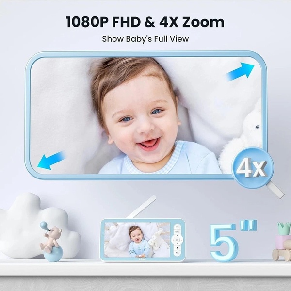






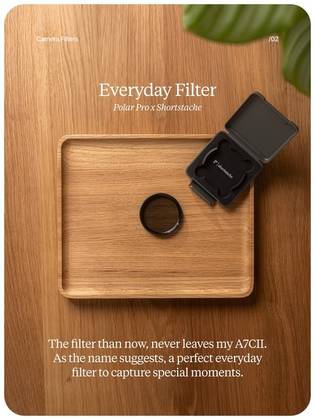


Promer helps you find the pattern, adapt it to your product, and create your own version in minutes.