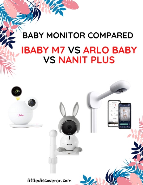
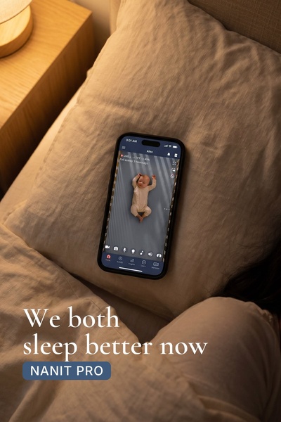
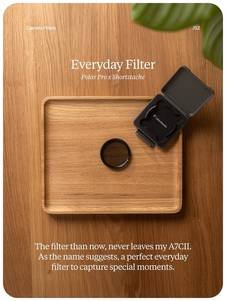
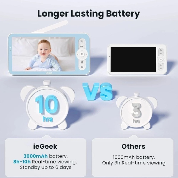
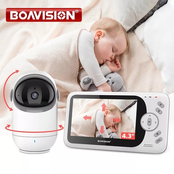
This creative visually compares the features and form factors of three popular baby monitors to assist customers in their evaluation process.
Free credits included. No card required
The comparative layout organizes complex choices for a baby monitor into a digestible grid. By contrasting three different designs, the brand positions itself as a helpful expert rather than just a vendor, effectively using the logical 'Us and Them' intent to guide shoppers through their research phase. This structured approach lowers cognitive load for the buyer, making it easier to evaluate features against their specific needs. Using Promer AI to replicate this comparative strategy allows brands to build trust by clearly outlining how their product performs alongside industry alternatives in a clean, professional format.
Comparative ads convert because they meet the customer at the exact moment they are deciding between competing solutions.
Pro tip
When running a comparative ad, prioritize the most requested feature or common pain point in your headlines. Ensure the visual hierarchy clearly links your hero product to the specific benefits mentioned in your text to avoid confusion.
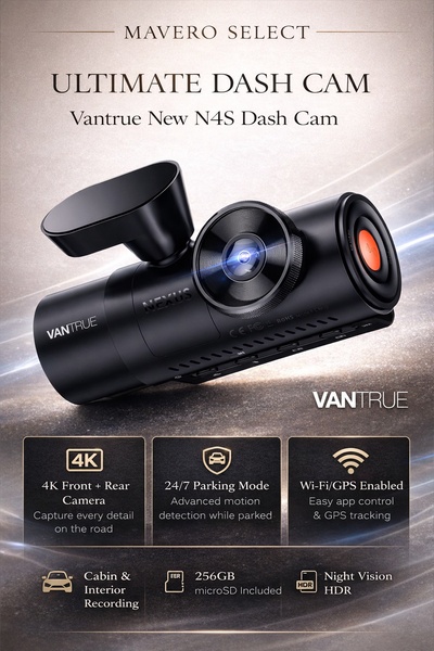
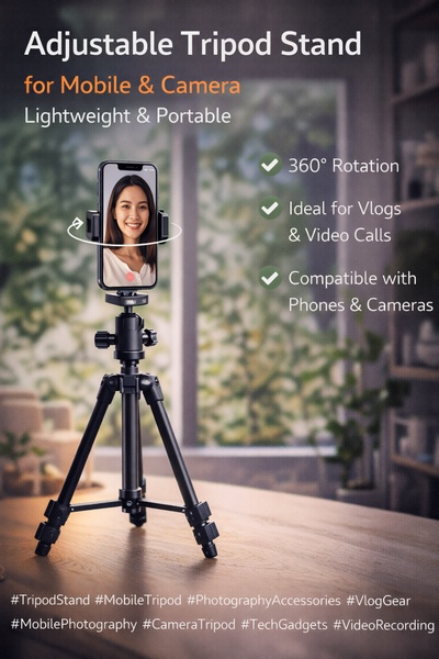






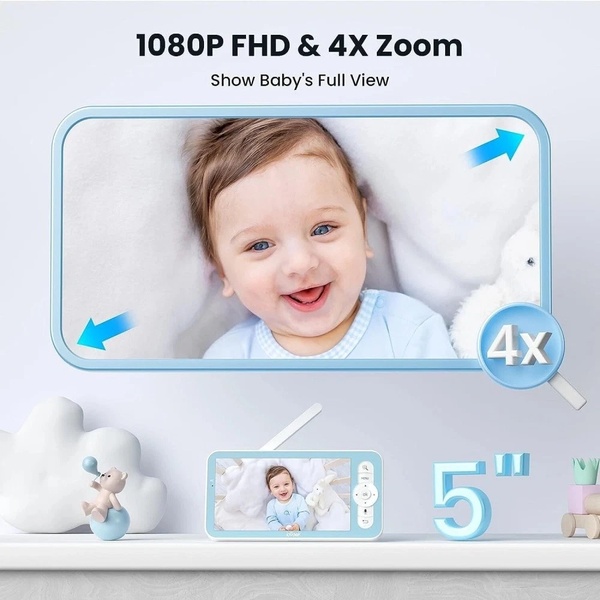






Promer helps you find the pattern, adapt it to your product, and create your own version in minutes.