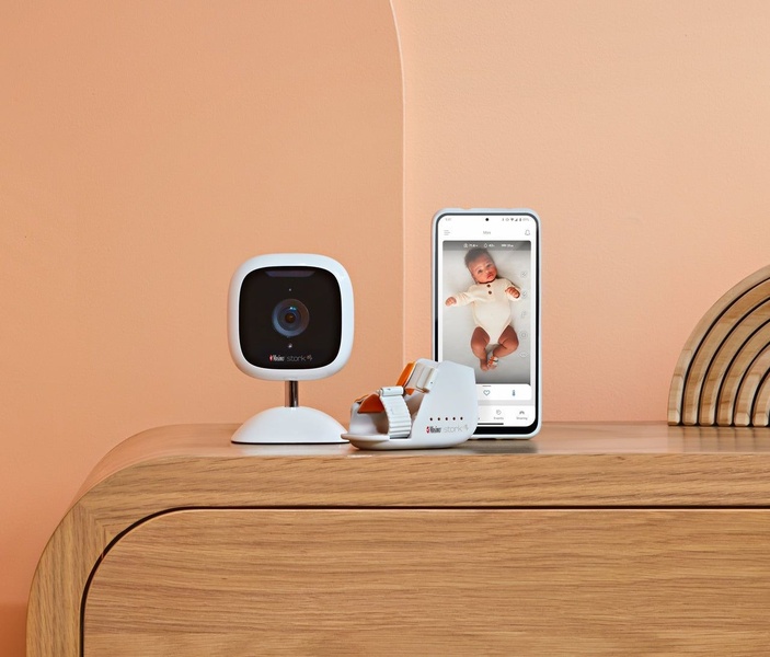
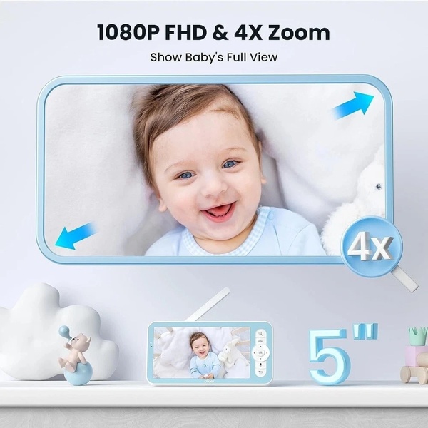
A clean, high-end hero shot of a baby monitor camera, heart rate sensor, and smartphone app showing a baby in the crib, set against a peach-toned curved wall.
Free credits included. No card required
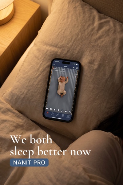
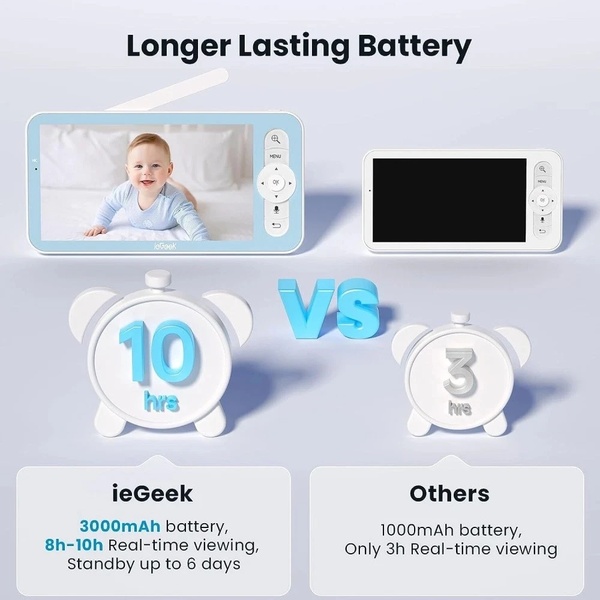
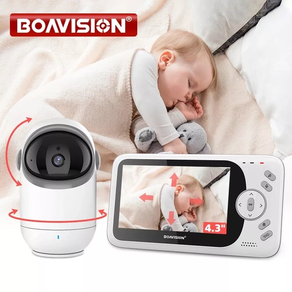
This creative relies on a clean, high-contrast visual display of the baby monitor to establish immediate trust and product clarity. By placing the hardware and the app interface side-by-side, it visually answers the user's primary question about what the product is and how the monitoring technology integrates into their daily routine, using a warm, calm color palette to evoke feelings of safety and nursery-readiness. This approach centers the product experience by removing distractions and focusing entirely on the utility of the tech, which is a powerful way to convert parents who are researching high-stakes purchases.
Adopting this visual structure provides a template for success, and you can easily experiment with this design language using Promer AI. In most cases, showing the complete ecosystem—in this case, the camera, the sensor, and the mobile app—helps potential customers quickly understand the value proposition without needing a lengthy explanation, which typically reduces friction and encourages further engagement.
A clean, high-end visual does more to sell safety and reliability than a dozen feature-heavy paragraphs ever could.
Pro tip
When focusing on tech hardware, ensure the mobile app screen shows a relatable, high-quality image of the end-user or result. This bridges the gap between the physical device and the emotional peace of mind that parents are actually buying.










Promer helps you find the pattern, adapt it to your product, and create your own version in minutes.