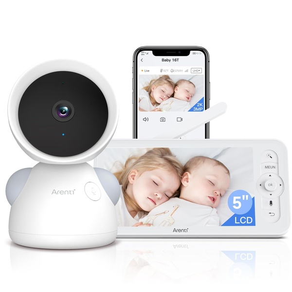
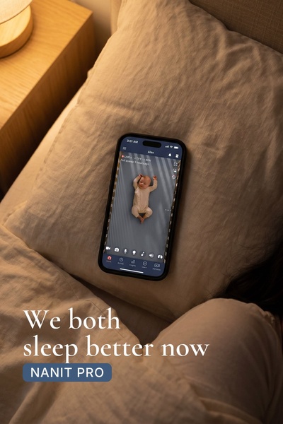
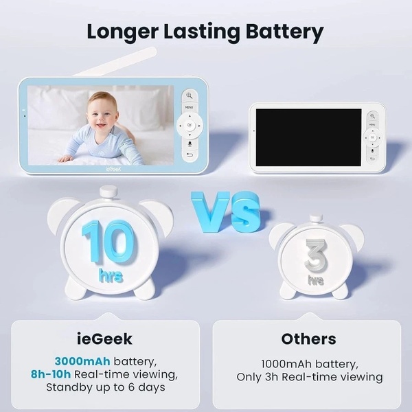
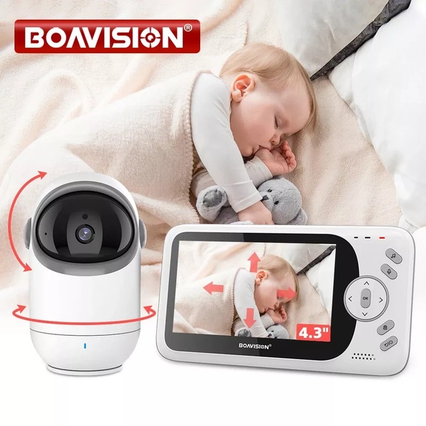
This creative displays a side-by-side comparison of a baby monitor hardware unit alongside the corresponding mobile app interface, showcasing the 2K resolution feed.
Free credits included. No card required
This baby monitor ad succeeds by leveraging a clear, split-screen visual structure that immediately validates the product's primary utility: remote visibility. By placing the physical device alongside the mobile interface, the creative communicates peace of mind and technical capability in a single glance without relying on cluttered text. Providing users with immediate proof of functionality is the most effective way to drive conversion for hardware products.
For most ecommerce teams, this type of clear product display is essential to overcome consumer skepticism. By using Promer AI to standardize your product imagery into these high-performing layouts, you can ensure consistency across your campaigns. While results depend on your specific audience targeting, a clear side-by-side demonstration typically outperforms abstract lifestyle imagery in high-intent categories.
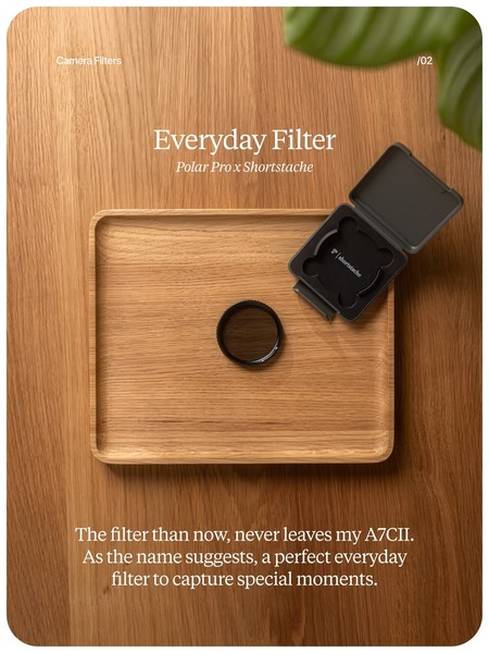
Great ads start from a structure that aligns your product's core utility with the customer's immediate need for clarity.
Pro tip
When testing a utility-focused hook, ensure your screen overlays match the actual product resolution exactly to maintain high perceived value. This builds trust by preventing the common disconnect between marketing assets and the out-of-box experience.












Promer helps you find the pattern, adapt it to your product, and create your own version in minutes.