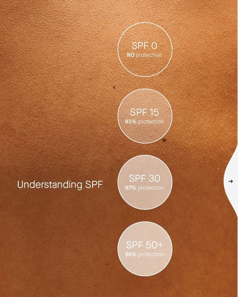
A clear, data-driven infographic comparing different SPF levels using skin-tone gradients to visualize protection percentages.

Understanding SPF Protection Levels

A clear, data-driven infographic comparing different SPF levels using skin-tone gradients to visualize protection percentages.

Ad Details
Style
Statistics
Format
4:5
Industry
Cosmetic
Platforms
Instagram · Facebook
Language
English
Clone this ad with AI

Free credits included. No card required

Why this ad works

This sunscreen ad creative leverages an educational infographic style to simplify complex scientific data into a quick, digestible visual comparison. By utilizing a clean, comparative design that maps SPF ratings directly to percentage-based protection levels, the brand effectively lowers the cognitive load for potential customers trying to decide which product meets their needs.

This pattern works because it establishes the brand as an authority without relying on aggressive sales tactics, making it highly effective for building trust in the beauty space. Using Promer AI to structure similar educational assets allows ecommerce teams to replicate this clear-cut communication strategy while maintaining high brand consistency across their product catalog.

The winning ingredients

  • Data-First Visuals The use of percentage values alongside SPF ratings provides immediate, quantifiable value to the viewer.
  • Logical Progression Organizing the SPF ratings from lowest to highest creates a natural hierarchy that guides the user eye downward.
  • Minimalist Palette The neutral skin-tone background reinforces the product category while keeping the focus entirely on the text labels.
Educational visuals transform abstract numbers into compelling product benefits that customers can instantly grasp.

How to make it yours

  1. Start by using AI Ad Clone to identify the structural breakdown of this infographic layout.
  2. Paste your product URL so that the platform can automatically map your specific product details and brand guidelines onto the layout.
  3. Refine the copy to highlight your specific USP, adjust the final image ratio for your chosen platform, and generate high-quality variations.

Pro tip

When creating comparative charts, ensure that your font hierarchy is extremely tight to maintain readability on smaller mobile screens. This ad succeeds because the text is legible even at a glance, which is critical for 4:5 social media placements.


Minimalist Benefit Highlight Lip Balm Ad
Glaze Aurora Blush Sensory Shot
Clarins Sun Care Collection
Regenerating Lip Serum Cocktail Concept
Renew Sun Protect Moisturizing Cream
V10 Hyal Lip Sun Protector Clear
A Balm You'll Finish
Luvu Lip Gloss Raspberry Minimalist Ad
Big Up Lip Balm Bold Claim
Banana Bright Eye Crème Claw Machine Ad
Not Your Basic Lip Balm Feature Highlight
Sunscreen Product Hero Shot
Creamy Lip Balm Application
Poppy & Pout Natural Ingredient Showcase
New Daily Must-Have
Glassy Hydration Lip Glow Oil Product Benefit Ad
Heart-Shaped Watermelon Lip Balm Texture
Sunscreen Spray Cocktail Metaphor
Natural Lip Balm Benefit Showcase
Ultra Renewal Eye Cream Clinical Result

Your next winning adis already out there.

Promer helps you find the pattern, adapt it to your product, and create your own version in minutes.


Free credits included
No credit card required
Ship in minutes.
Create your first ad free
Sunscreen Ad Creative: Visualizing SPF Effectiveness




















