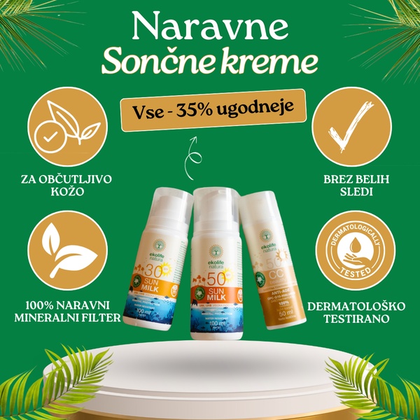
A square-format ad featuring three Sun Milk products centered on a pedestal, surrounded by four clear benefit icons and a promotional discount header.
Free credits included. No card required
This Sun Milk ad creative utilizes a highly organized, symmetrical layout that immediately communicates product value through clear, benefit-driven icons. By positioning the central product image against a deep green backdrop and using gold accents for promotional text, the creative creates a premium and trustworthy aesthetic that reduces cognitive load for the viewer. The core effectiveness of this ad lies in its ability to pair a direct financial incentive with clear technical product advantages. This structure works because it addresses the two most critical friction points for skincare shoppers: the immediate "what's in it for me" (the 35% discount) and the "is this safe for me" (the four benefit icons). For your own campaigns, you can leverage Promer AI to replicate this structured approach by highlighting your product's most essential performance attributes in a similarly organized, clean, and visual format.
A high-performing product ad should act like a visual cheat sheet, delivering the most important reasons to buy in the first two seconds of scanning.
Pro tip
When using this grid-based layout, ensure your icons are custom-designed to match your brand's unique personality rather than using generic stock assets. This consistency helps build deeper subconscious trust with your target demographic during the critical window between their first scroll and the final purchase decision.




















Promer helps you find the pattern, adapt it to your product, and create your own version in minutes.






