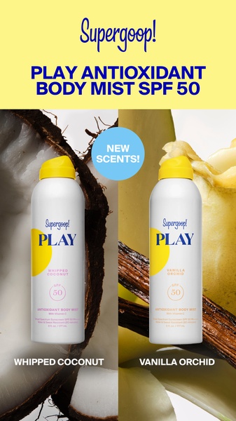
This creative displays two versions of an antioxidant body mist side-by-side, using a clean split-screen layout to highlight new product scent options.
Free credits included. No card required
This antioxidant body mist ad creative leverages a clean, high-contrast side-by-side layout to instantly introduce two product variations. By utilizing a minimalist background and macro photography, the visual hierarchy keeps the focus entirely on the product bottles, signaling quality and freshness to the viewer without the need for complex narrative clutter. The simplicity of this visual hook serves to decrease cognitive load, allowing the user to quickly process the new scent options while maintaining brand recognition.
For most ecommerce teams, this structure is highly effective because it treats the product as the hero, allowing for quick testing of different product bundles or variants. With Promer AI, you can replicate this clean, high-performance aesthetic by swapping in your own product assets and brand color palettes to see if this comparison format increases your click-through rates.
Great ads start from a clear product-led structure that removes friction for the customer, rather than trying to invent a new visual language for every launch.
Pro tip
For products with multiple scents or flavors, don't just rely on the bottle. Use macro-photography of the raw ingredients behind the product, just like this ad, to trigger an immediate subconscious craving or scent association.




















Promer helps you find the pattern, adapt it to your product, and create your own version in minutes.






