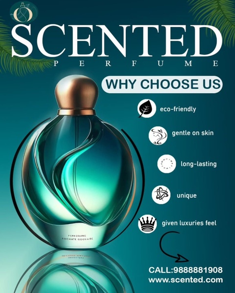
A high-conversion ad creative for a fragrance bottle that uses a minimalist layout, clear benefit icons, and a bold color palette to drive consumer attention.
Free credits included. No card required
This perfume ad creative leverages a clean, high-end visual aesthetic to command attention through contrast and clarity. By centering the product and surrounding it with five distinct, icon-backed benefits, the brand establishes a clear value proposition before the user even considers clicking the link. The core effectiveness of this approach lies in reducing cognitive load by pairing specific, readable text with relevant visual iconography.
For most ecommerce teams, this structure works because it addresses immediate buyer concerns—like skin safety and longevity—without forcing a complex narrative. You can replicate this proven organizational structure using Promer AI by analyzing the spacing and icon-text relationship of this layout. This strategy allows your product to remain the hero while benefits act as the conversion catalyst, which is typically highly effective for premium goods.
Great ads start from a structured clarity that guides the viewer's eye from the product to the promise, not a cluttered design.
Pro tip
When using this layout, ensure your icons are visually uniform in weight and size to maintain a sense of balance. Testing different benefit claims against a consistent base layout is the fastest way to find your winning combination.




















Promer helps you find the pattern, adapt it to your product, and create your own version in minutes.






