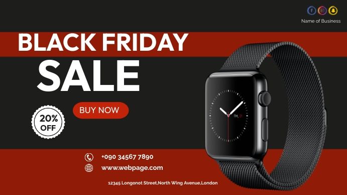
A 16:9 promotional banner for a smartwatch, featuring bold typography, a high-contrast red and black color scheme, and a clear discount offer.
Free credits included. No card required
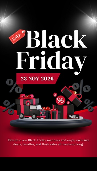
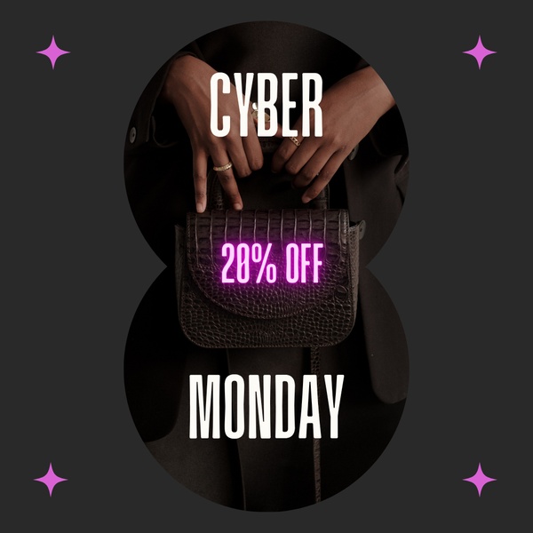
This creative succeeds by pairing a clear smartwatch value proposition with a high-contrast visual hierarchy that demands attention in a cluttered feed. By using a bold black and red palette, the design creates an immediate sense of urgency that aligns perfectly with the seasonal demand of a Black Friday event. The power of this layout lies in its uncompromising focus on the primary offer, ensuring the user recognizes the discount instantly without needing to process complex visuals.
For most ecommerce brands, this structured approach is highly repeatable for any promotional cycle using Promer AI. It prioritizes readability and direct action, which are essential for performance marketing success, especially when you are testing multiple seasonal offers at once.
A winning sale ad should be a frictionless transition from a stopping visual to a clear, actionable offer.
Pro tip
When using a high-contrast theme like this, ensure your primary call-to-action button color is the only element that deviates from the main color scheme. This creates a psychological trigger that makes the clickable area impossible to ignore compared to the rest of the static creative.
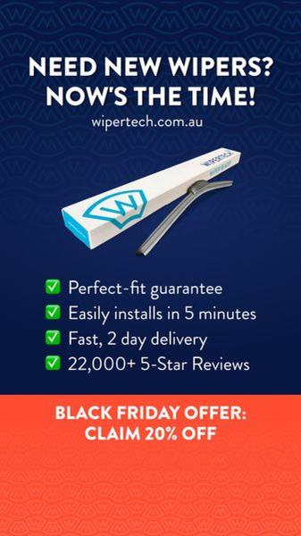
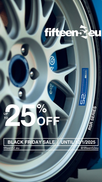
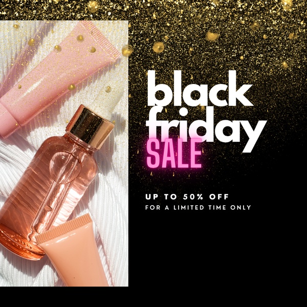







Promer helps you find the pattern, adapt it to your product, and create your own version in minutes.






