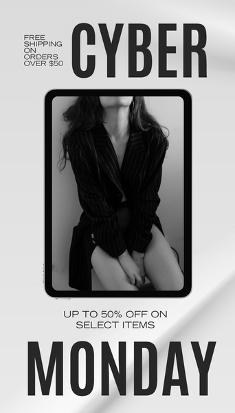
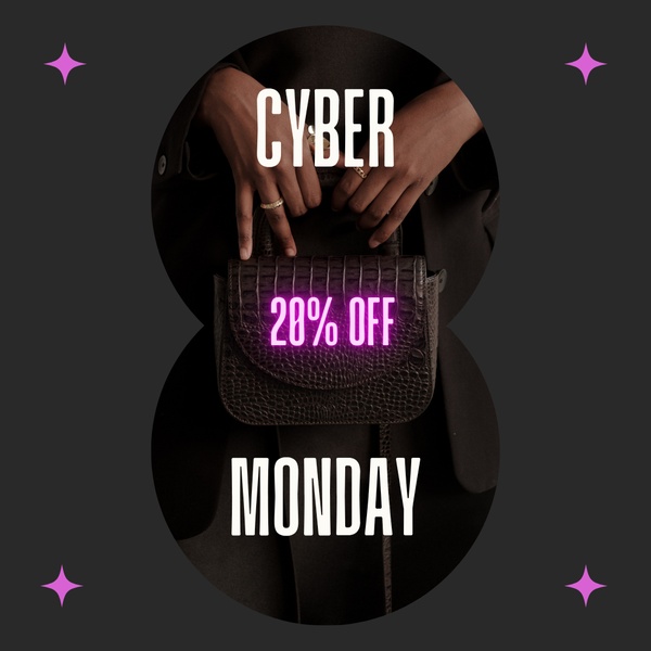
A high-contrast 9:16 vertical sale creative featuring a central tablet overlay containing a professional fashion photograph, framed by bold Cyber Monday typography.
Free credits included. No card required
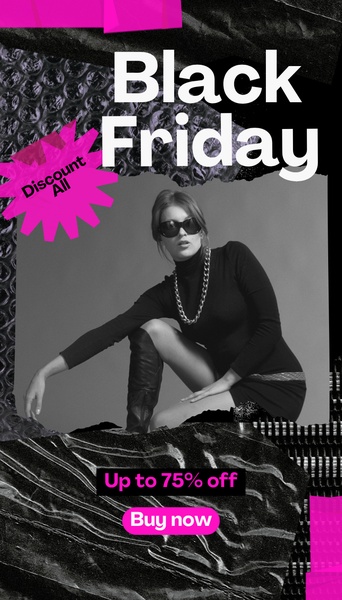
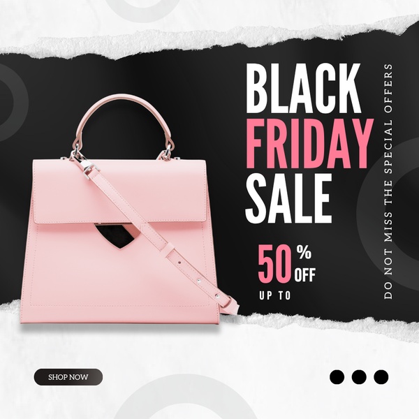
This ad relies on a clean, monochromatic layout to highlight the blazer without visual clutter. The strong vertical hierarchy forces the eye from the offer details straight to the centered product imagery, creating an immediate connection between the sale event and the product quality. By utilizing high-contrast typography in black and white, the ad commands attention in fast-scrolling environments.
For most ecommerce teams, this approach leverages familiarity to reduce friction. Using Promer AI, you can maintain this professional aesthetic while swapping out your own catalog items. This structure effectively communicates urgency for promotional events without relying on aggressive, low-quality sales tactics.
A successful promotional ad prioritizes legibility and brand alignment above complex graphic design elements.
Pro tip
When running a sale, keep your typography consistent with your brand's existing identity rather than opting for default bold fonts. Even in a simple sale creative, subtle changes to the font weight can significantly impact perceived brand value.
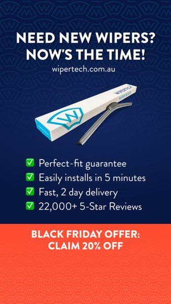
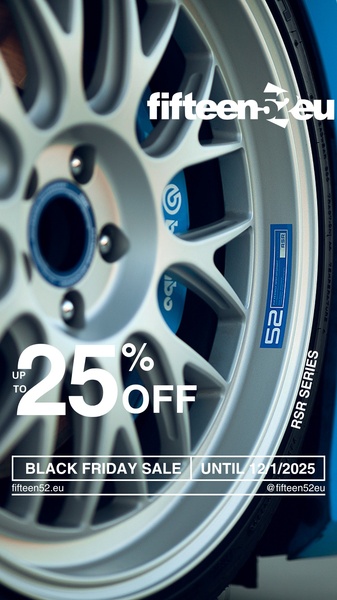



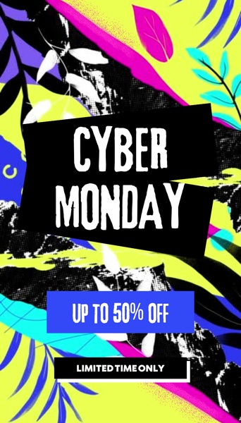











Promer helps you find the pattern, adapt it to your product, and create your own version in minutes.






