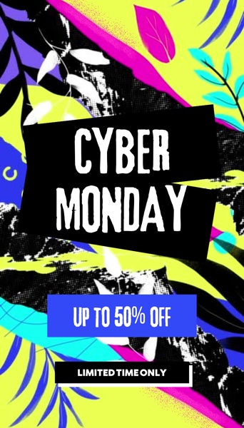
A bold, high-contrast Cyber Monday graphic using neon yellow and black to highlight a 50% off discount.
Free credits included. No card required
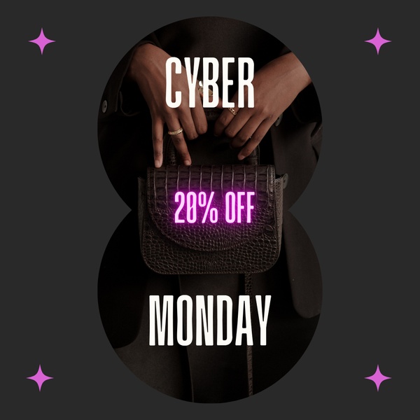
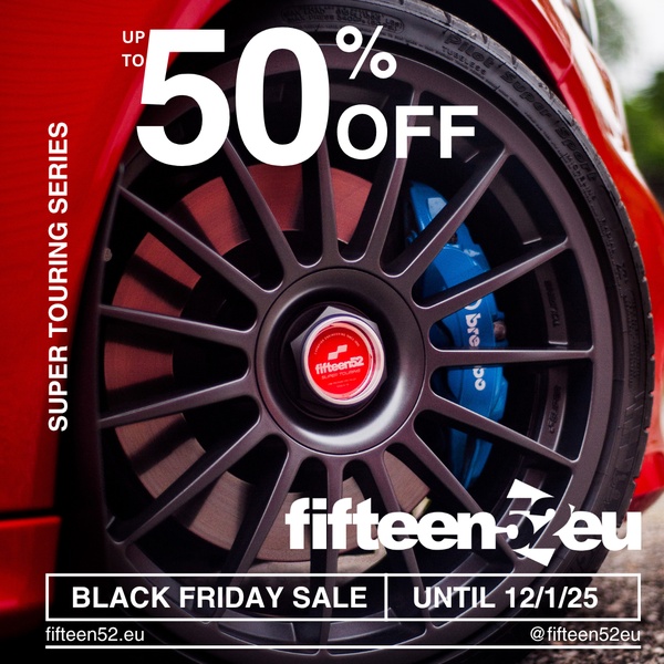
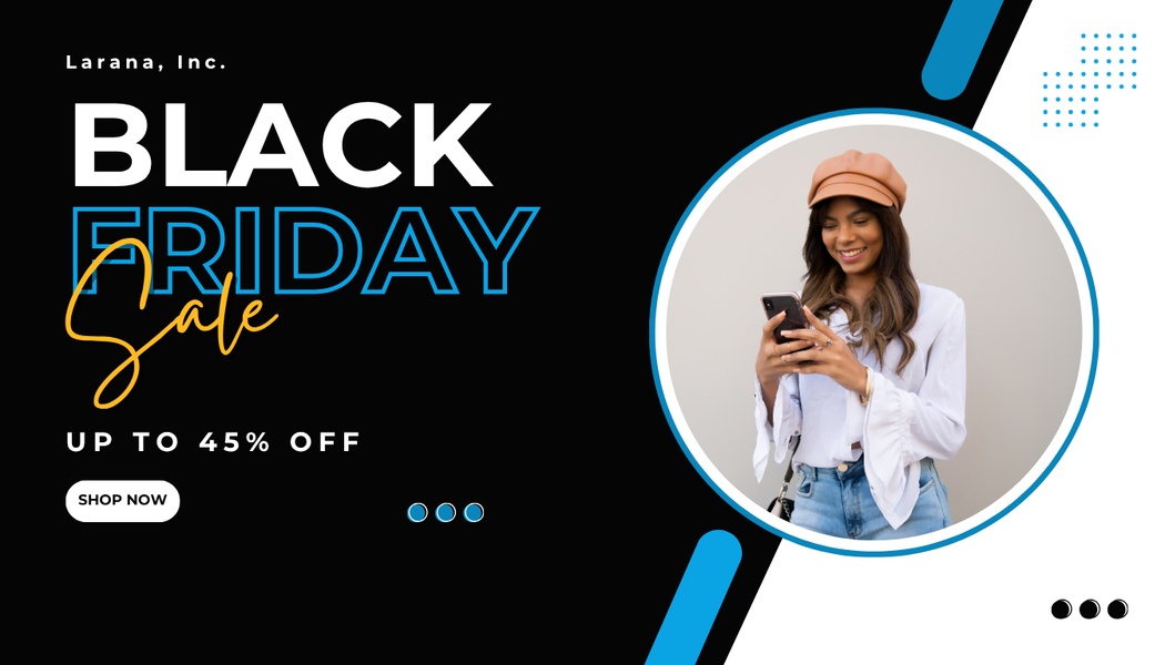
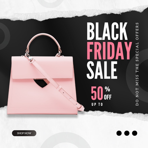
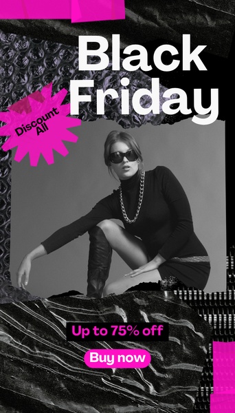
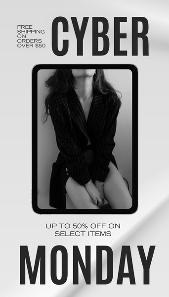
The effectiveness of this promotional offer lies in its aggressive use of high-contrast color theory and bold typography. By stripping back non-essential design elements to focus entirely on the discount value and the event date, the creative creates immediate cognitive friction that stops the scroll. This visual intensity forces the viewer to process the offer instantly, making it ideal for time-sensitive, high-volume retail events.
For most ecommerce brands, this pattern works because it mimics the urgency of physical store signage within a digital 9:16 frame. Using Promer AI allows you to standardize this high-contrast approach across your seasonal assets, ensuring your visual brand identity remains consistent even when you pivot to rapid-fire sale messaging.
Great ads start from an idea, a feeling, or a structure, not a blank design.
Pro tip
When using high-contrast designs, stick to a maximum of three core colors to avoid visual fatigue. Use the vibrant color for the most important element, such as your discount percentage, and reserve the neutral black for text hierarchy.

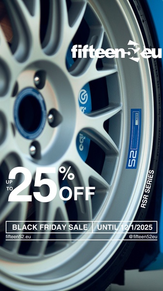
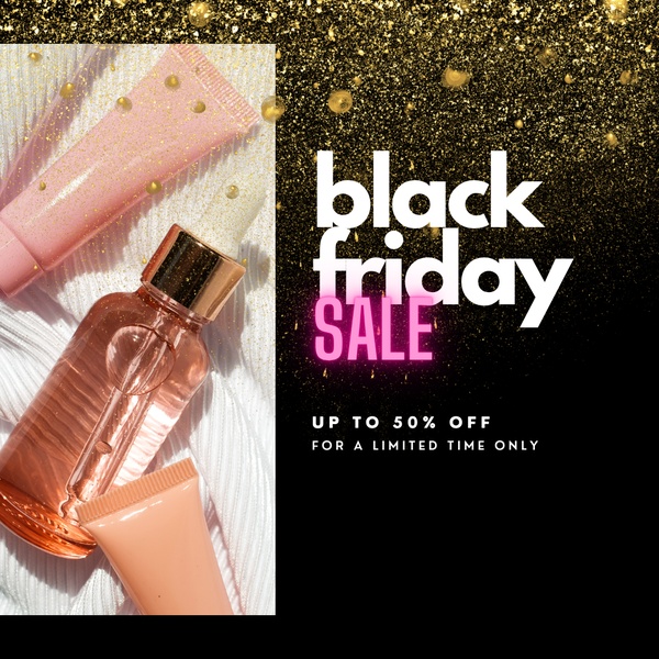





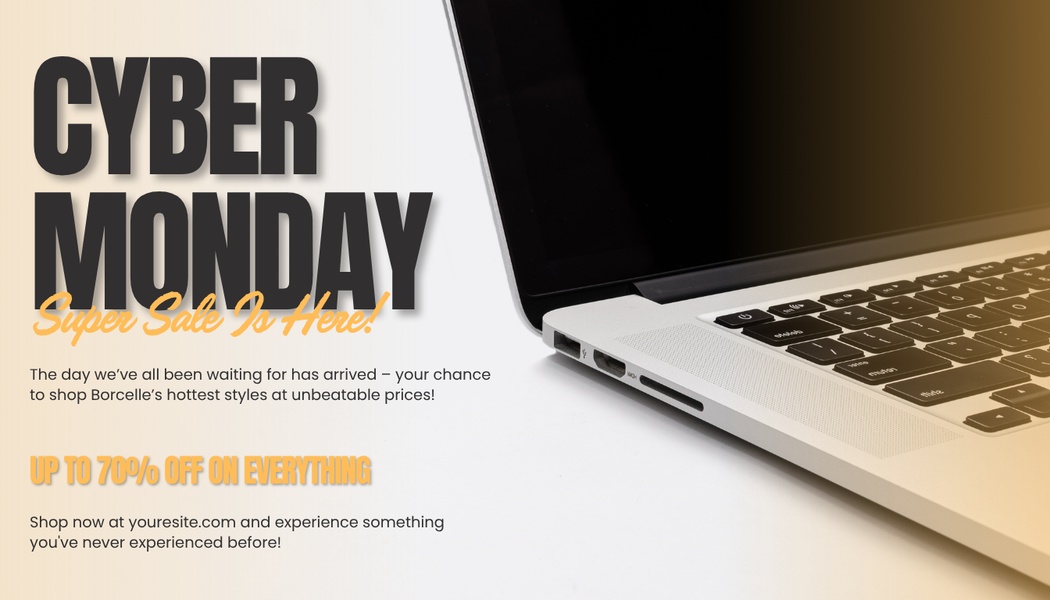





Promer helps you find the pattern, adapt it to your product, and create your own version in minutes.






