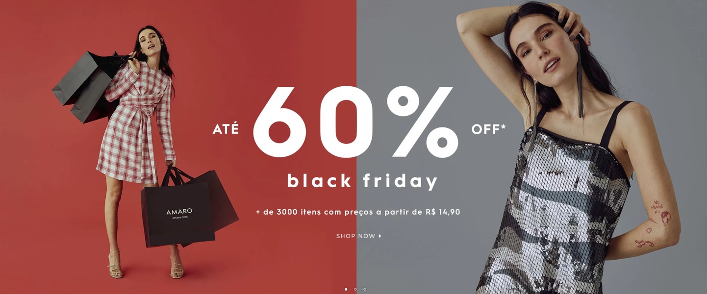
A high-impact 21:9 split-screen ad featuring two distinct model poses and a bold offer for a clothing sale.
Free credits included. No card required
The use of a high-contrast split-screen design creates an immediate visual anchor for this apparel offer. By placing the boldest discount percentage at the center of the color transition, the ad forces the viewer to process the value proposition instantly before their eye travels to the styled models on either side. This approach thrives on visual symmetry to organize complex sales information into a clean, digestible format for the user.
For most ecommerce teams, leveraging a clean, two-tone background with a central bold headline is a proven way to reduce creative fatigue during seasonal events like Black Friday. You can use Promer AI to mirror this structural balance, ensuring your discount hierarchy remains clear even when your product photography changes.
Great ads start from a balanced structure that highlights the offer first, then lets the product photography build the brand desire.
Pro tip
When using a split-screen layout, ensure the two sides of the image have a similar visual weight so one does not overpower the other. Use consistent lighting on both sides of the frame to keep the overall ad feeling like a single cohesive unit.
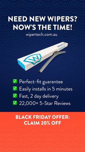
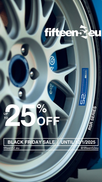



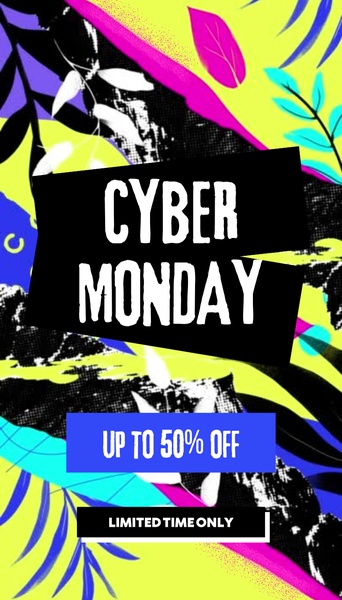











Promer helps you find the pattern, adapt it to your product, and create your own version in minutes.






