Most beauty ad creative falls into one of two traps: a flat product shot on a plain background with nothing to stop the scroll, or a staged luxury scene so abstract the viewer can't tell what's actually for sale.
These 15 examples of ai ad creative for beauty brands show what a more deliberate approach looks like, across mascara, lipstick, perfume, skincare, serums, and sunscreen.
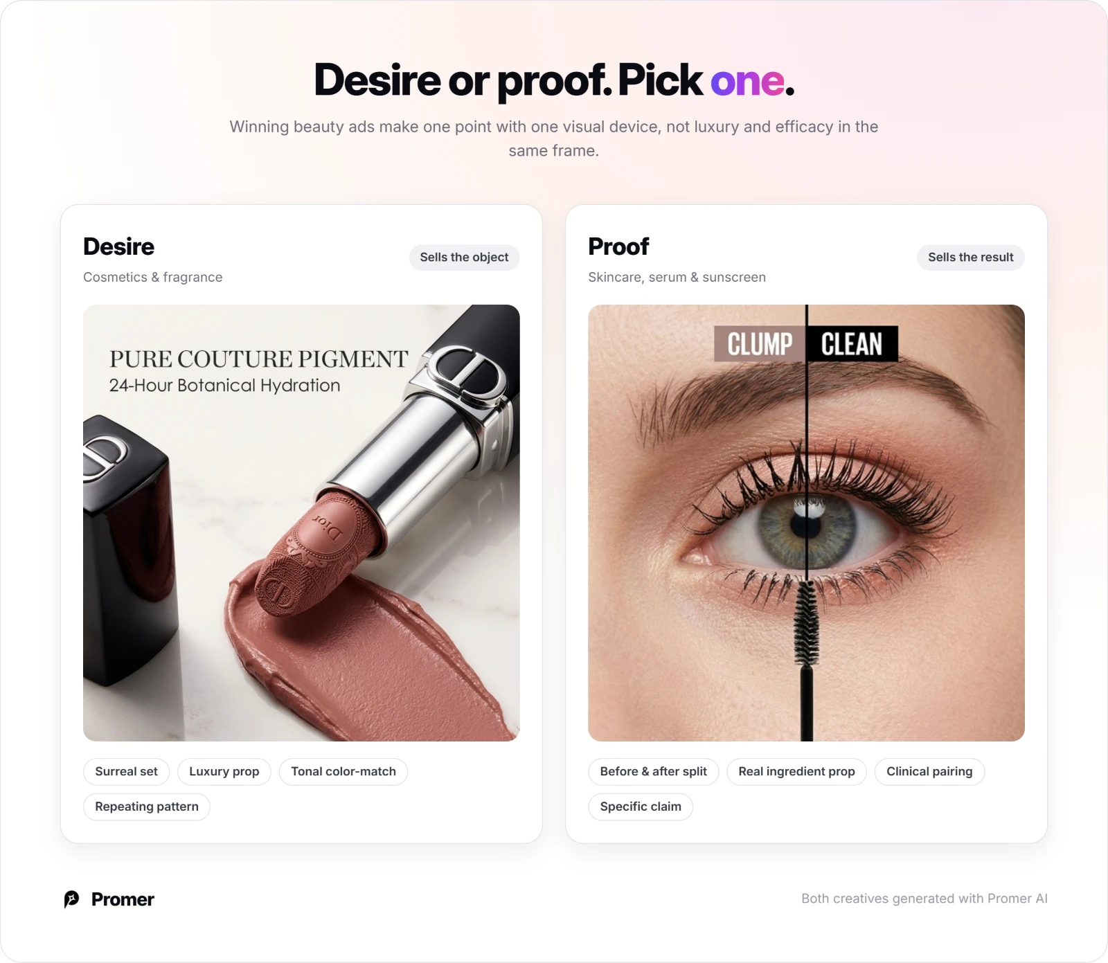
The AI ad creative that works for beauty brands treats the product as either a desire object or a piece of proof, and uses a single visual device, a color-matched tone, a real ingredient prop, a split-screen comparison, to make one point clearly instead of trying to sell luxury and efficacy in the same frame. A clinical before-and-after that also tries to look like a perfume campaign usually undersells both.
This article covers 15 real beauty ad creatives across Lancome, Tom Ford, NARS, Hince, AMUSE, Gucci, Valentino, Innisfree, Medik8, Lavera, Dior, and more, with the platform, ratio, and layout choice that makes each one work. At the end, you'll find how to adapt any of these structures to your own beauty brand.
Key takeaways
- Cosmetics and fragrance ads lean on desire, surreal sets, luxury props, repeating patterns, while skincare and sunscreen ads lean on proof, before-and-after splits, ingredient shots, clinical pairings.
- Tonal color-matching, a portrait and product in the same shade, a backdrop matched to an ingredient, repeats across both lipstick and skincare as a way to keep a busy shot legible.
- Real, recognizable props (a tennis racket, halved citrus, an actual gift box) do the explaining that a headline would otherwise have to carry alone.
- Vertical ratios (9:16, 4:5, 2:3) dominate the set, while 1:1 is reserved mostly for direct, benefit-led or before-and-after formats.
- Before & after remains the single most-used proof format across both mascara and skincare examples here.
What makes AI ad creative work for beauty brands?
The same split shows up across the 15 examples below. Cosmetics and fragrance ads (examples 3, 4, 5, 6, 7, 8, and 14) lead with desire, a surreal set, a luxury prop, a repeating pattern, because the product itself needs to feel like something worth owning before a single claim is read. Skincare, serum, and sunscreen ads (examples 1, 9, 10, 11, 12, 13, and 15) lead with proof instead, an ingredient, a split-screen result, a specific benefit, because that buyer has usually been burned by an overstated claim before.
Promer AI's breakdown of what makes a winning ad covers this same single-hook principle in more depth, if you want the underlying framework beyond beauty specifically.
15 AI ad creative examples for beauty brands
Each one below lists its platform, ratio, and hook type first, so you can match the layout to your own product before you look at the image. A "Try AI Ad Clone" button sits under every creative if you want to jump straight into recreating it.
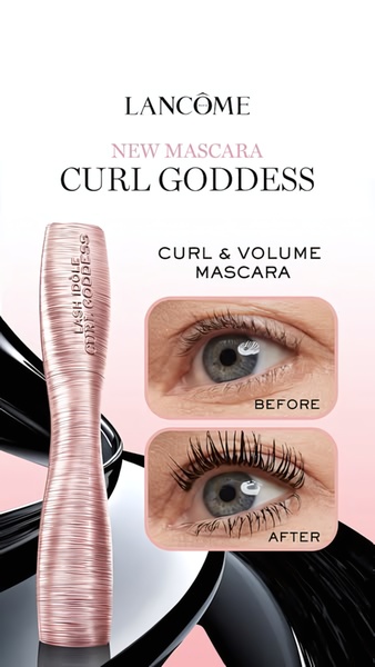
1. Lancome Lash Idole Before & After (Mascara)
Platform: Instagram Stories, TikTok, Facebook Reels | Ratio: 9:16 | Hook type: Before & after split comparison
A vertical split-screen pairs a bare-lash "before" against a dramatically curled, volumized "after," both shot in the same soft pink-and-white studio light. The product name and a two-word benefit claim, curl and volume, sit beneath the split.
Winning ingredients:
- A split-screen keeps both states in one frame, so the transformation needs no scrolling or video to land
- Identical lighting and angle on both sides keep the comparison believable instead of staged
- A two-word benefit claim under the image names the result the split already proved
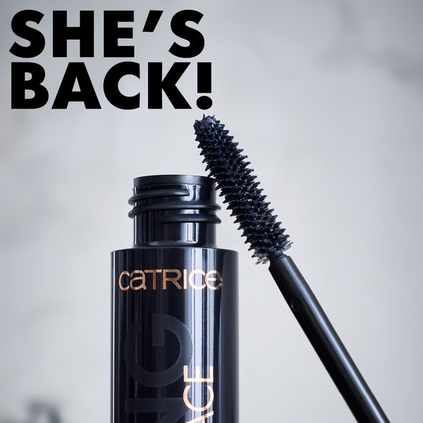
2. "She's Back" Mascara Launch Teaser (Mascara)
Platform: Instagram, Facebook | Ratio: 1:1 | Hook type: Teaser relaunch headline
A macro, centered shot of the wand emerging from its tube sits against a plain white background, with a short, punchy headline, "She's back!", announcing the product's return. Nothing else competes with the wand's silhouette.
Winning ingredients:
- A short teaser headline creates a curiosity gap that a longer, explain-everything headline would close too early
- Centering the wand against plain white keeps a single product silhouette the entire focus
- Macro framing on the applicator signals premium formulation before a single claim is made
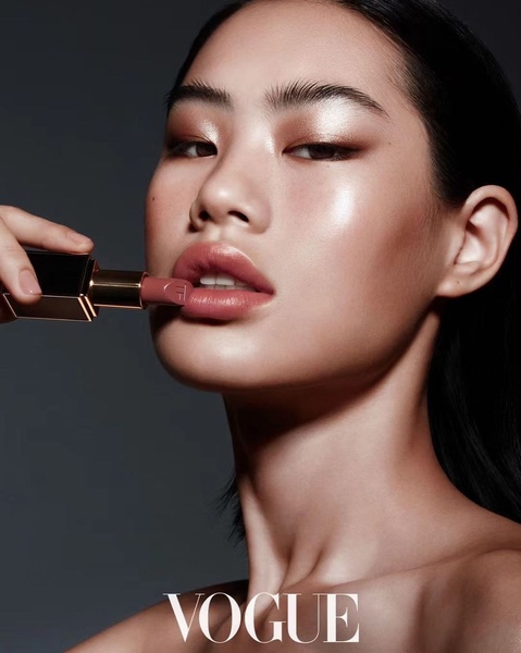
3. Tom Ford Lipstick Application Close-Up (Lipstick)
Platform: Instagram, Pinterest | Ratio: 4:5 | Hook type: Editorial application close-up
A close, soft-lit portrait captures the lipstick mid-application against a dark, neutral backdrop, with the tube itself staged beside the model's face. The editorial lighting and restrained black-nude-gold palette read as a fashion shoot rather than a product ad.
Winning ingredients:
- Shooting the product mid-application, not just the packaging, builds an aspirational link to the result
- A dark, minimal backdrop removes any competition for the eye
- A restrained three-color palette (black, nude, gold) signals luxury without a single word of copy
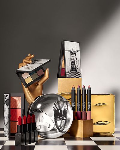
4. NARS Surreal Collection Display (Makeup Collection)
Platform: Instagram, Pinterest | Ratio: 4:5 | Hook type: Surreal luxury still life
Lipsticks, a palette, and pencils are staged on a black-and-white checkered platform, with a golden hand prop and deep red accents turning the arrangement into a theatrical stage rather than a flat product shot. The brand name anchors the bottom of the frame.
Winning ingredients:
- An unexpected prop (the golden hand) creates a memorable visual hook a standard flat-lay can't match
- Staging products at different heights on a checkered platform adds depth instead of a flat grid
- Gold, black, and deep red stay restricted to three tones, keeping a busy arrangement from feeling cluttered
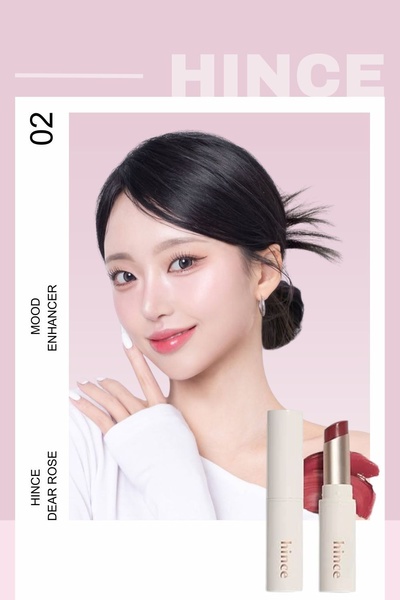
5. Hince Tonal Portrait and Product Hero (Lipstick)
Platform: Instagram, Pinterest | Ratio: 2:3 | Hook type: Monochromatic portrait-to-product pairing
A model's portrait in a rose-pink lip tone sits stacked above a product shot and color swatch in the exact same shade, with the entire frame kept in one soft, muted palette. The repetition of one color across portrait, product, and swatch is the whole message.
Winning ingredients:
- Matching the portrait, product, and swatch to one tone turns color-matching into the ad's entire argument
- Stacking the portrait above the product guides the eye top to bottom in a single, obvious path
- A monochromatic palette reduces cognitive load, so the shade itself is what gets remembered
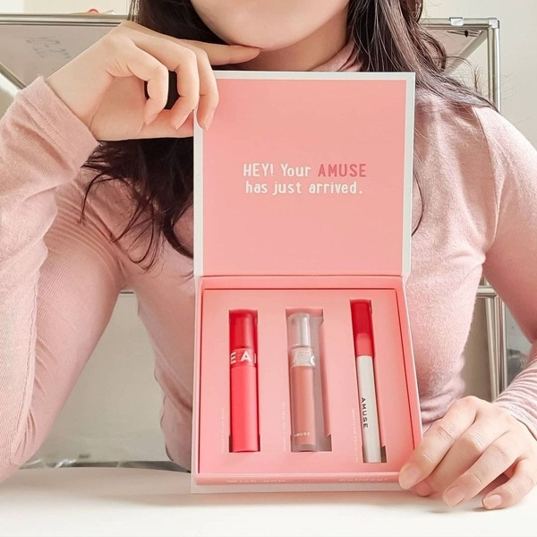
6. AMUSE Gift Box Unboxing Reveal (Lip Set)
Platform: Instagram Feed, Facebook Feed | Ratio: 1:1 | Hook type: First-person unboxing reveal
A top-down shot shows a hand lifting the lid off a pink-branded box to reveal three lipsticks nestled inside, shot in the same point-of-view framing as a real unboxing video. A short, welcoming headline greets the viewer as if they just received the gift themselves.
Winning ingredients:
- A top-down, point-of-view angle puts the viewer in the position of the person opening the box
- Showing the product in its actual retail packaging, not a staged flat-lay, feels authentic rather than overly polished
- A welcoming, second-person headline turns a product shot into a personal gifting moment
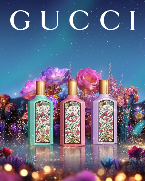
7. Gucci Flora Floral Dreamscape (Perfume)
Platform: Instagram, Pinterest | Ratio: 4:5 | Hook type: Surreal atmospheric brand world
Three perfume bottles sit centered among oversized, glowing flowers under a starlit, aurora-toned sky, with teal, pink, and lavender lighting replacing any plain studio background. No claim or feature text competes with the scene.
Winning ingredients:
- Centering three bottles in a single frame doubles as a range shot without needing three separate ads
- A surreal, lit-from-within floral set builds an emotional brand world instead of stating a scent note
- Zero claim text lets the atmosphere alone carry the luxury positioning
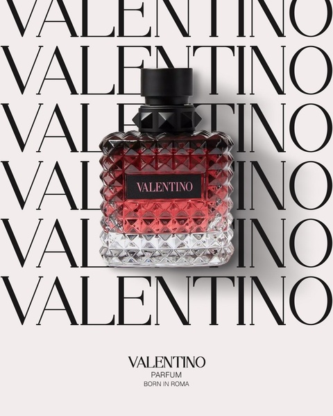
8. Valentino Repeating Wordmark Hero (Perfume)
Platform: Instagram, Facebook | Ratio: 4:5 | Hook type: Repeating logo pattern
The brand name repeats as an oversized background texture behind a single, illuminated bottle centered in the frame, in a restrained black, white, and red palette. The repetition itself functions as the backdrop instead of a plain studio set.
Winning ingredients:
- A repeating wordmark turns brand recognition into the background texture, not an afterthought logo
- Centering the bottle against a busy pattern still keeps it the clear focal point through contrast and lighting
- A three-color palette keeps a typographically dense background from feeling cluttered
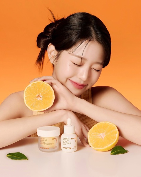
9. Innisfree Citrus Ingredient Hero (Skincare)
Platform: Instagram Feed, Facebook Feed | Ratio: 4:5 | Hook type: Ingredient-led visual proof
A serum and cream are framed by halved oranges against a matching orange backdrop, visually tying the Vitamin C brightening claim to a real, recognizable ingredient. The monochromatic orange styling keeps packaging and prop in one cohesive color story.
Winning ingredients:
- Real halved fruit next to the product proves the ingredient claim before a single word is read
- Matching the backdrop color to the ingredient keeps the whole frame visually cohesive
- A clean, centered composition leaves no doubt about which two products are being sold
10. Medik8 Clinical Anti-Wrinkle Duo (Serum)
Platform: Instagram Feed, Facebook Feed | Ratio: 1:1 | Hook type: Clinical problem-solution pairing
A serum and a cream are shot side by side in stark black and white, framed as a two-step routine rather than two separate purchases. A headline names the specific problem, deep-set wrinkles, that the pairing is built to solve.

Winning ingredients:
- Pairing two products together implies a complete regimen instead of a single, isolated purchase
- A black-and-white palette signals clinical, evidence-based positioning over a soft beauty aesthetic
- Naming the exact problem in the headline, not a vague anti-aging claim, sets a specific expectation
11. Lavera Glow Application Demonstration (Serum)
Platform: Instagram, Facebook | Ratio: 1:1 | Hook type: Live application demonstration
A close, bright shot shows a model applying the serum directly to her face, with the full product lineup arranged beside her and a benefit-led tagline overhead. Warm orange and cream tones tie the application shot to the product range next to it.

Winning ingredients:
- Showing the actual application moment builds more trust than a product-only shot
- Placing the full lineup beside the model reinforces a complete routine, not a single item
- A warm, consistent color palette links the human moment and the product shot into one scene
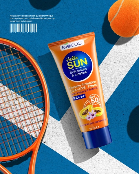
12. Biocos Sport-Context Flat Lay (Sunscreen)
Platform: Instagram Feed, Facebook Feed | Ratio: 4:5 | Hook type: Contextual lifestyle association
The tube is shot top-down on a tennis court, framed by a racket and a tennis ball, so the product is introduced inside an actual active-lifestyle moment instead of a sterile studio background. Bold orange packaging against the blue court creates instant contrast.
Winning ingredients:
- Styling the product inside a real activity context (a tennis court) answers "when do I use this" visually
- High-contrast orange-on-blue makes the tube the obvious focal point of a flat lay
- Familiar sports props (racket, ball) require no caption to explain the use case
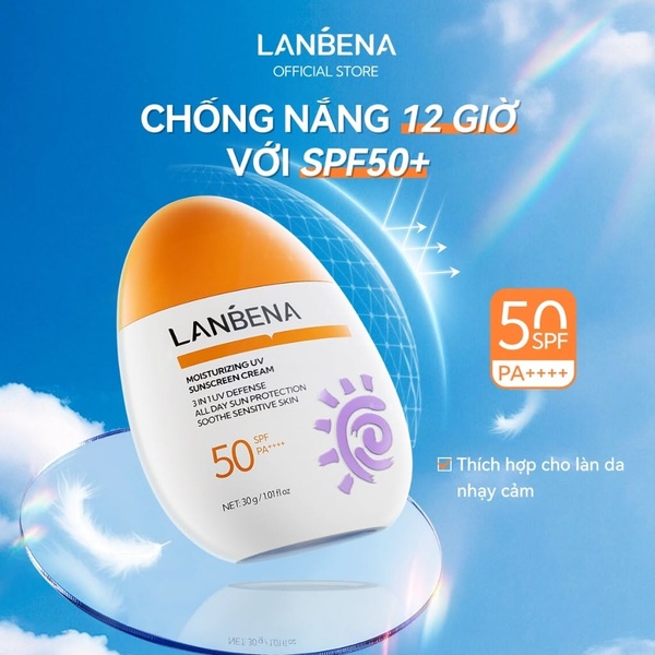
13. Lanbena 12-Hour Protection Hero (Sunscreen)
Platform: Facebook, Instagram | Ratio: 1:1 | Hook type: Direct benefit headline
A single bottle is centered against a bright blue sky backdrop, with a bold "12-hour protection" headline stating the exact benefit before any other copy. The blue-white-orange palette keeps the shot feeling fresh and outdoor rather than clinical.
Winning ingredients:
- Leading with a specific, timed claim (12 hours) is more concrete than a generic "long-lasting" promise
- A bright blue sky background does double duty as both color contrast and an outdoor-use cue
- Centering a single bottle keeps a benefit-led headline from competing with a crowded product shot
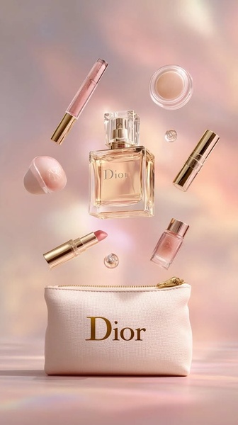
14. Dior Floating Cosmetic Collection (Cosmetic Collection)
Platform: Instagram Stories, Pinterest | Ratio: 9:16 | Hook type: Weightless ethereal brand float
A fragrance bottle, a lipstick, and several beauty essentials appear to float, weightless, against a soft pink-and-cream gradient, with gold packaging accents the only warm note in an otherwise airy frame. The vertical frame gives each floating item its own breathing room.
Winning ingredients:
- A floating, weightless styling signals premium quality through a feeling, not a stated claim
- Soft pink and cream keep an otherwise busy, multi-product shot from feeling crowded
- The 9:16 frame gives a full-screen, immersive feel suited to Stories and Pinterest browsing
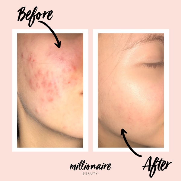
15. Before & After Skincare Split Proof (Skincare Treatment)
Platform: Instagram, Facebook | Ratio: 1:1 | Hook type: Clinical before & after evidence
A side-by-side split shows visibly clearer skin texture after treatment, with simple hand-drawn-style arrows pointing to the specific areas that changed. A soft pink-and-white palette keeps an evidence-led format from feeling overly clinical.
Winning ingredients:
- A direct split-screen format removes any need for the viewer to imagine the result themselves
- Hand-drawn-style arrows point to specific, localized changes instead of a vague "better skin" claim
- Identical lighting and angle in both photos keep the comparison credible rather than staged
How to apply these AI ad creative examples to your own beauty brand
The layouts above share a structure, not a product. A tonal portrait-to-product pairing, an ingredient-matched backdrop, or a before-and-after split works the same way whether you sell mascara, serum, or perfume, as long as you match the visual language to what you're actually selling and can actually prove.
If you want to browse more real beauty campaigns before building your own, Promer AI's ai ad creative for beauty brands library groups them by category, hook type, and platform so you can shortlist the structures closest to your product.
Promer AI, an AI ad maker, turns any of these structures into your own ad, starting from the product instead of a blank canvas. Six features cover the workflow end to end, depending on where you're starting from.
AI Ad Concept: Several finished concepts from one product
Promer AI's AI Ad Concept reads your product into four editable fields, highlights, ideal customer, pain point, and need, then generates several concepts in one run.
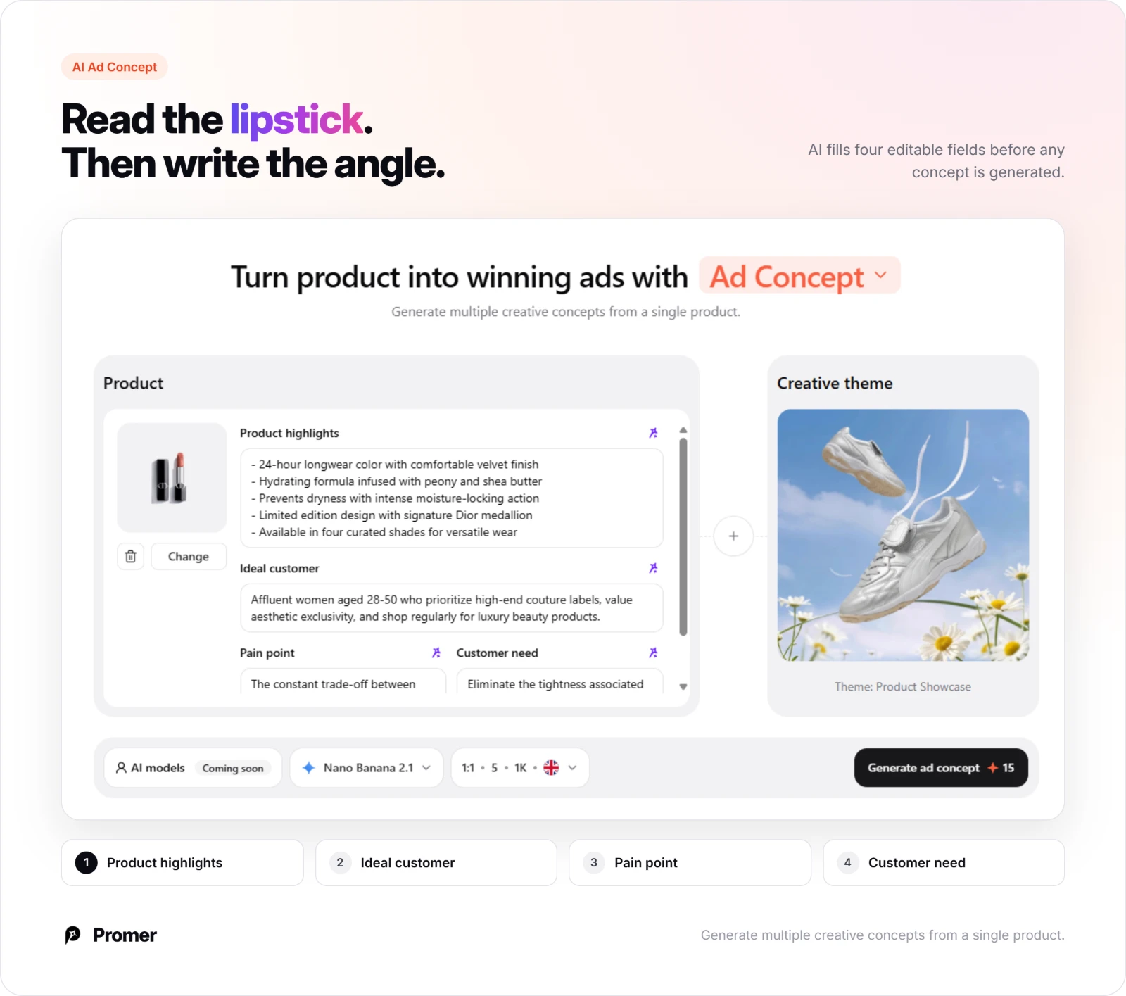
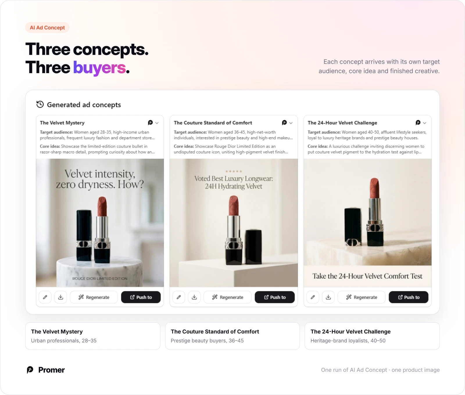
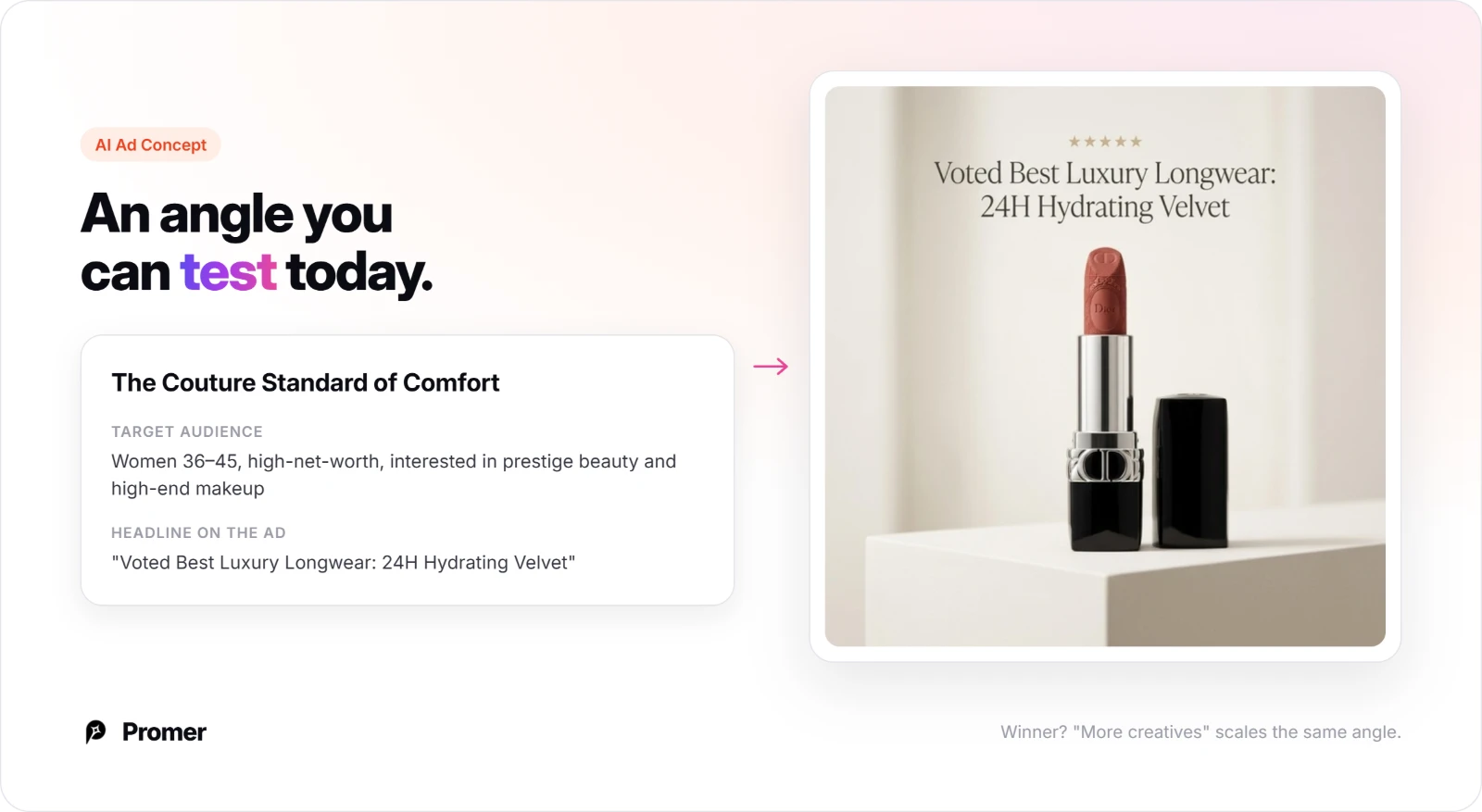
Each concept arrives with its own target audience and core idea, so a skincare brand can compare an ingredient-led angle against a lifestyle angle side by side instead of three colors of the same bottle.
When one concept wins, "More creatives" scales that same angle into new executions without starting the analysis over.
AI Ad Prompt: Functional, emotional, and symbolic angles from one photo
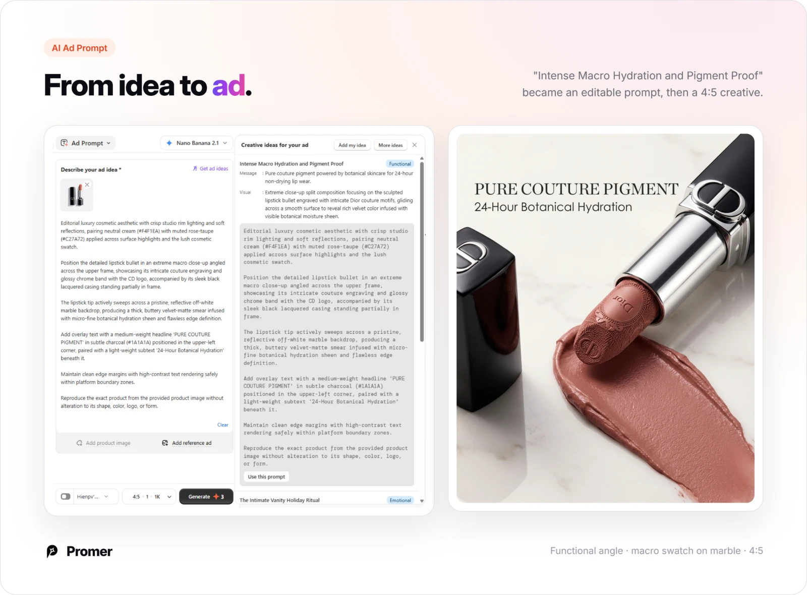
Promer AI's AI Ad Prompt takes a single product photo and returns ideas tagged Functional, Emotional, or Symbolic, so you can test an ingredient claim against a desire-led angle instead of five versions of the same pitch.
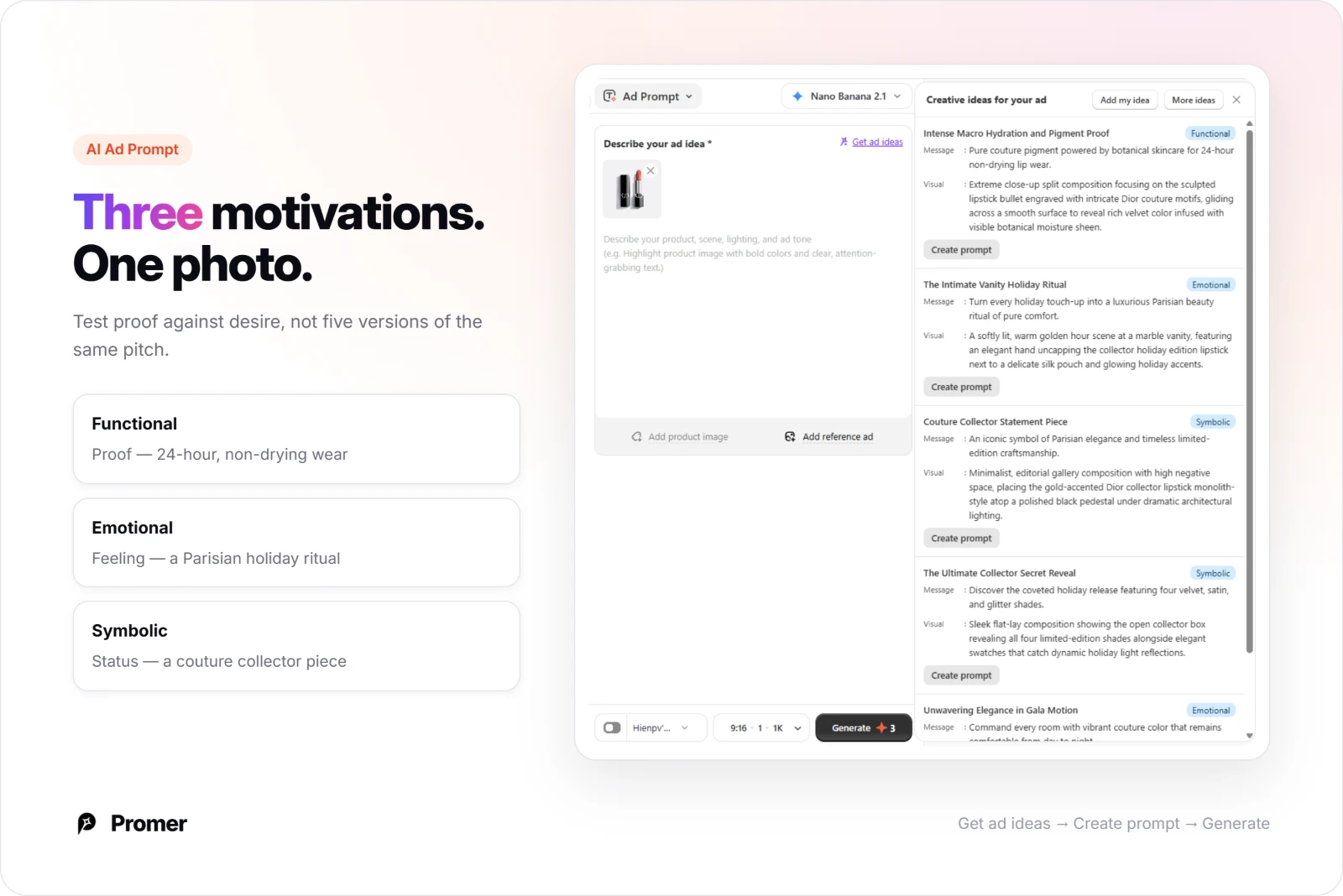
"Create prompt" turns any of those ideas into a detailed, editable prompt before you generate the finished ad.
AI UGC Ads: Angle, hook, and format for video
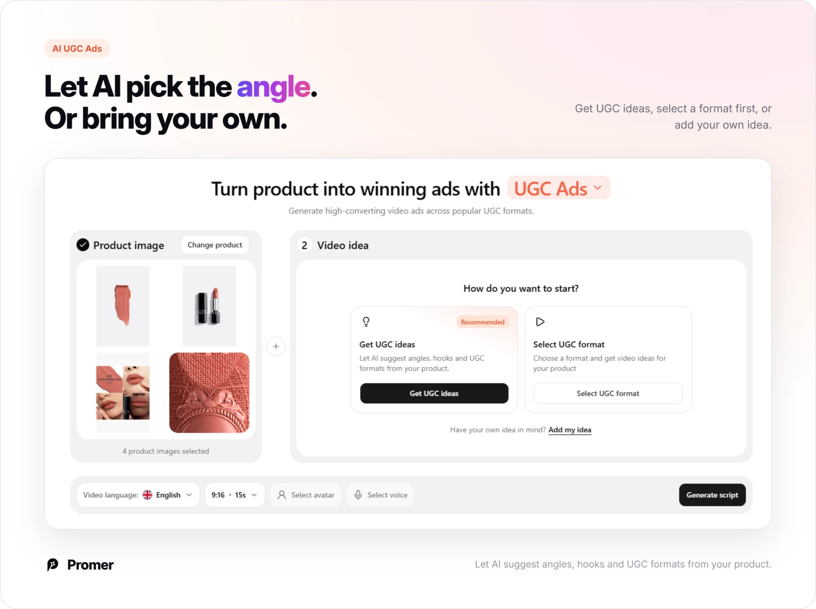
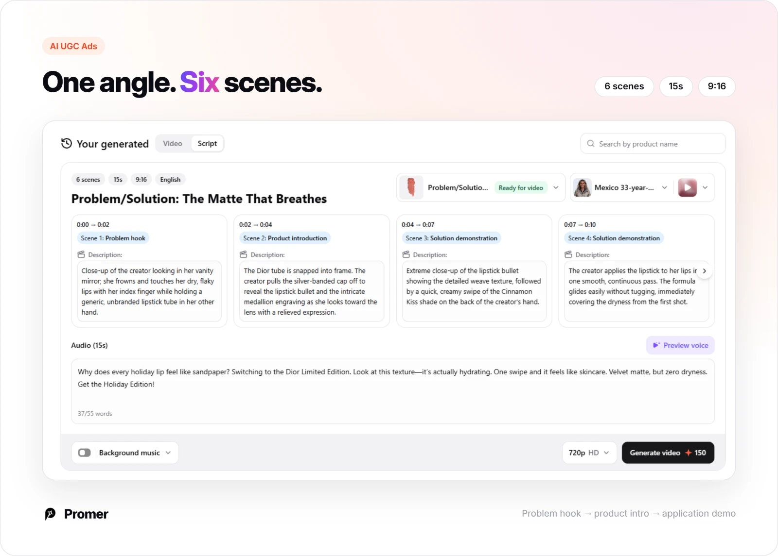
AI UGC Ads suggests an angle, a hook, and a matching UGC format straight from your product image, or you can bring your own idea instead.
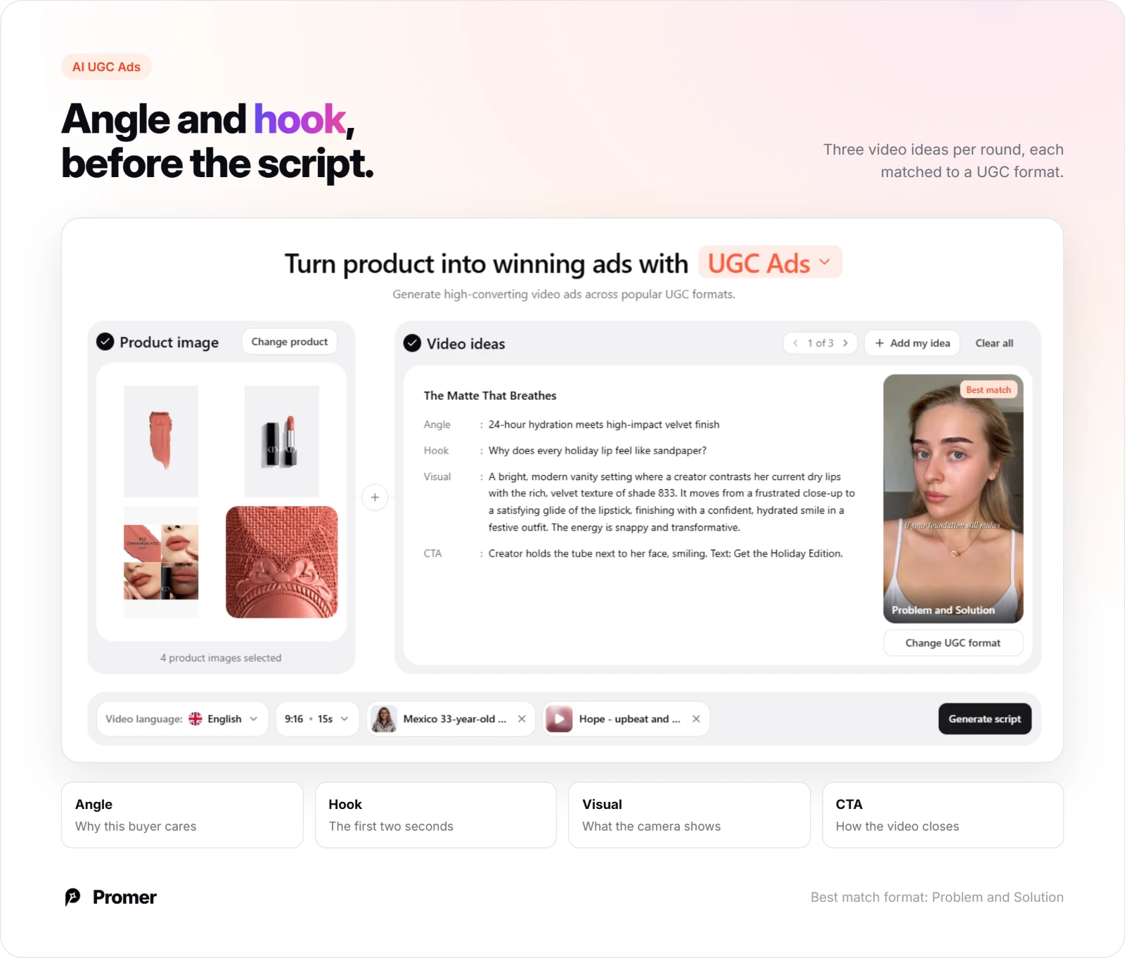
Each video idea comes with a named angle, a hook, a visual description, and a CTA, a strong fit for an application-demonstration ad like the Lavera example above. "Generate script" then turns that idea into a scene-by-scene script, each scene timestamped with its own visual and voiceover line.
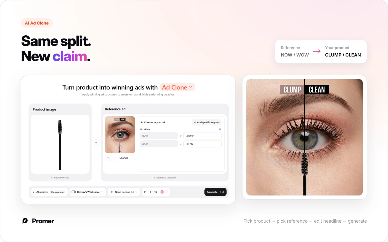
Promer AI's AI Ad Clone is the fastest route to copy one of the 15 structures above exactly: pick your product, select the reference ad you want to recreate, and the AI suggests a headline, body text, and CTA you can edit individually before generating.
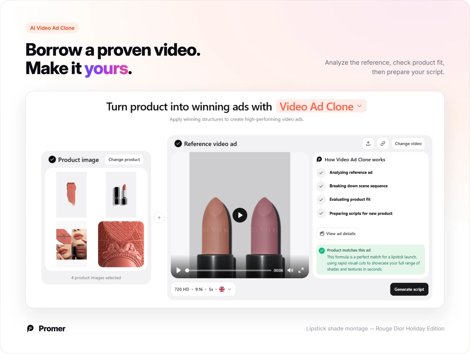
AI Video Ad Clone: Borrow a proven video structure
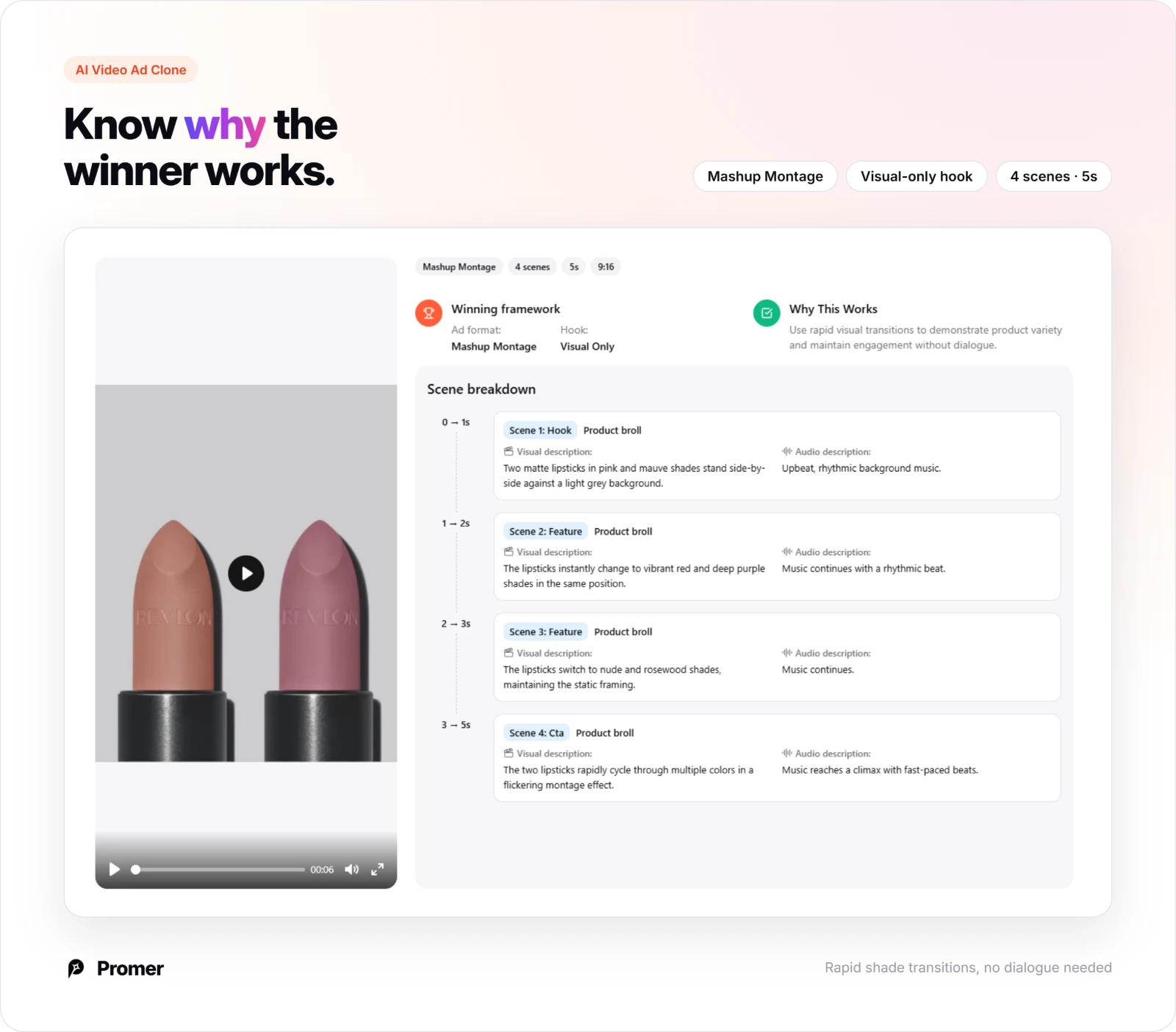
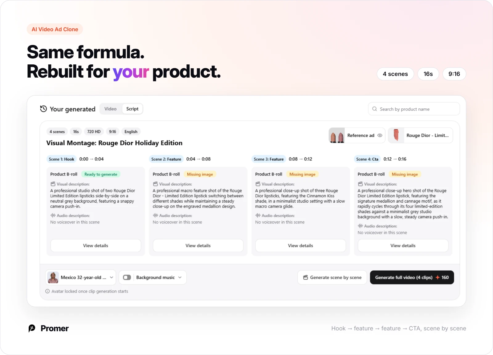
AI Video Ad Clone analyzes a reference video, breaks down its scene sequence, and checks whether your product actually fits that structure before committing to a script. It explains why the framework works, then rebuilds it as a timestamped scene breakdown for your product.
Promer AI's AI Photoshoot is the better starting point if you only have a plain product photo: it places your tube, bottle, or compact into a lit, on-brand background, the same clean staging used in the hero shots above, without booking a studio.
AI Ad Animation: Move a winning static into motion
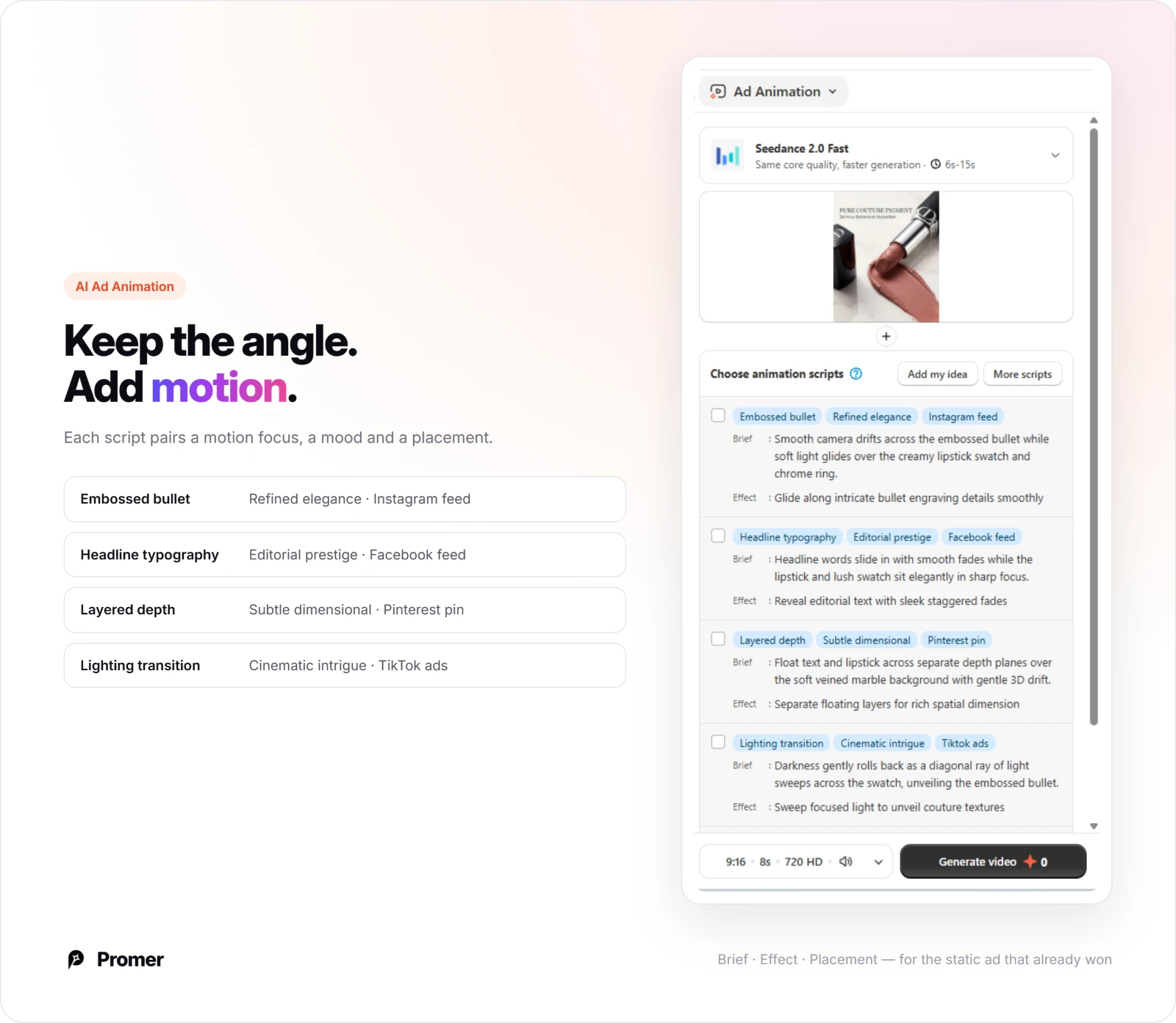
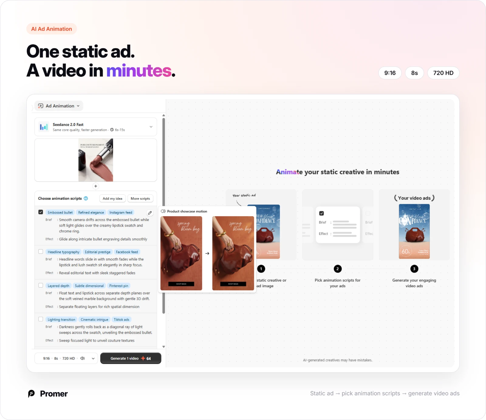
Once a static angle wins, AI Ad Animation suggests animation scripts with a brief, an effect, and placement tags, so you can take that same angle into Instagram, TikTok, Facebook, or YouTube without reshooting.
Review every generated creative before it runs. AI-generated ads can have mistakes, and for beauty specifically, double-check that any ingredient claim, before-and-after result, or shade name shown in the creative matches what's actually accurate for your product.
Common mistakes beauty brands make with AI ad creative
Building an aesthetic brand world with no product clarity. A surreal, luxury-styled set can look stunning and still fail if a viewer can't immediately tell what's actually for sale.
Making an ingredient claim with no visual prop to back it. Naming an ingredient in the headline without showing it, a citrus half, a botanical, wastes the one visual that would make the claim concrete.
Showing before and after with inconsistent lighting or angle. Even a small mismatch between the two photos makes a real result look staged, undercutting the exact credibility the format is meant to build.
Overloading one flat lay with too many products and no color discipline. A collection shot with five clashing packaging colors and no shared palette reads as cluttered instead of curated.
Using the same aspect ratio across every platform. A 1:1 square built for a Facebook feed gets letterboxed on Stories and Pinterest, where a 9:16 or 4:5 crop fills more of the screen.
FAQs about AI ad creative for beauty brands
These are the questions beauty marketers ask most before building their own AI-generated ad creative.
What makes good AI ad creative for beauty brands?
Good AI ad creative for beauty brands gives the viewer exactly one reason to stop scrolling, either the product as a desire object or a specific piece of proof, not both competing in the same frame. The examples above split between cosmetics and fragrance ads built on an aesthetic hook, and skincare, serum, and sunscreen ads built on an ingredient or result. Picking one direction and matching the visual style to what you're actually selling typically outperforms a layout that tries to do everything.
Which aspect ratio works best for beauty ad creative?
There's no single best ratio, it depends on where the ad runs. Vertical ratios like 9:16, 4:5, and 2:3 dominate the examples above because they fill more of a mobile feed, Stories, or Pinterest screen, while 1:1 still carries most of the direct, benefit-led and before-and-after layouts well. Testing your creative in the ratio native to its placement usually performs better than resizing one master file for every platform.
Does cosmetics advertising need to look different from skincare advertising?
Yes. Skincare and sunscreen sell a result, so the strongest creative relies on evidence, an ingredient, a before-and-after, a clinical pairing. Cosmetics and fragrance sell the immediate effect and the product as an object of desire, so the strongest creative relies on the visual alone, the color, the finish, the staging. Using a proof-led structure for a fragrance, or a pure-desire structure for a treatment serum, usually undersells the product.
Do beauty and skincare ads need to follow specific claim rules?
Generally yes, claims about ingredients, results, or skin outcomes typically need to be substantiated, and requirements vary by platform and market. This isn't legal advice, confirm your current claim and labeling obligations before running an ad built around a specific before-and-after result or ingredient claim.
Do I need professional product photography to create ads like these?
No. Several of the examples above, including the ingredient-hero and benefit-led shots, rely on clean, evenly lit product photography rather than a complex set build. Promer AI's AI Photoshoot places a product into a lit, on-brand background, which typically removes the need for a separate studio session.
How many ad variations should a beauty brand test?
Testing at least 2-3 structurally different variations, not just color or copy tweaks, usually surfaces a clearer winner. Covering different hooks, a desire-led aesthetic version, a proof-led ingredient or before-and-after version, and a direct benefit version, gives a more useful read than testing five versions of the same layout. Results will vary by audience and price point, so treat this as a starting test set, not a fixed rule.
Summary
The 15 examples of ai ad creative for beauty brands above all follow the same underlying discipline: one clear hook, matched to whether the product sells on desire or on proof, instead of one generic shot reused for every purpose.
Pick the structure closest to what you're selling, choose the Promer AI tool that matches where you're starting from, a reference ad, a blank idea, or a product photo that needs a studio-quality background, and swap in your own brand colors and copy.