24 Black Friday Ad Examples to Steal for Your 2026 Campaign
Category
Blogs
Date
Authored by
NaNa Phan
Summary
24 real Black Friday ad examples broken down by layout, hook, and platform - plus how to recreate the structure for your 2026 campaign.
Every ecommerce brand runs the same Black Friday ad feed: A discount percentage, a product shot, and a countdown clock. These 24 black friday ad examples break down which specific layout, color, and hook choices separate a scroll-stopping sale creative from a generic one.
The Black Friday ads that convert most are built around one clear visual path from hook to offer to product, not the size of the discount. A 50% off headline buried under three fonts and a busy background does less work than a 30% off headline on a clean background.
This article covers 24 real Black Friday creatives across fashion, accessories, electronics, beauty, pet, baby, jewelry, and photography gear, with the platform, ratio, and specific layout choice that makes each one work. At the end, you'll find how to adapt any of these structures to your own product without starting from a blank canvas.
Key takeaways
Direct-offer headlines (a specific discount %, stated plainly) outperform vague seasonal copy across nearly all 24 examples.
High-contrast color blocking - a solid background plus one accent color - does more to stop the scroll than busy or textured backgrounds.
9:16 vertical dominates Stories, TikTok, and Reels placements; 1:1 square still holds up well for Instagram and Facebook feed.
Lifestyle imagery works best for emotionally-driven categories (baby gear, pets, apparel); clean studio or flat lay shots work best for price-driven categories (accessories, electronics, beauty).
A specific sale date or window reads as more urgent than the words "Black Friday" alone.
What makes a Black Friday ad work?
Most Black Friday ads fail the same way: They try to say too much in one frame. The highest-performing examples below all isolate a single hook (a product, a discount, or a feeling) and build the rest of the layout around making that one thing unmissable.
The second pattern is ratio discipline. An ad built for a 9:16 Story placement and then reused as a 1:1 feed post almost always loses legibility, because the text hierarchy was designed for a different amount of space. Each example below lists its actual ratio for this reason.
Promer AI's breakdown of what makes a winning ad covers this same single-hook principle in more depth, if you want the underlying framework beyond Black Friday specifically.
Black Friday ad examples: What 24 real campaigns got right?
Each one below lists its platform, ratio, and hook type first, so you can match the layout to your own product before you look at the image. A "Try AI Ad Clone" button sits under every creative if you want to jump straight into recreating it.
Platform: Instagram, Facebook | Ratio: 1:1 | Hook type: Direct value offer
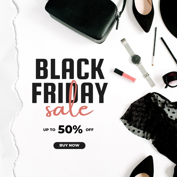
A handbag, watch, and shoes are arranged in a clean flat lay against a white background, with a single peach-colored "50% off" callout centered in the frame. The high-contrast black-and-white base lets that one colored headline do all the work.
Black-and-white base palette with one accent color reserved only for the offer
Spaced-out flat lay so no single product crowds another
Offer text centered, not tucked into a corner
To recreate this exact layout with your own products, you'd clone the structure with AI Ad Clone and swap in your own catalog images - more on that at the end of this article.
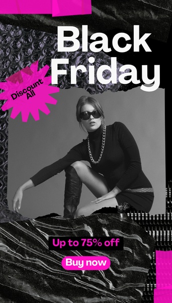
Torn-paper and bubble-wrap textures layer over a black-and-white editorial portrait, with a single magenta accent carrying the discount and the CTA. The texture adds grit without competing with the sale message.
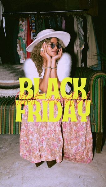
Bold yellow "Black Friday" type sits over a film-style, retro-toned portrait of a model in a floral dress, set against a dark background. Instead of leading with the discount, this one leads with a mood, then confirms the sale.
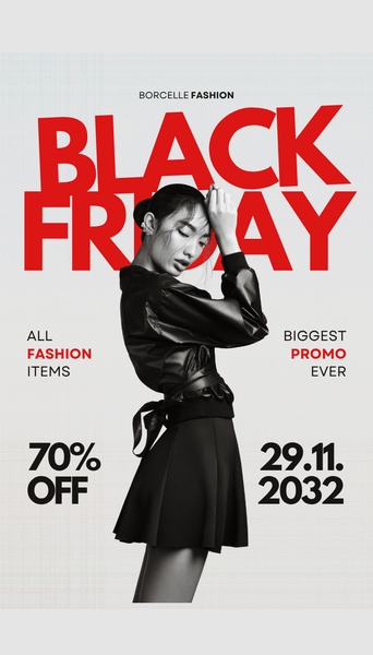
Massive red "Black Friday" type takes up nearly a third of the frame, sitting in front of a grayscale, studio-lit model shot. The oversized text, not the product, is what a viewer reads first in a fast scroll.
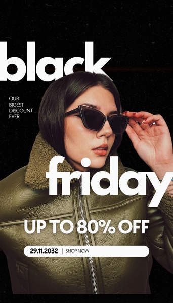
One aggressive claim, "up to 80% off," runs in massive white type over a model wearing sunglasses. Nothing else competes for attention: Just the product and one number.
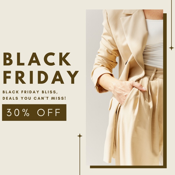
Beige and dark brown tones dominate a close-cropped editorial shot of a blazer, with a simple "30% off" callout in a solid color block. The discount is isolated so it never dilutes the premium feel of the photography.
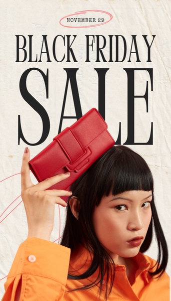
A model holds a red wallet at eye level while bold type announces the sale behind her, with a specific date circled near the bottom. The product is the foreground anchor; the date is the urgency anchor.
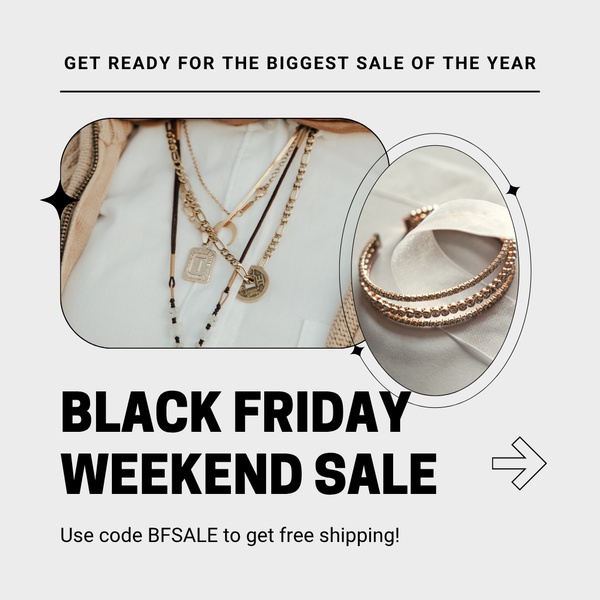
Two circular product crops of layered necklaces and bracelets sit above a bold black-on-white headline and a free-shipping promo code. The dual-circle framing shows product detail without needing a second ad variation.
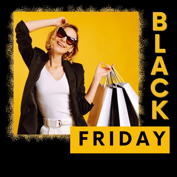
Shopping bags and a saturated yellow background create an energetic, hard-to-scroll-past block of color, with vertical black type running alongside the model instead of over the product.
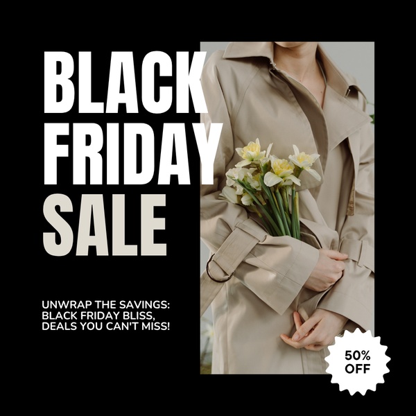
One half of the frame goes deep black to carry the sale announcement, while the other half shows a trench coat styled with seasonal flowers. The split keeps the discount and the lifestyle moment from fighting for space.
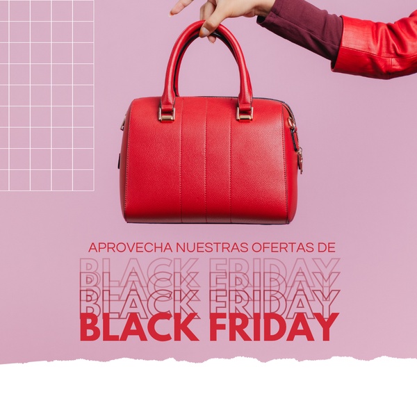
A hand holds a red handbag against a soft purple background, with "Black Friday" repeated in layered, stacked type behind the product. The repetition creates depth instead of a single flat headline.
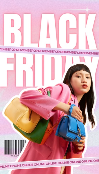
Oversized typography spelling out the sale event sits over a gradient, color-blocked background that echoes the colorful handbags in the shot. The product colors and the background colors are matched on purpose.
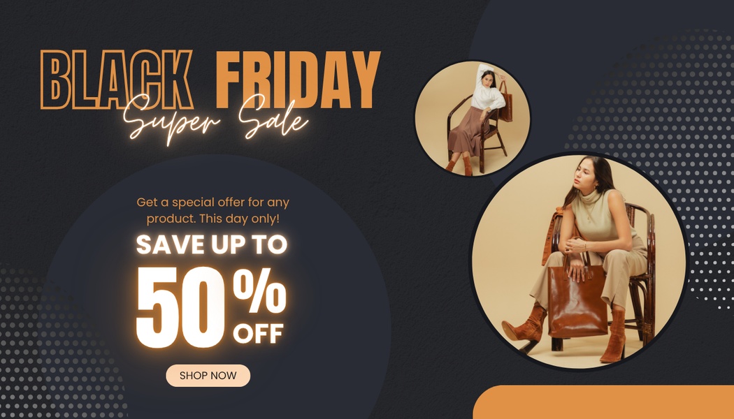
Against a black background, a premium leather handbag pairs with a single neon-orange "50% off" claim, the only accent color in the frame. The horizontal ratio gives the text and product their own separate zones.
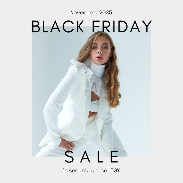
A bright, high-key white background keeps full attention on a model in a white blazer suit, with thin sans-serif type announcing a 50% discount. The brightness itself does the work a busy background usually tries to do.
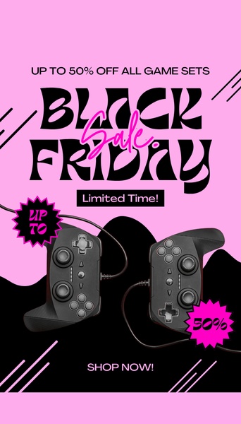
Sharp contrast comes from a bright pink background against black, framing a game controller under two stacked callouts: "Limited Time" and "Up to 50% Off," kept as separate urgency anchors instead of one combined line.
Two separate urgency callouts (time limit + discount %) instead of one blended claim
High-contrast pink-on-black palette suited to a younger, fast-scrolling audience
Product shot kept minimal so the callouts stay the clear focal point
16. Split-Grid Beauty Offer (Health & Beauty)
Platform: Instagram, Facebook | Ratio: 1:1 | Hook type: Direct value proposition
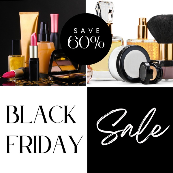
A black-white-gold grid separates the discount percentage (top half) from the product photography (bottom half), so the offer and the product never have to share the same visual space.
A literal grid split between "the offer" and "the product" sections
Gold accent reserved for product packaging to keep a premium read
Discount placed inside a solid circle so it reads as a badge, not body copy
17. Directional-Hook Minimalist Sale (Dress)
Platform: Instagram, Facebook | Ratio: 1:1 | Hook type: Direct value proposition
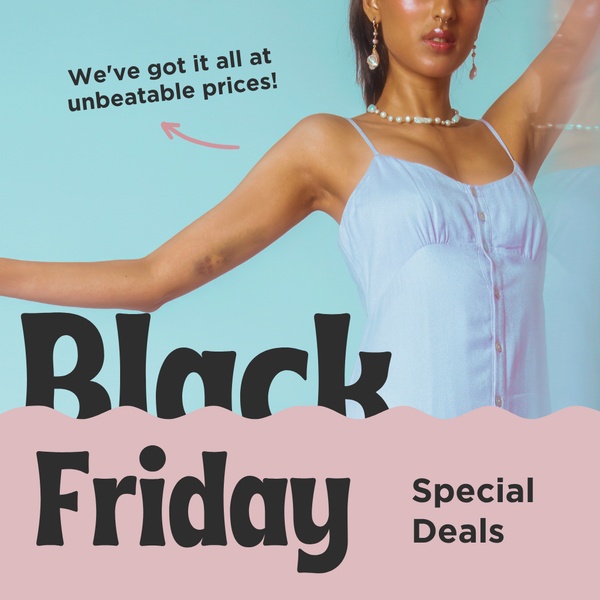
A small arrow graphic points from a price callout directly to a summer dress, shot in a soft light-blue and pink studio setup. The arrow does the connecting work instead of extra copy.
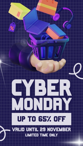
A 3D-rendered hand holds a basket of digital goods against a dark blue and purple gradient, with "Up to 65% off" as the only text on screen. The render itself is the hook, not the discount text.
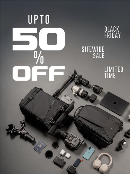
Camera gear is arranged top-down in an organized grey-and-black flat lay, with bold white type stating the discount against the darkest part of the frame. The organization itself signals "professional-grade" before a viewer even reads the offer.
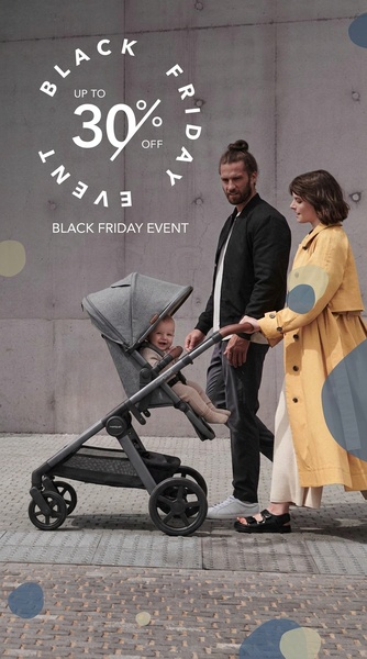
Parents push a stroller in a candid, natural-light shot, with a small, clean circular Black Friday badge instead of a large headline. For a high-trust purchase like baby gear, the emotional scene leads and the discount stays secondary.
A cat peeks through torn blue paper to reveal gift-wrapped treats, with the exact sale window (specific start and end dates) stated instead of just "Black Friday." The torn-paper frame itself creates the scroll-stopping moment.
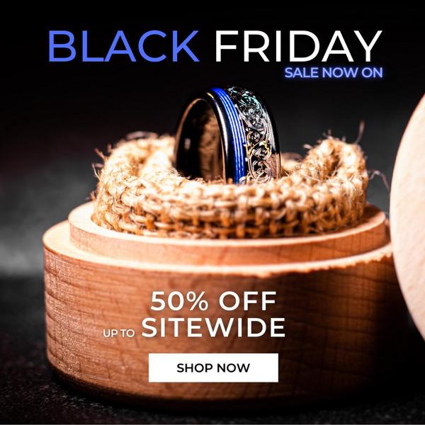
A ring sits in a rustic wooden box against a dark background, shot with a shallow depth of field that keeps the texture and material detail sharp while the background falls away. A centered 50% off claim is the only text competing with the product.
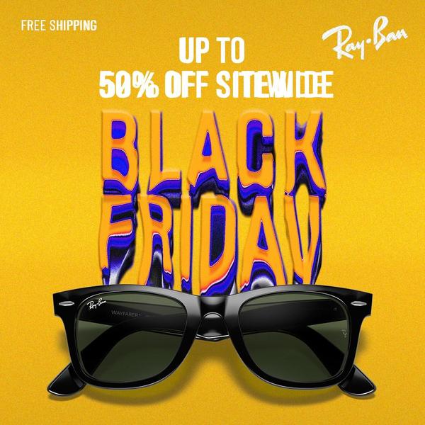
Sitewide "Up to 50% Off" messaging gets anchored by a bold yellow background, with the sunglasses placed at the base of the frame rather than the center. The product acts as a grounding element under an otherwise abstract sale message.
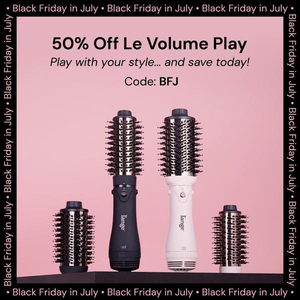
Soft pink frames a hair volumizer tool, paired with a value-first headline and a short, easy-to-remember discount code placed clearly below it. The code itself is treated as a design element, not a footnote.
A value-first headline that leads with the discount, not the brand
A short, capitalized discount code sized to be easily readable
A minimalist studio background that keeps both the product and the code legible
How to apply these Black Friday ad examples to your own ads?
The layouts above share a structure, not a brand. A flat lay, a color-block headline, or a peek-a-boo reveal works the same way regardless of whether you sell handbags or dog treats, as long as you keep the single-hook discipline each example uses.
If you want to browse more real campaigns like these before building your own, Promer AI's black friday ad examples library groups them by category, hook type, and platform so you can shortlist the structures closest to your product.
Promer AI, an AI ad generator, turns any of these structures into your own ad with two tools, depending on whether you want to start from a specific reference or from a blank scene.
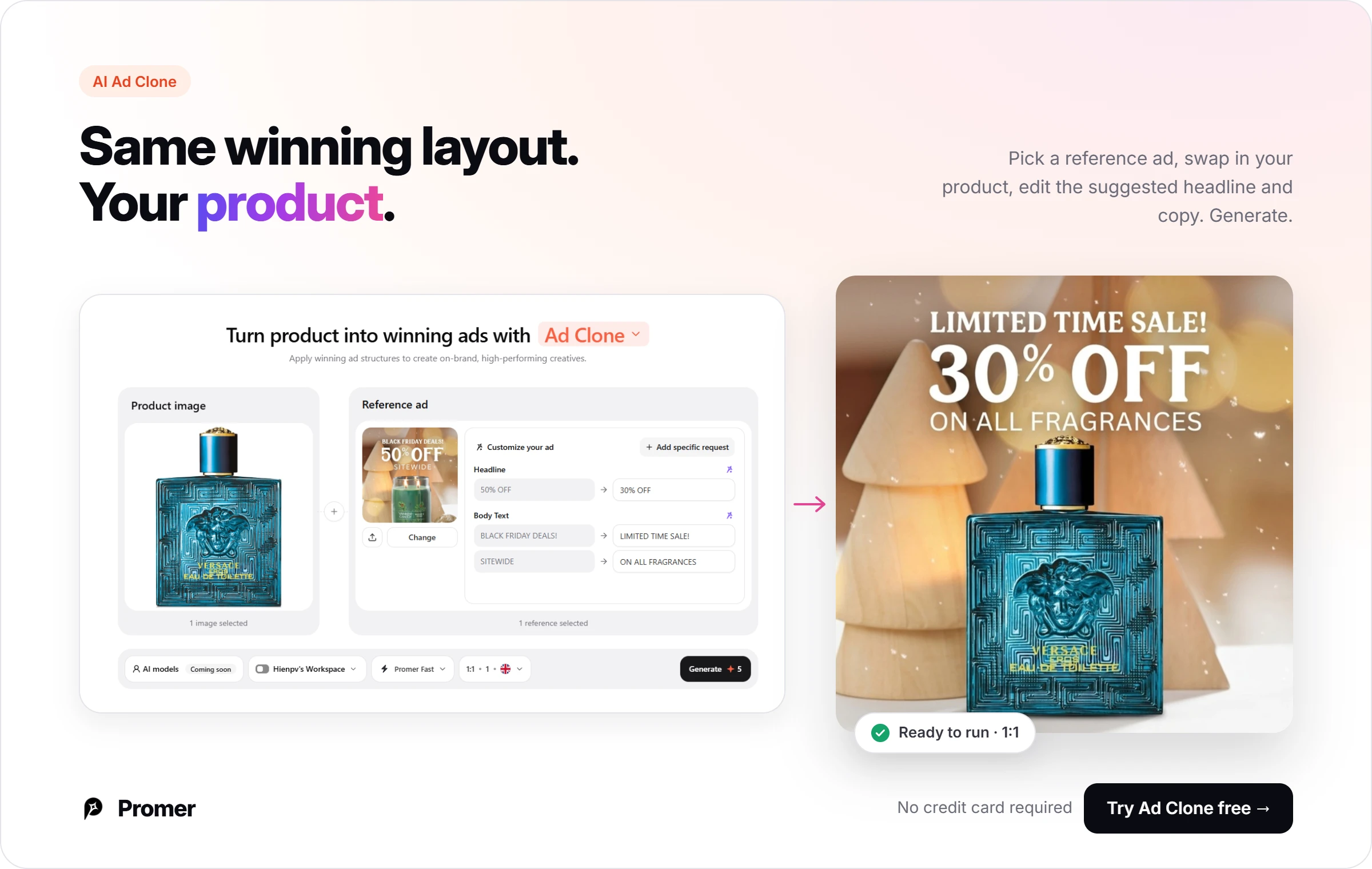
Promer AI's AI Ad Clone is the fastest route to copy one of the 24 structures above exactly: Pick your product, select the reference ad you want to recreate, and the AI suggests a headline, body text, and CTA you can edit individually before generating.
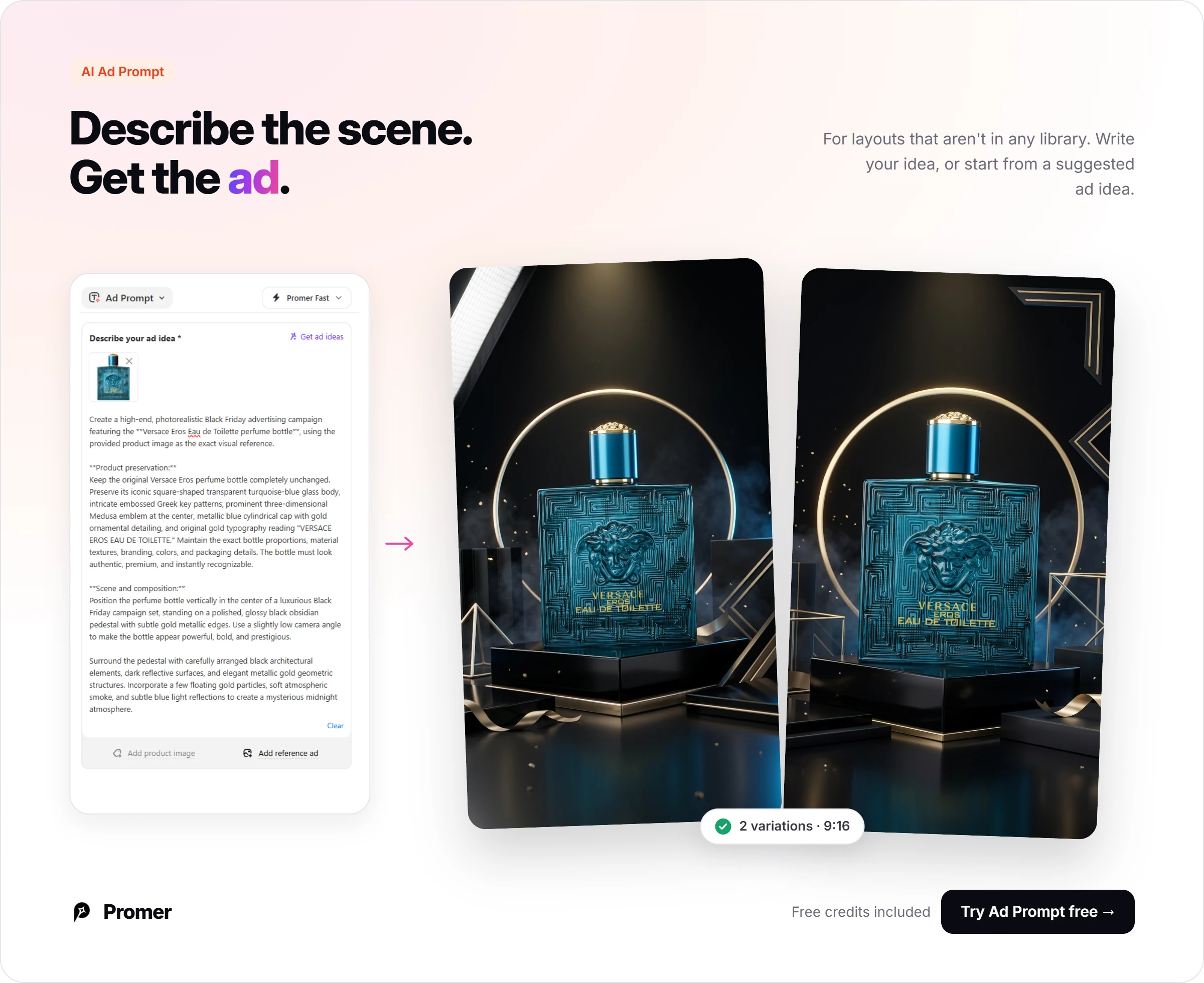
For a layout that isn't an exact match to one of these 24, Promer AI's AI Ad Prompt lets you describe the scene and message directly, or turn one of its suggested ad ideas into a ready-to-use prompt, with a product image and a reference ad as optional inputs.
Review every generated creative before it runs. AI-generated ads can have mistakes, and for Black Friday specifically, double-check that any discount percentage or sale date shown in the creative matches what's actually live on your site.
Common mistakes brands make with Black Friday ads
Using the same ratio across every platform. A 1:1 square built for Facebook feed gets letterboxed on Stories and TikTok, where a 9:16 crop fills the whole screen and performs better.
Crowding a flat lay with every SKU in the catalog. The flat lay examples above work because one or two hero products get space to breathe, not because the frame is packed.
Burying the discount number inside a paragraph. In nearly every example here, the discount is the largest or most isolated element on screen, not a line buried in supporting copy.
Writing "Black Friday" without a specific window. A stated start and end date, like the cat treats example above, creates more urgency than the event name alone.
Copying a competitor's exact visual instead of its structure. Recreating the layout logic (contrast, hierarchy, hook placement) and applying your own brand colors and product typically performs better than a one-to-one visual copy.
FAQs about Black Friday ad examples
These are the questions ecommerce teams ask most before building their own Black Friday creative from the examples above.
What's the best ad format for Black Friday, static or video
Static images can still convert well for Black Friday when the hook and offer are clear, as shown in most examples above. Video tends to help more for storytelling-heavy categories, but for a fast-scanning, deal-hunting audience, a sharp static hook is often faster to produce and test at volume. If you want to test both from the same creative, Promer AI's AI Ad Animation turns any static ad into an 8-second video version.
What aspect ratio should I use for Black Friday ads
Use 9:16 for Stories, TikTok, and Reels placements, and 1:1 or 4:5 for Instagram and Facebook feed. Matching the ratio to the placement, rather than reusing one size everywhere, typically keeps your headline and product from getting cropped or shrunk.
Do all Black Friday ads need to use red or black
No. Black and high-contrast palettes are common because they read as urgent and premium, but the examples above also use yellow, pink, purple, and magenta accents effectively. The key is contrast between the background and the offer text, not a specific required color.
How many Black Friday ad variations should a brand have ready
Most ecommerce teams benefit from testing at least 3-5 creative variations per core offer, covering different hooks (flat lay, lifestyle, bold typography) instead of just different colors of the same layout. Testing structurally different approaches, like the 24 examples above, usually surfaces a clearer winner than testing minor color tweaks.
Does a Black Friday ad need a lifestyle shot, or is a plain product shot enough
It depends on the category. Emotionally-driven purchases like baby gear, pets, or apparel typically benefit from a lifestyle or human element, while price-sensitive categories like electronics or accessories often perform fine with a clean studio or flat lay shot.
How early should ecommerce brands start testing Black Friday creative
Most performance marketers start testing creative structures 4-6 weeks before Black Friday, so there's time to identify which hook and layout is working before the highest-spend week of the sale. Testing structure early and swapping only copy or offers closer to the date keeps production light during the busiest week.
Summary
The 24 black friday ad examples above all share the same underlying discipline: One hook, one offer, and a layout with no competing elements. Whether that hook is a flat lay, a lifestyle moment, or a 3D render depends on the category, not on the holiday itself.
Pick the structure closest to your product, choose the Promer AI tool that matches where you're starting from (a reference ad, a blank idea, or just a product photo), and swap in your own brand colors and copy.
Nana Phan has 16 years of experience across marketing, ecommerce, and SaaS, including running her own dropshipping business and nearly 8 years at FireGroup working on products for online merchants. Her experience spans both selling online and building software for the people behind those businesses.
As Head of Growth at Promer AI, she works across customer research, product, and marketing. She writes about ecommerce growth, ad creative, and practical applications of AI, informed by firsthand experience and conversations with merchants about the challenges they face.