Most fitness ad creative falls into one of two traps: a flexed, sweaty lifestyle shot with no clear reason to stop scrolling, or a cluttered offer banner stacking a discount, a transformation claim, and a trust badge into one frame.
These 15 examples of ai ad creative for fitness brands show what a more deliberate approach looks like, across activewear, wearable tech, gym memberships, training apps, protein, and recovery supplements.
The AI ad creative that works for fitness brands treats the product, or the specific outcome it promises, as the one hero of the frame, and uses a single visual device, a statistic, a motion effect, a coordinated prop set, to make one point clearly instead of trying to sell performance, price, and identity all at once. A gym ad that also tries to double as a discount banner usually undersells both.
This article covers 15 real fitness ad creatives across activewear brands, a smartwatch, a gym membership, a training app, whey protein, spirulina tablets, plant milk, and Pilates accessories, with the platform, ratio, and layout choice that makes each one work. At the end, you'll find how to adapt any of these structures to your own fitness product or business.
Key takeaways
- Statistic-led hooks (a percentage, a QR code tied to measurable results) show up across both apparel and training-app ads, borrowing credibility the way a testimonial does in other categories.
- Activewear brands lean on action poses and motion effects, a squat, a jump-kick, a disintegration effect, instead of a static flat-lay, to prove fit and range of motion.
- Supplement ads pair the product with its real use occasion (a yoga mat, a shaker bottle mid-drink) rather than a studio shot alone.
- A single bold accent color, neon green, pink, orange, repeats across gym memberships, training apps, and flat-lays to keep a text-heavy layout legible at a glance.
- Vertical ratios (9:16, 4:5, 2:3) dominate the set, built for mobile feeds and Stories, while 1:1 still carries most of the statistic-led and offer-led layouts.
What makes AI ad creative work for fitness brands?
The same split shows up across the 15 examples below. Apparel and wearable ads (examples 1, 2, 3, 6, 10, 11, and 12) use one action pose or one statistic to carry the whole message, because the product's performance claim needs a single, specific proof point, not a list. Supplement and service ads (examples 5, 7, 8, 9, and 15) lean on a real use occasion or a measurable outcome instead, because the buyer has usually been burned by a vague fitness promise before.
Promer AI's breakdown of what makes a winning ad covers this same single-hook principle in more depth, if you want the underlying framework beyond fitness specifically.
15 AI ad creative examples for fitness brands
Each one below lists its platform, ratio, and hook type first, so you can match the layout to your own product or business before you look at the image. A "Try AI Ad Clone" button sits under every creative if you want to jump straight into recreating it.
1. Nike "Just Don't Quit" Barbell Squat (Activewear)
Platform: Instagram Stories, TikTok | Ratio: 9:16 | Hook type: Action-pose typography
A woman mid-squat under a loaded barbell is caught at the point of exertion, with a disintegration particle effect breaking apart around the weight plates against a solid purple background. The headline plays on the brand's own tagline, "Just don't quit," pairing the wordplay with the brand's swoosh at the bottom.

Winning ingredients:
- Capturing the hardest point of the rep, not the setup or the finish, communicates effort more than a posed shot could
- A particle-disintegration effect on the weight plates adds motion to a still frame without shooting video
- Rewriting the brand's own tagline into the headline makes the wordplay instantly recognizable
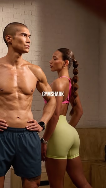
2. Gymshark Back-to-Back Studio Portrait (Activewear)
Platform: Instagram Stories, TikTok | Ratio: 9:16 | Hook type: Dual-model brand portrait
A man and a woman stand back-to-back in a bare brick studio, both in muted, earth-toned activewear, with the Gymshark wordmark centered between them. Neither model faces the camera, letting the garment fit and the brand mark carry the entire shot.
Winning ingredients:
- Back-to-back posing lets one frame introduce both a men's and a women's fit at once
- A plain brick backdrop keeps the attention on silhouette and fabric, not a staged set
- Placing the wordmark at the exact center of the frame makes it the visual anchor without a headline
3. Amazfit Falcon Price-Drop Hero (Fitness Wearable)
Platform: Facebook, Instagram | Ratio: 1:1 | Hook type: In-use price anchor
A man mid-dumbbell-curl is set against a dark gym backdrop under a "Breaking limits" headline, with two angles of the smartwatch face shown beside a struck-through price. The brand logo and name sit top-left, keeping the layout readable even at a glance.

Winning ingredients:
- Showing the watch mid-workout, on a wrist actually lifting, proves the fitness claim instead of a flat product shot
- A struck-through price next to the watch removes any need to calculate the discount
- Two watch-face angles side by side let a buyer compare the dial design before clicking through
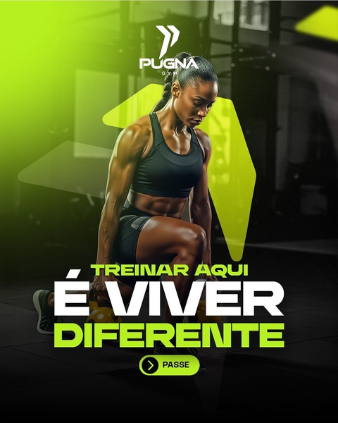
4. Pugna Gym Neon Membership Hero (Gym Membership)
Platform: Instagram, Facebook | Ratio: 4:5 | Hook type: Identity-driven lifestyle statement
A woman in a deadlift stance is lit in neon green against a dark gym interior, with a tagline translating to "training here is living differently" stacked beneath the gym's own logo. A single rounded button sits at the bottom as the only call to action.
Winning ingredients:
- A single neon accent color against an otherwise dark frame stays legible even muted in a feed
- The tagline sells an identity shift, not a price or a class schedule, which fits a membership decision better than a discount would
- One small CTA button keeps the ad from competing with its own headline for attention
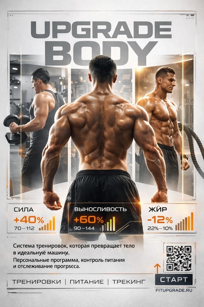
5. Upgrade Body Training App Stats (Fitness Training App)
Platform: Instagram, Pinterest | Ratio: 2:3 | Hook type: Multi-angle statistics roadmap
Three back views of the same athlete, shot from a weights session, a boxing-style workout, and a studio pose, are framed side by side under three stat callouts: strength up 40%, endurance up 60%, body fat down 12%. A QR code and a start button sit at the bottom, pointing straight at the program's own site.
Winning ingredients:
- Three photos of one person across different training contexts imply range without three separate campaigns
- Attaching a specific percentage to each outcome makes the promise measurable instead of vague
- A QR code turns a static image into a direct path to sign-up, useful for a service that lives entirely online
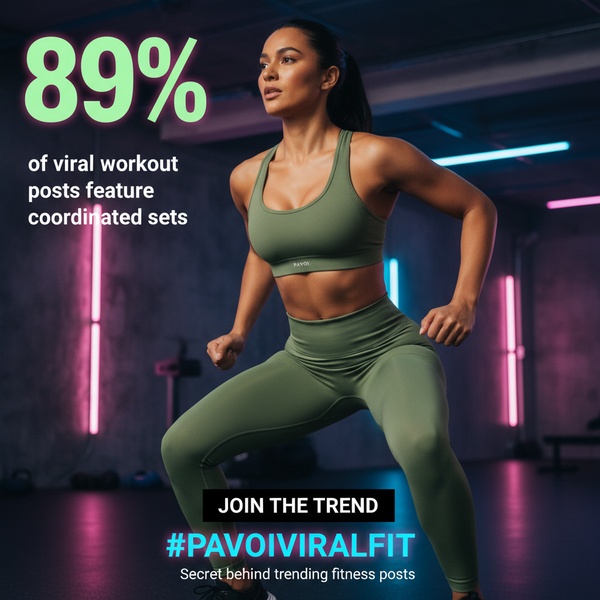
6. PAVOI Viral Statistic Hook (Activewear)
Platform: Instagram, TikTok | Ratio: 1:1 | Hook type: Social-proof statistic
A woman mid-stride in a matching olive activewear set is lit by pink and blue neon strips in a dark gym, with a bold "89%" statistic and a branded hashtag anchoring the bottom third. The stat reframes the outfit as a trend to join, not just a product to buy.
Winning ingredients:
- Leading with a statistic borrows social proof before the viewer even reads what's being sold
- A branded hashtag under the CTA turns a single ad into an entry point for a larger trend, not a one-off purchase
- Neon gym lighting signals a current, scroll-native aesthetic instead of a static catalog shot
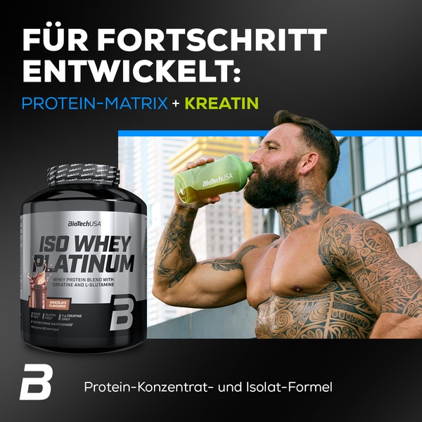
7. BioTechUSA Iso Whey UGC Hero (Whey Protein)
Platform: Facebook, Instagram | Ratio: 1:1 | Hook type: Split-panel ingredient callout
A tattooed, shirtless man drinks from a branded shaker bottle against a city skyline in one panel, next to a studio shot of the whey protein tub and a headline reading "developed for progress" in the other. The ingredient callout, protein matrix plus creatine, sits directly under the headline in a contrasting color.
Winning ingredients:
- Pairing a real person mid-drink with a clean product shot proves the "in use" claim without losing label legibility
- Naming the two active ingredients directly in the headline answers the "what's actually in it" question upfront
- A two-panel layout lets the lifestyle shot and the product shot each stay uncluttered instead of competing in one frame
8. EnergyBits Spirulina Flat-Lay (Supplement)
Platform: Instagram, Pinterest | Ratio: 3:4 | Hook type: In-context product flat-lay
A spirulina tablet pouch sits center-frame on a teal yoga mat, flanked by a pair of dumbbells, a glass water bottle, and a pair of sneakers, with just a cropped pair of legs seated at the edge of the mat. The pouch itself carries the claim, zero sugar, one ingredient, directly on the packaging.

Winning ingredients:
- Surrounding the product with real workout props shows the use occasion without needing a face or a model pose
- Cropping the person to just their legs keeps the product the clear subject while still implying a real routine
- Letting the packaging's own claim do the talking avoids a redundant headline on top
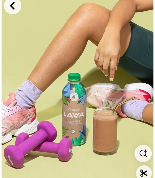
9. LAWA Plant Milk Post-Workout Moment (Nutrition Crossover)
Platform: Instagram, Pinterest | Ratio: 4:5 | Hook type: Pastel lifestyle flat-lay
A bottle of chocolate oat milk and a poured glass with a straw sit between a seated person's legs and a pair of purple dumbbells, with pink sneakers and lavender socks completing a pastel, post-workout scene. The product's own label stays legible against the muted green backdrop.
Winning ingredients:
- Pairing the bottle with its own poured glass shows exactly what the product looks like once prepared, not just the packaging
- A coordinated pastel palette makes a recovery-drink ad feel considered rather than thrown together
- Resting the product between workout gear ties a beverage directly to a post-workout occasion without a lifestyle headline
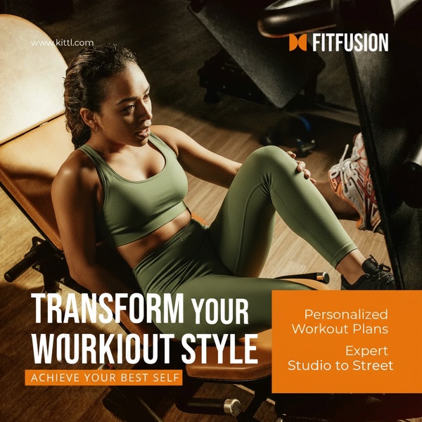
10. FitFusion Studio-to-Street Split Frame (Activewear)
Platform: Facebook, Instagram | Ratio: 1:1 | Hook type: Lifestyle photo plus offer panel
A woman in an olive activewear set sits on a gym bench mid-stretch, lit warm and low, with the headline "Transform your workout style" stacked over a smaller "Achieve your best self" line. A bright orange panel beside her lists two concrete offers: personalized workout plans and expert guidance from studio to street.
Winning ingredients:
- Warm, low gym lighting signals an in-progress workout moment rather than a staged studio shoot
- Splitting the frame between a lifestyle photo and a solid-color text panel keeps a long headline and an offer both legible
- Naming two specific offerings under the headline turns a style claim into something a buyer can act on
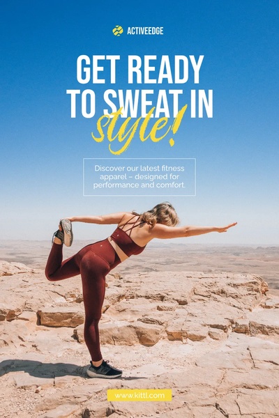
11. ActiveEdge Desert Lifestyle Hero (Activewear)
Platform: Instagram, Facebook | Ratio: 2:3 | Hook type: Scenic outdoor hero shot
A woman in a maroon activewear set holds a yoga balance pose on a desert cliff edge, under the headline "Get ready to sweat in style!" against a clear blue sky. A small subhead frames the apparel as both performance and comfort, with the brand's own site listed at the bottom.
Winning ingredients:
- A scenic, outdoor backdrop sells the lifestyle before a reader even gets to the apparel copy
- A clear, uncluttered sky leaves enough negative space for a two-line headline without crowding the model
- Naming both performance and comfort in one subhead covers the two most common objections to a new activewear brand at once
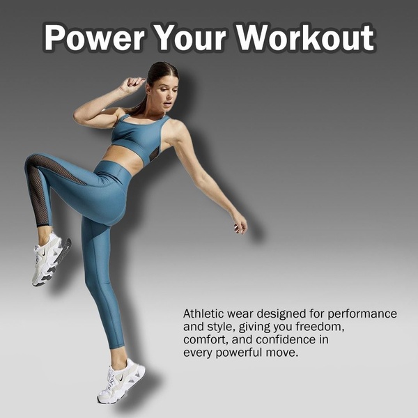
12. Power Your Workout Jump-Kick Hero (Activewear)
Platform: Facebook, Instagram | Ratio: 1:1 | Hook type: Cut-out motion pose
A woman is caught mid-jump-kick against a plain grey gradient, cut out from any background entirely, with the headline "Power your workout" at the top and a short benefit line in the bottom right. Removing the background keeps the pose itself the only visual element in the frame.
Winning ingredients:
- A fully cut-out subject with no environment removes every distraction except the garment and the movement
- A dynamic kick pose shows range of motion in a way a standing product shot cannot
- A short, three-line benefit statement sits quietly in a corner instead of competing with the visual
13. Stretch & Recover Mat Moment (Fitness Equipment)
Platform: Instagram, Pinterest | Ratio: 1:1 | Hook type: Candid overhead crop, no copy
A tight, overhead crop shows someone folded into a seated stretch on a dark mat, hands reaching toward a sneakered foot, on an outdoor pebble surface. No text, logo, or product label appears anywhere in the frame.

Winning ingredients:
- An overhead, cropped angle makes the stretch itself, not a face or a logo, the entire subject
- Shooting on a real outdoor surface instead of a studio floor makes a mat ad feel like a candid moment, not a catalog shot
- Zero text lets a single believable movement carry the entire ad
14. Pilates Girl Flat-Lay Kit (Pilates Accessories)
Platform: Instagram Stories, Pinterest | Ratio: 9:16 | Hook type: Identity-based curated bundle
A full Pilates starter kit, resistance bands, a smartwatch, a mat and bag, grip socks, a Pilates ring, and an eye-mask twin-pack, is arranged in a grid entirely in shades of pink. The headline asks, "Pilates girl? You need this," tagged with a creator handle and "trendy plus actually useful."

Winning ingredients:
- An identity-based question qualifies the exact viewer the ad is meant for before they read anything else
- A single coordinated color across every item makes an eight-product bundle read as one considered kit, not a random grid
- Crediting a creator handle on the image signals this is a real recommendation, not a brand selling itself
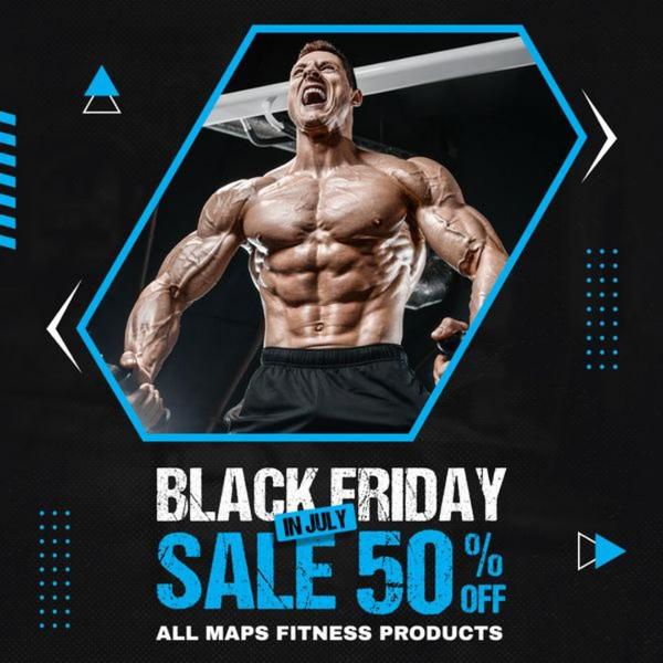
15. MAPS Black Friday Fitness Sale (Seasonal Offer)
Platform: Facebook, Instagram | Ratio: 1:1 | Hook type: Geometric-framed seasonal offer
A bodybuilder mid-flex, visibly shouting, is framed inside a blue hexagon outline against a black background, with "Black Friday in July" stacked above a headline naming 50% off all of the brand's fitness products. Moving the occasion to July borrows the urgency of Promer AI's own Black Friday ad examples playbook without actually competing with the real November sale date.
Winning ingredients:
- Framing the athlete inside a bold geometric shape draws the eye before the discount text even loads
- Naming the exact scope of the sale, all of the brand's fitness products, removes any doubt about what qualifies
- Borrowing a familiar shopping occasion and moving it to an off-season month gives the discount its own reason to exist
How to apply these AI ad creative examples to your own fitness brand
The layouts above share a structure, not a product. A statistic-led hook, a cut-out motion pose, or a coordinated flat-lay works the same way whether you sell activewear, a wearable, or a gym membership, as long as you match the visual language to what you're actually selling and can actually prove.
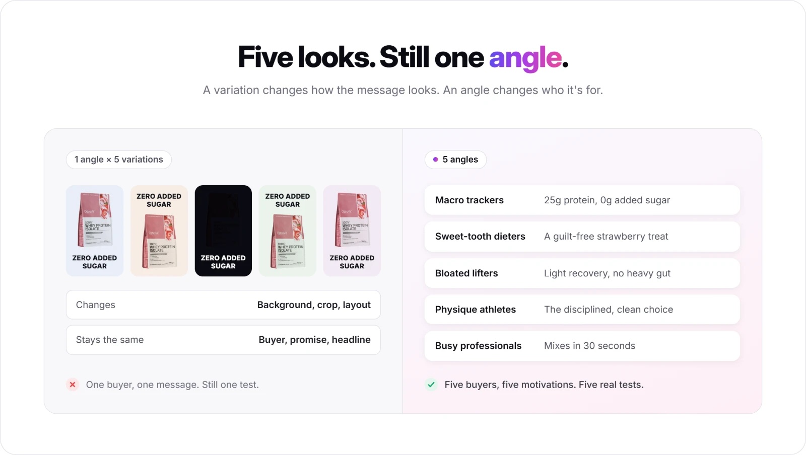
Copying the layout alone only gets you a new look, not a new test. Swapping the product and keeping everything else identical is one angle shown five ways; pairing that same layout with a genuinely different buyer and promise is five separate angles worth testing.
If you want to browse more real fitness campaigns before building your own, Promer AI's ai ad creative for fitness brands library groups them by category, hook type, and platform so you can shortlist the structures closest to your product.
Promer AI, an AI advertisement generator, turns any of these structures into your own ad, starting from the product instead of a blank canvas. Six features cover the workflow end to end, depending on where you're starting from.
AI Ad Concept: Several finished concepts from one product
Promer AI's AI Ad Concept reads your product into four editable fields, highlights, ideal customer, pain point, and need, then generates several concepts in one run.
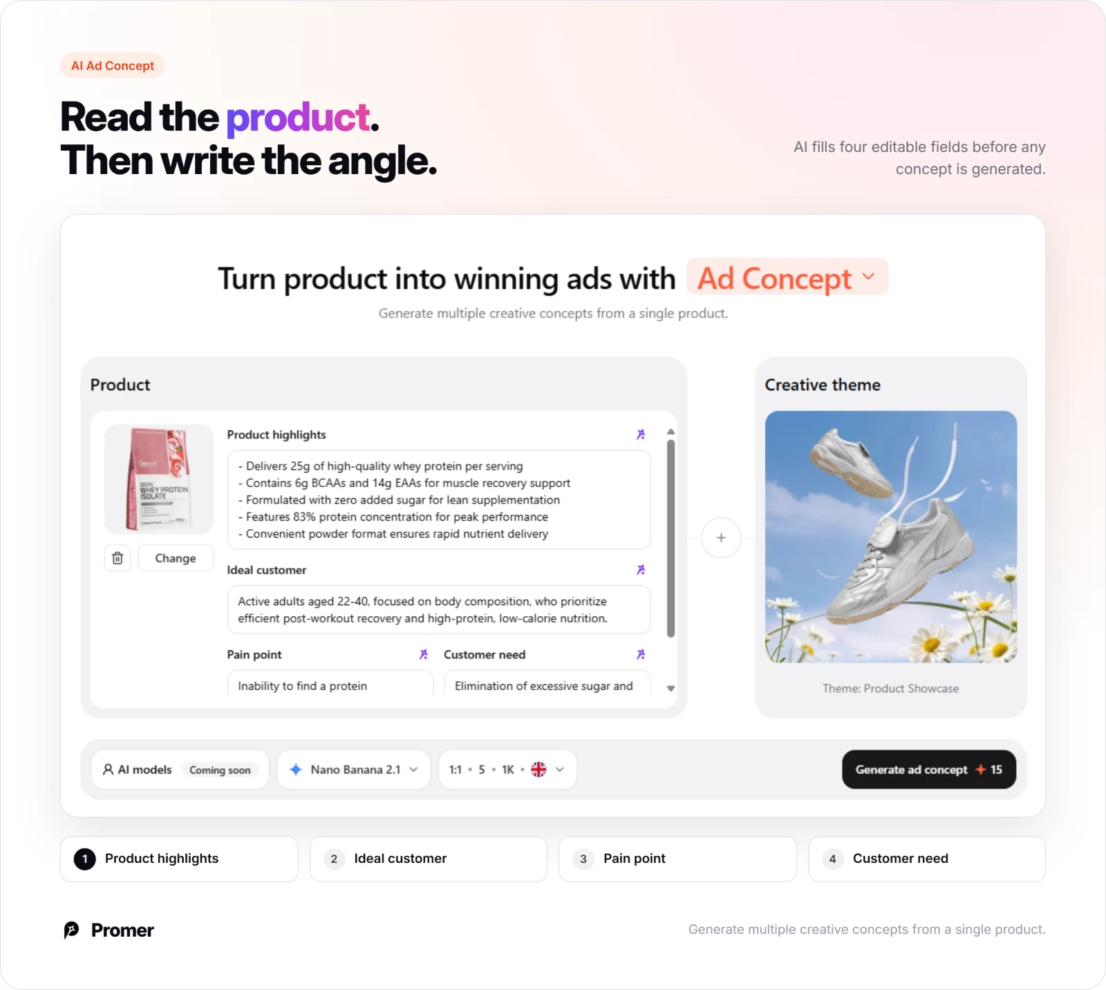
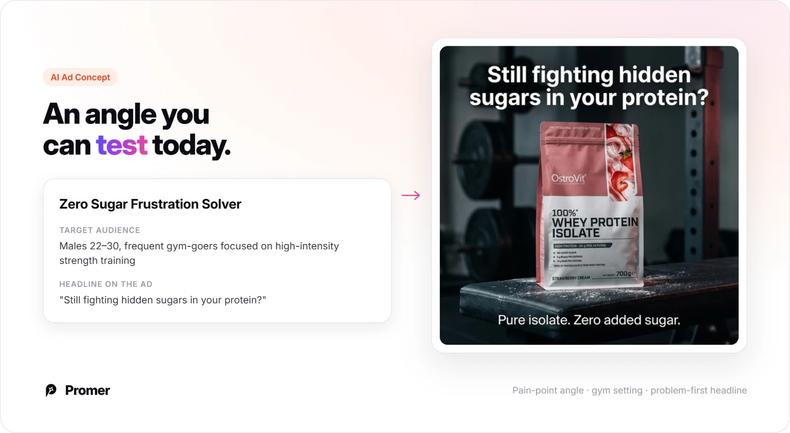
Each concept arrives with its own target audience and core idea, so a wearable or a supplement brand can compare a results-focused angle against an identity-focused angle side by side instead of three colors of the same product.
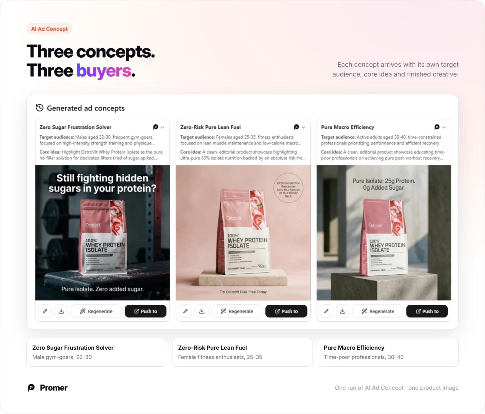
When one concept wins, "More creatives" scales that same angle into new executions without starting the analysis over.
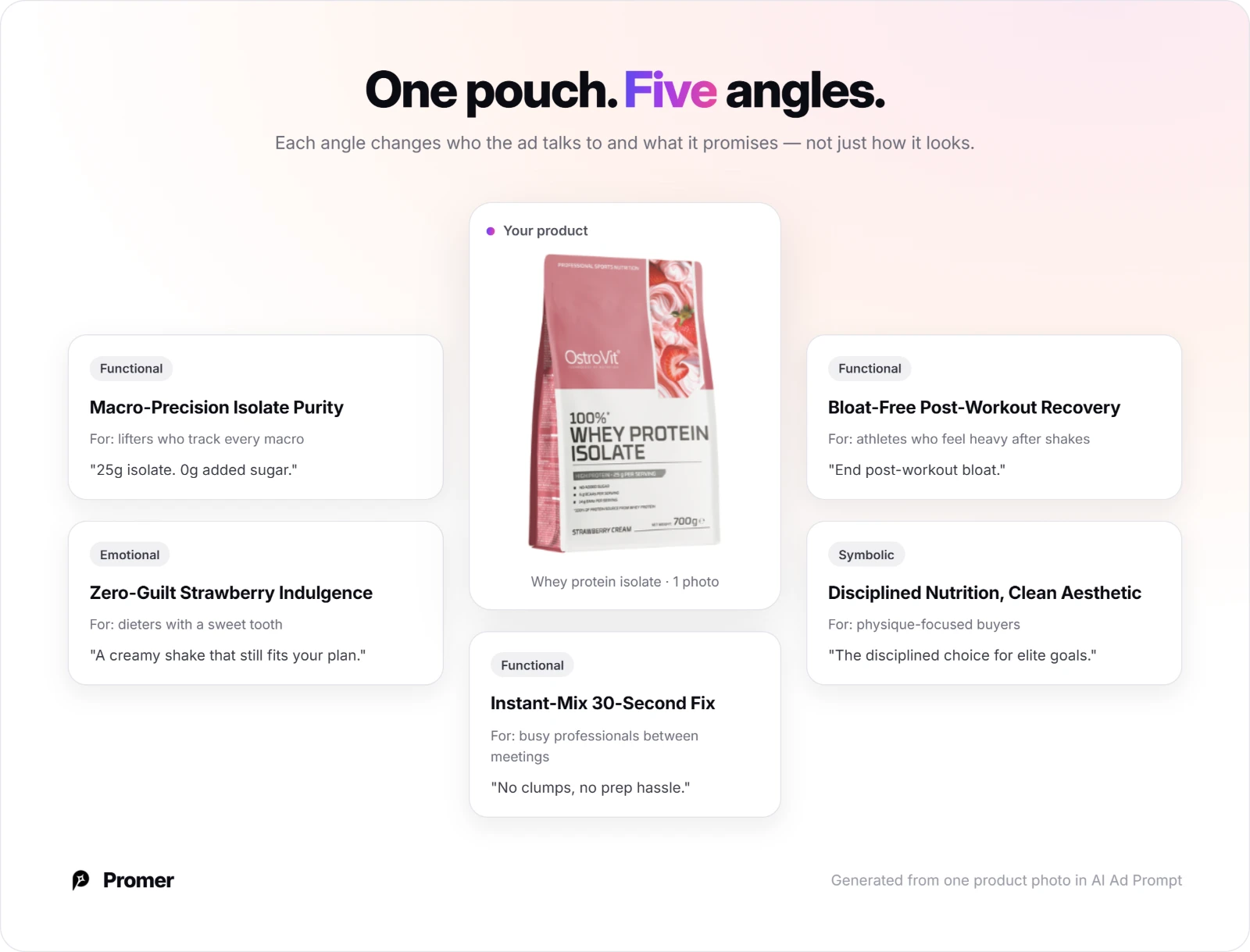
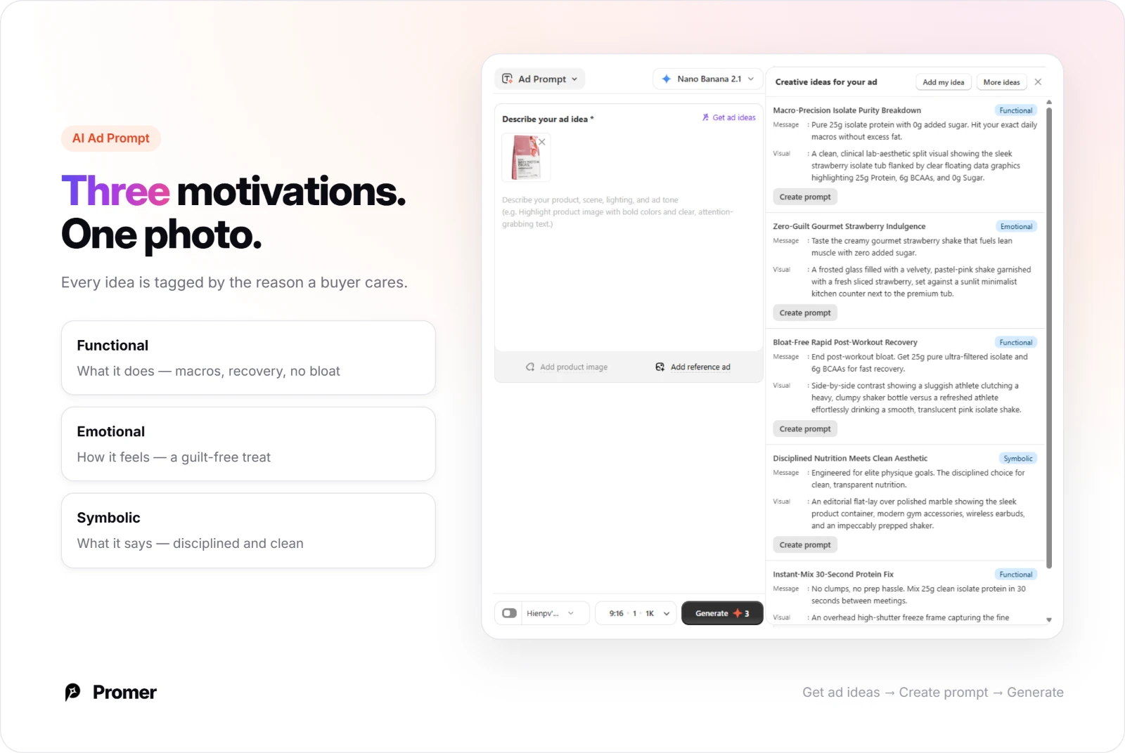
AI Ad Prompt: Functional, emotional, and symbolic angles from one photo
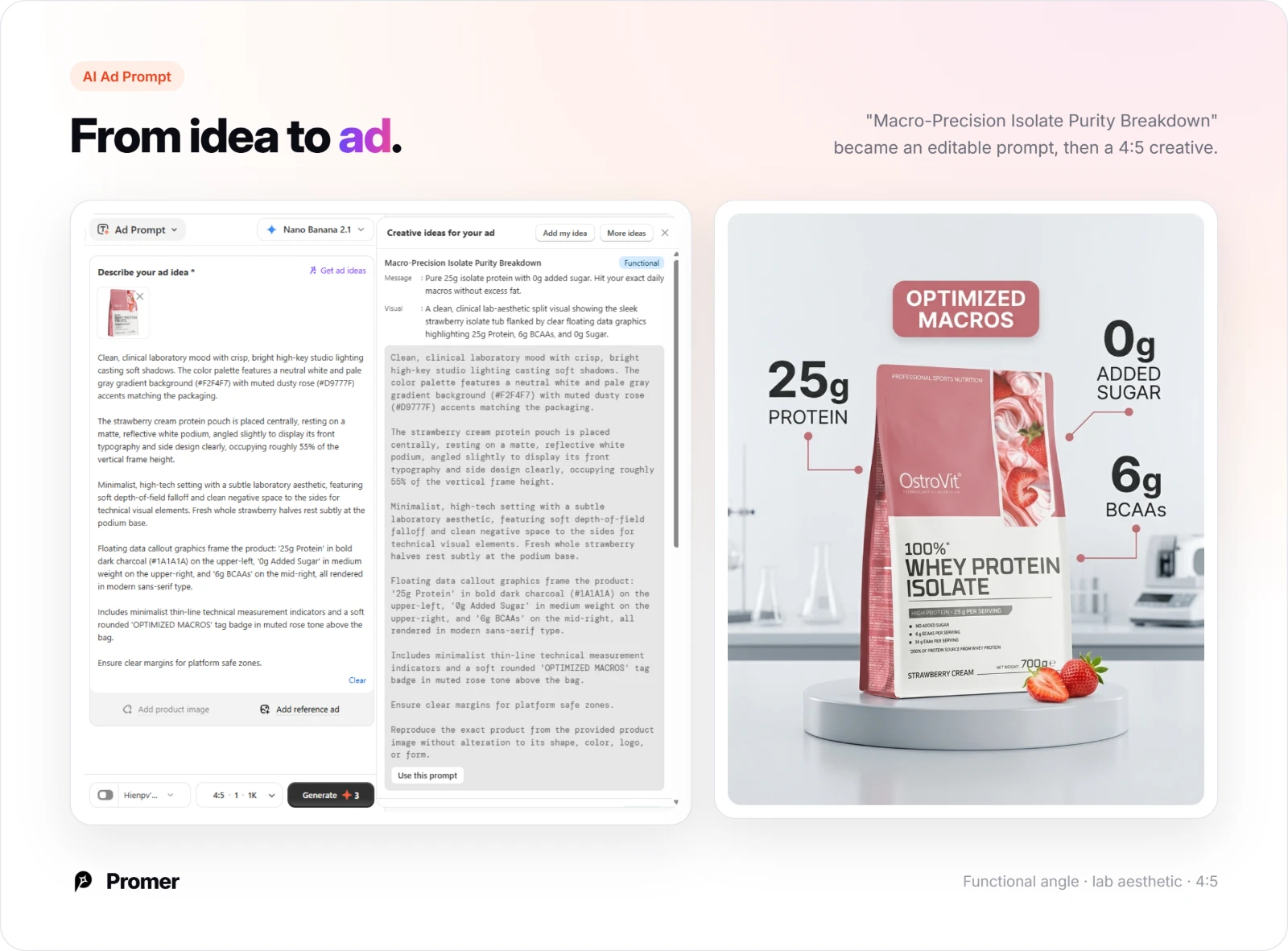
AI Ad Prompt takes a single product photo and returns ideas tagged Functional, Emotional, or Symbolic, so you can test a results claim against a lifestyle claim instead of five versions of the same pitch.
"Create prompt" turns any of those ideas into a detailed, editable prompt before you generate the finished ad.
AI UGC Ads: Angle, hook, and format for video
AI UGC Ads suggests an angle, a hook, and a matching UGC format straight from your product image, or you can bring your own idea instead.
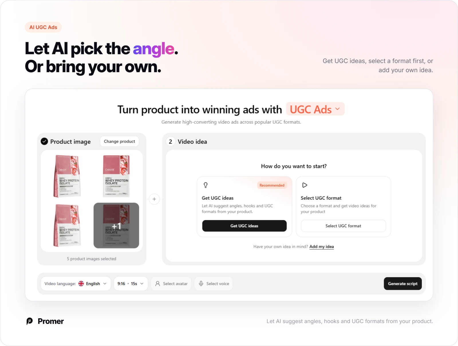
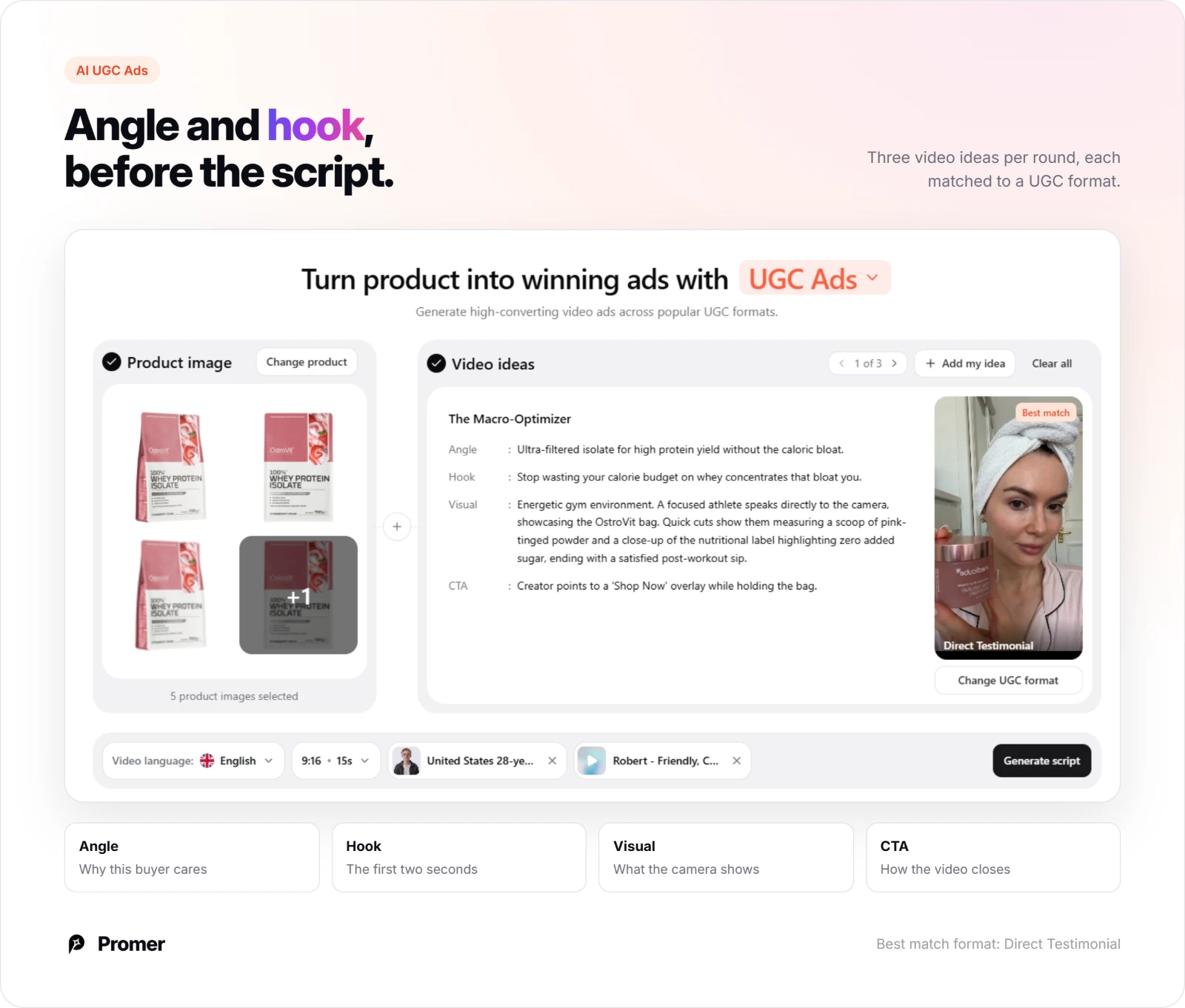
Each video idea comes with a named angle, a hook, a visual description, and a CTA, a strong fit for a hand-held, in-use ad like the whey protein and spirulina examples above.
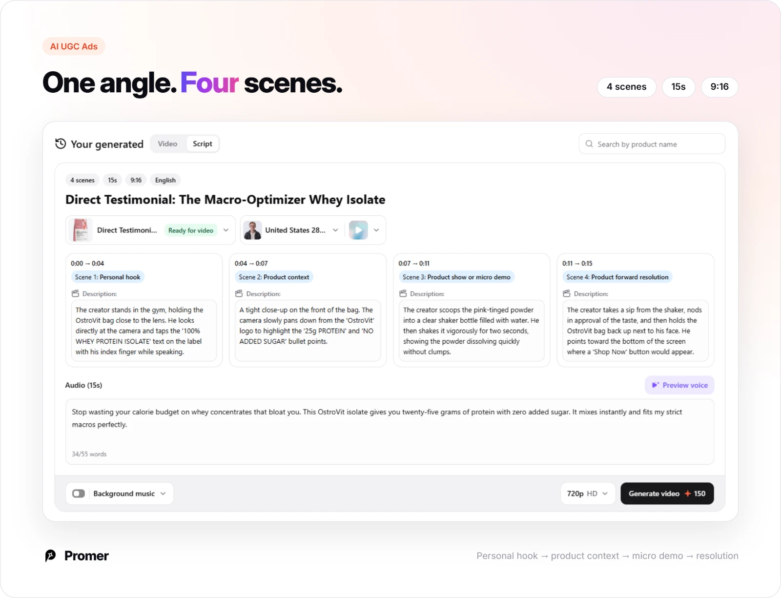
"Generate script" turns that video idea into a scene-by-scene script, each scene timestamped with its own visual and voiceover line, ready to shoot or hand to an AI avatar.
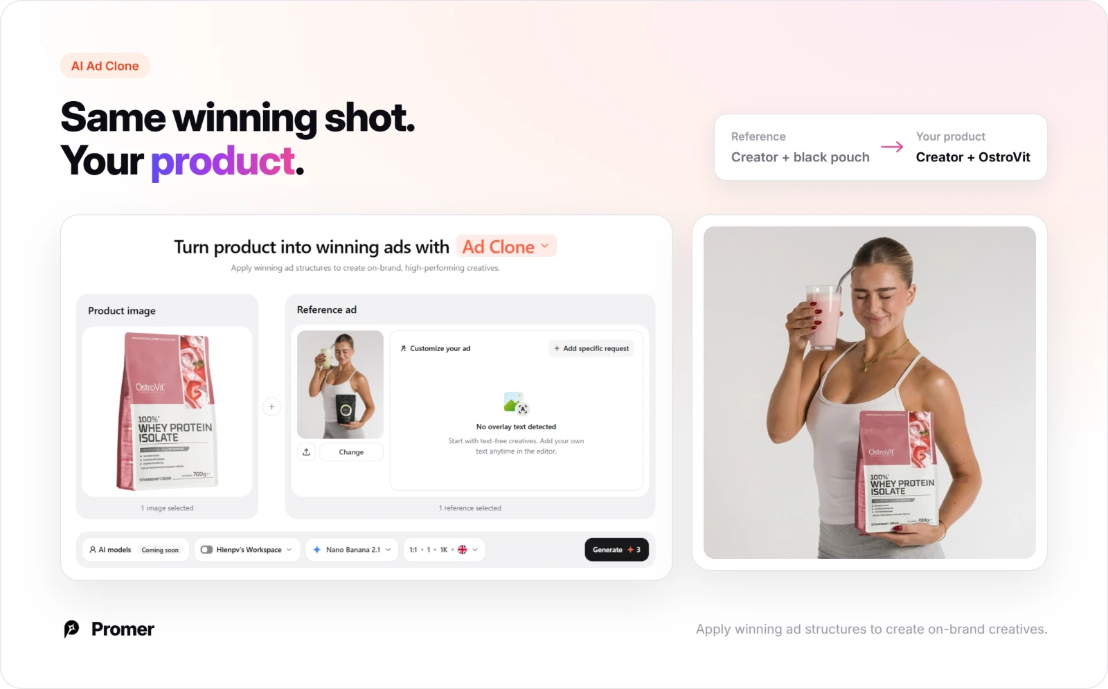
Promer AI's AI Ad Clone is the fastest route to copy one of the 15 structures above exactly: pick your product, select the reference ad you want to recreate, and the AI suggests a headline, body text, and CTA you can edit individually before generating.
AI Video Ad Clone: Borrow a proven video structure
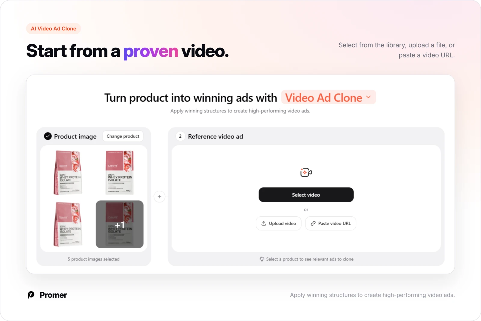
Start by selecting, uploading, or pasting the link to a reference video ad you want to apply to your product.
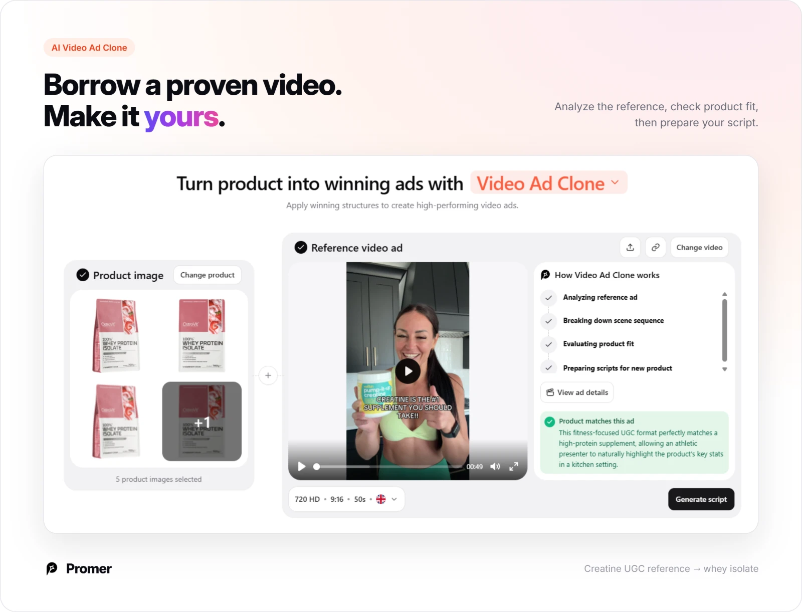
AI Video Ad Clone analyzes a reference video, breaks down its scene sequence, and checks whether your product actually fits that structure before committing to a script.
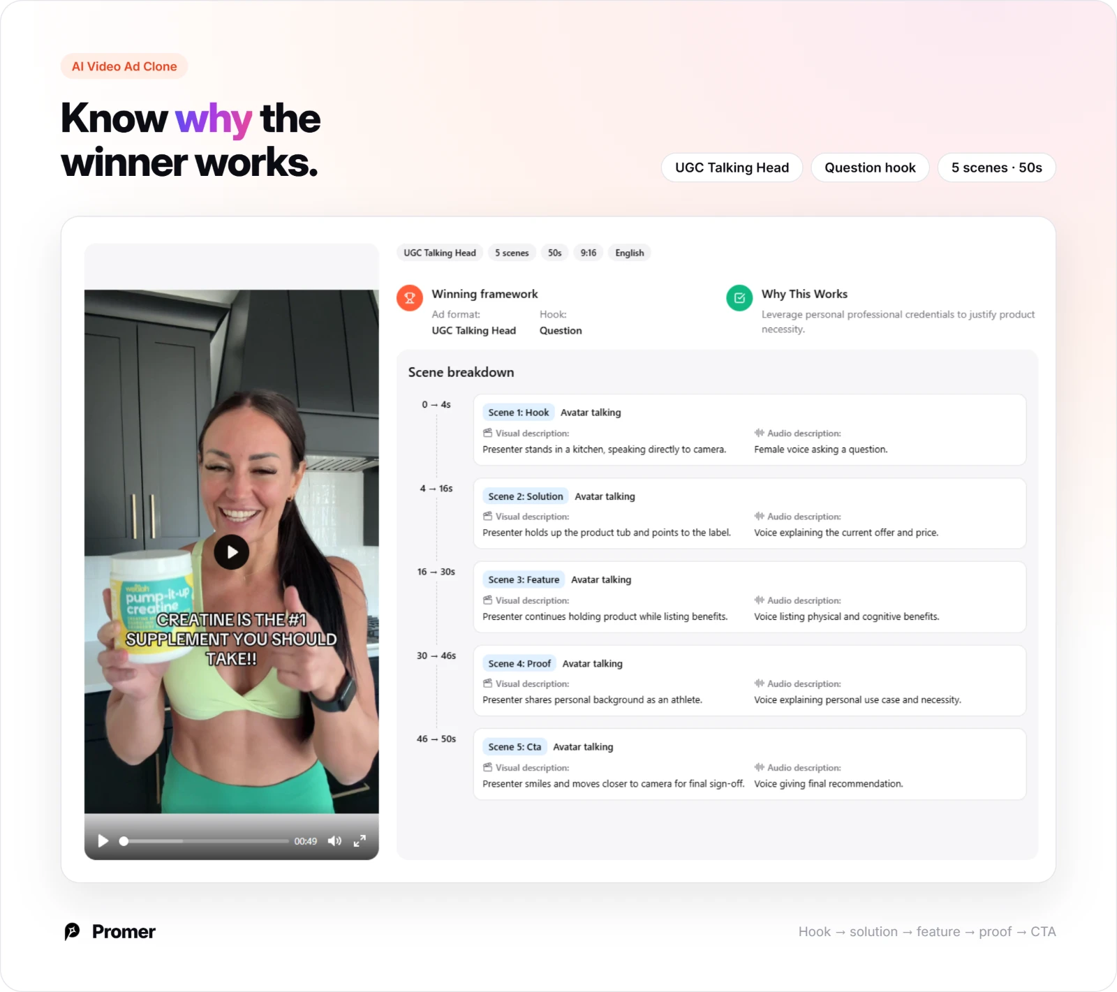
It explains why the framework works, then rebuilds it as a timestamped scene breakdown for your product.
Promer AI's AI Photoshoot is the better starting point if you only have a plain product photo: it places your apparel, bottle, or device into a lit, on-brand background, the same clean staging used in the hero shots above, without booking a studio.
AI Ad Animation: Move a winning static into motion
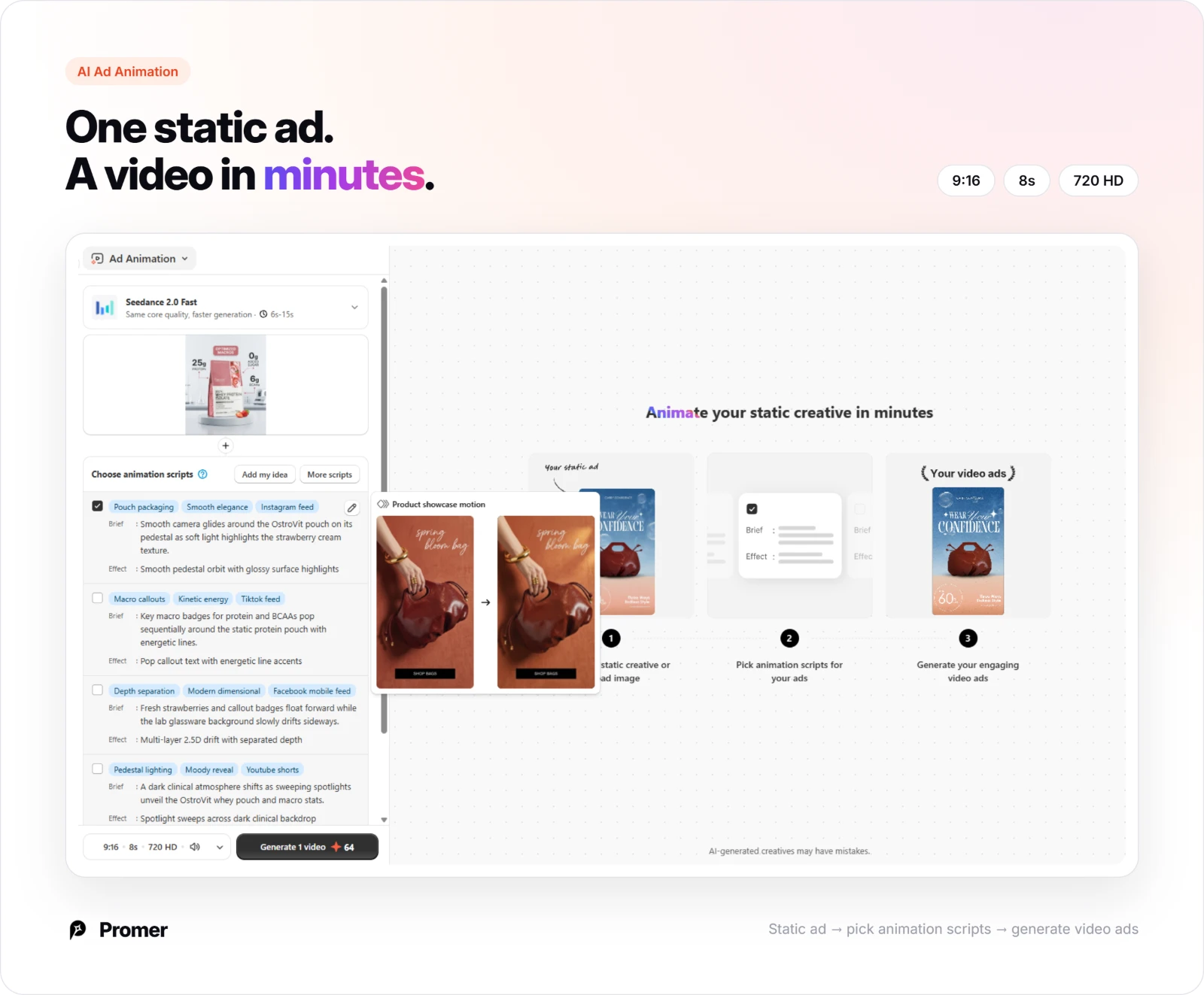
Once a static angle wins, AI Ad Animation suggests animation scripts with a brief, an effect, and placement tags, so you can take that same angle into Instagram, TikTok, Facebook, or YouTube without reshooting.
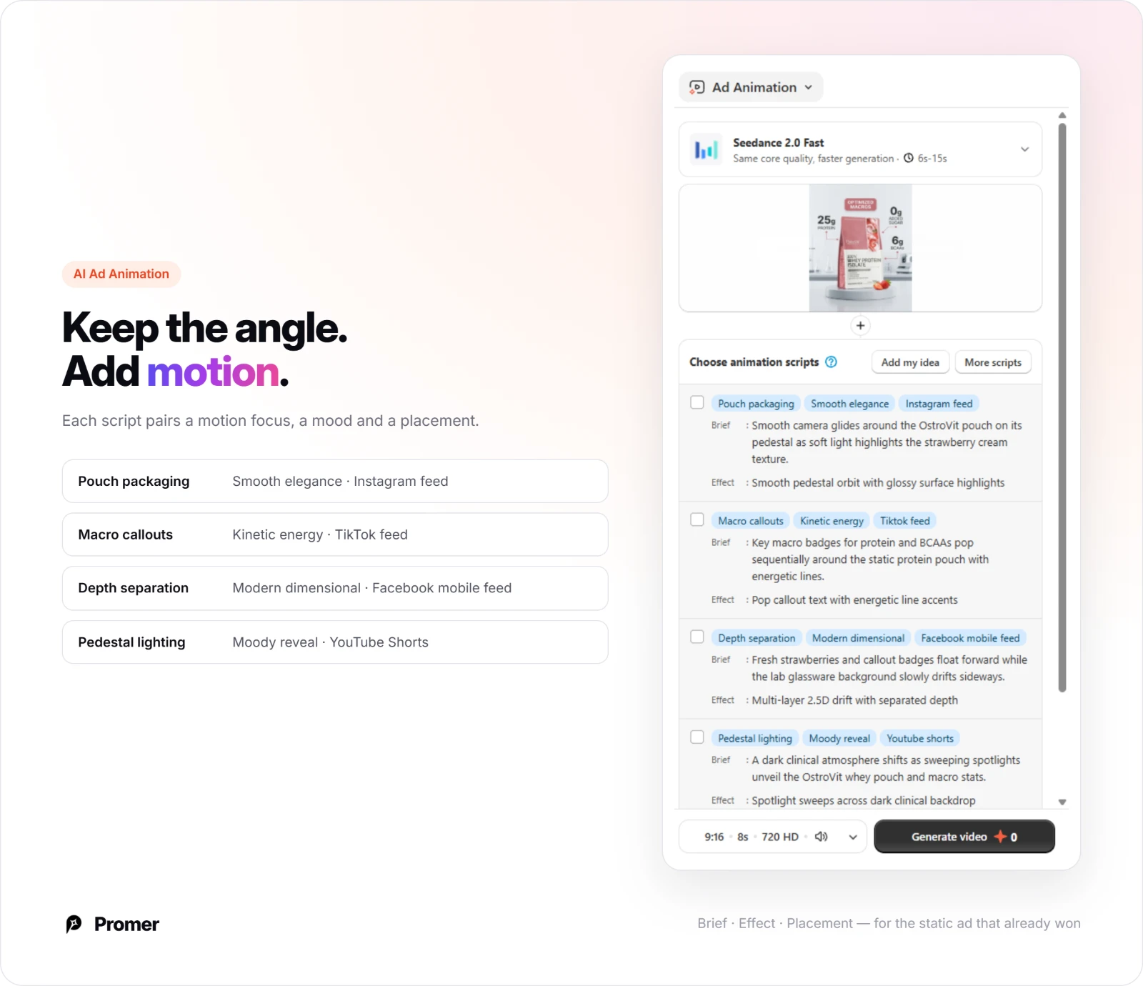
Pick the script that fits your platform and "Generate" turns the static creative into a short video, ready for Instagram, TikTok, Facebook, or YouTube Shorts.
Review every generated creative before it runs. AI-generated ads can have mistakes, and for fitness specifically, double-check that any performance statistic, result, or supplement claim shown in the creative matches what's actually accurate and substantiated for your product.
Common mistakes fitness brands make with AI ad creative
Using a statistic with nothing tying it to the product. A percentage or a result only builds trust when the viewer can tell where it came from; an unsourced number next to a product shot reads as filler, not proof.
Showing the product with no real use occasion. A supplement, wearable, or mat shot alone in a studio loses the context a workout prop, a real surface, or a cropped in-use moment would add for free.
Stacking a membership tagline on top of a discount badge. An identity-driven lifestyle statement and a loud percentage-off callout pull the viewer's attention in two directions; pick the identity pitch or the offer, not both in the same frame.
Reusing the same hero pose across every product variant. A single action shot works for one SKU, but swapping only the color while keeping identical staging across a full apparel line reads as lazy rather than consistent.
Using the same aspect ratio across every platform. A 1:1 square built for a Facebook feed gets letterboxed on Stories and TikTok; match the ratio to where the ad will actually run instead of resizing after the fact.
FAQs about AI ad creative for fitness brands
These are the questions fitness marketers ask most before building their own AI-generated ad creative.
What makes good AI ad creative for fitness brands?
Good AI ad creative for fitness brands gives the viewer exactly one reason to stop scrolling, a specific statistic, a single action pose, or a real use occasion, not a crowded mix of all three. The examples above split between apparel and wearable ads built on one proof point, and supplement or service ads built on a measurable outcome. Picking one direction and matching the visual style to what you're actually proving typically outperforms a layout that tries to do everything.
Which aspect ratio works best for fitness ad creative?
There's no single best ratio, it depends on where the ad runs. Vertical ratios like 9:16, 4:5, and 2:3 dominate the examples above because they fill more of a mobile feed or Stories screen, while 1:1 still carries most of the statistic-led and offer-led layouts well. Testing your creative in the ratio native to its placement usually performs better than resizing one master file for every platform.
Can these ad structures work for a gym membership or training app, not just a physical product?
Yes. The gym membership and training app examples above both use a result-driven hook, a lifestyle statement for the gym, a measurable statistic for the app, paired with a single, clear call to action. The same AI Ad Prompt workflow that builds a product-focused angle works the same way for a service offer, since it only needs a product image or a description of the scene.
Do fitness and supplement ads need to follow specific claim rules?
Generally yes, claims about health outcomes, performance, or specific results typically need to be substantiated, and requirements vary by platform and market. This isn't legal advice, confirm your current claim and labeling obligations before running an ad built around a specific statistic, result, or transformation claim.
Do I need professional product photography to create ads like these?
No. Several of the examples above, including the flat-lay and in-use product shots, rely on clean, evenly lit photography rather than a complex set build. Promer AI's AI Photoshoot places a product into a lit, on-brand background, which typically removes the need for a separate studio session.
How many ad variations should a fitness brand test?
Testing at least 2-3 structurally different variations, not just color or copy tweaks, usually surfaces a clearer winner. Covering different hooks, a statistic-led version, an action-pose version, and an offer-led version, gives a more useful read than testing five versions of the same layout. Results will vary by audience and price point, so treat this as a starting test set, not a fixed rule.
Summary
The 15 examples of ai ad creative for fitness brands above all follow the same underlying discipline: one clear hook, matched to the type of product, service, or proof behind the ad, instead of one generic shot reused for every purpose.
Pick the structure closest to what you're selling, choose the Promer AI tool that matches where you're starting from, a reference ad, a blank idea, or a product photo that needs a studio-quality background, and swap in your own brand colors and copy.