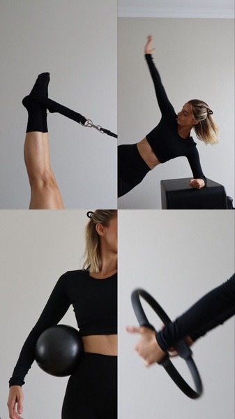
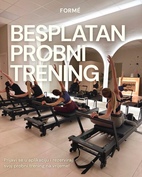
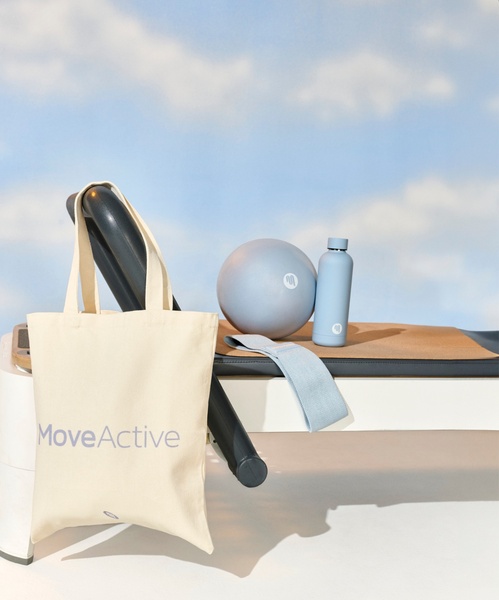
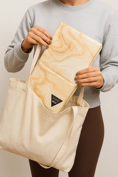
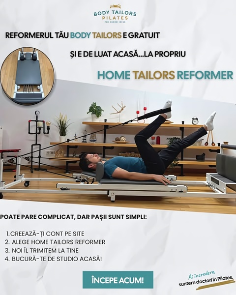
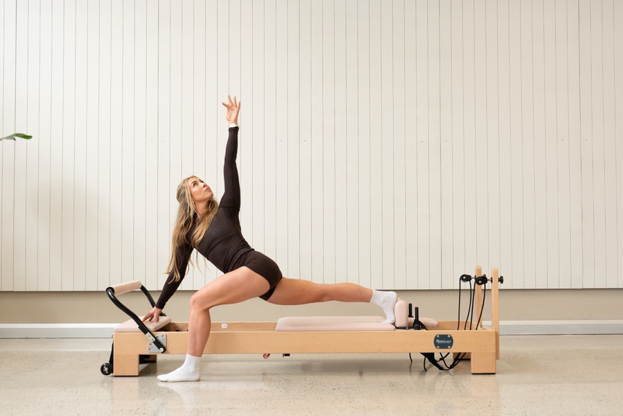
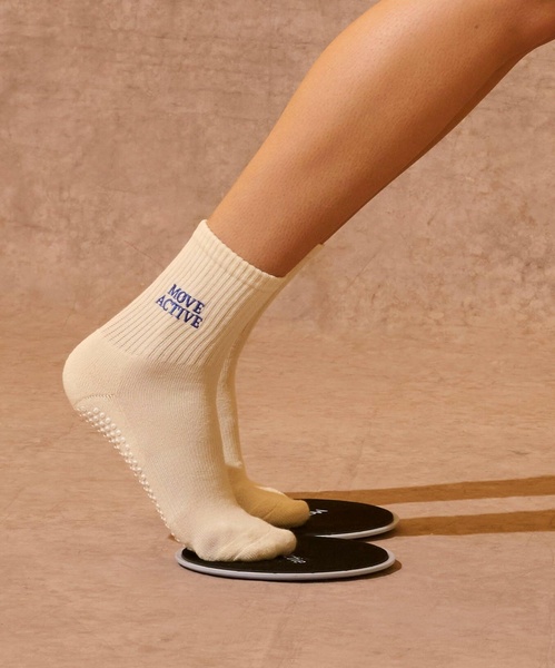
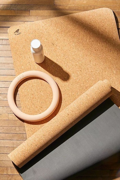
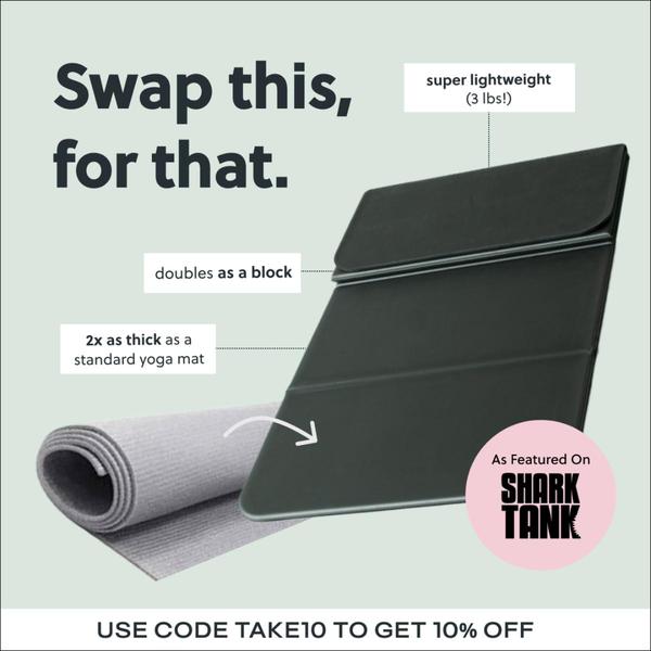
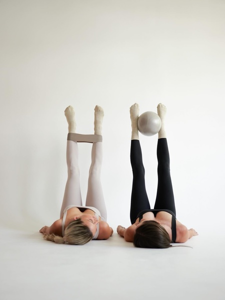
A 9:16 vertical grid split into four segments showing close-up shots of pilates accessories and a user performing exercises.
Free credits included. No card required
This pilates equipment ad creative uses a high-contrast, four-part grid layout to immediately demonstrate product utility across multiple use cases. By stripping away distractions and focusing purely on the intersection of user form and accessory function, the brand creates a high-density information hook that captures attention in crowded social feeds.
This structural approach effectively signals product versatility, a critical factor for home fitness conversion. Teams looking to test this high-performing grid pattern can use Promer AI to maintain this aesthetic consistency while swapping in their own hardware, ensuring their creative output stays as polished and focused as the original.
Great ads start from a clear structural idea, a specific feeling, or a consistent visual cadence, not a blank design.
Pro tip
When using a grid layout, ensure every panel communicates a unique value proposition rather than just showing the same angle four times. Use one panel for the main product, one for a closeup of the texture or quality, and two for active use cases to maximize the conversion potential of the static space.








Promer helps you find the pattern, adapt it to your product, and create your own version in minutes.






