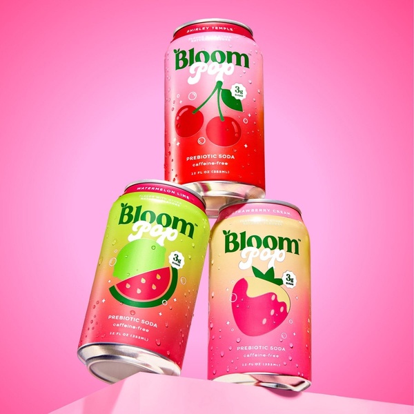
A vertical stack of three flavored sparkling soda cans featuring a clean, studio-lit aesthetic and vibrant color palette.
Free credits included. No card required
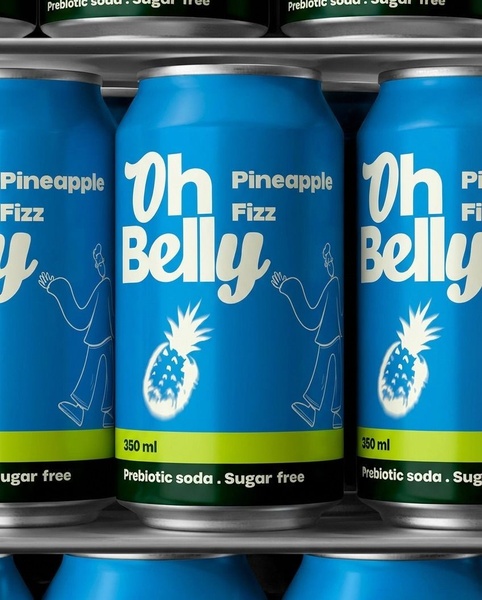
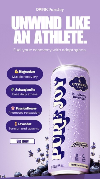
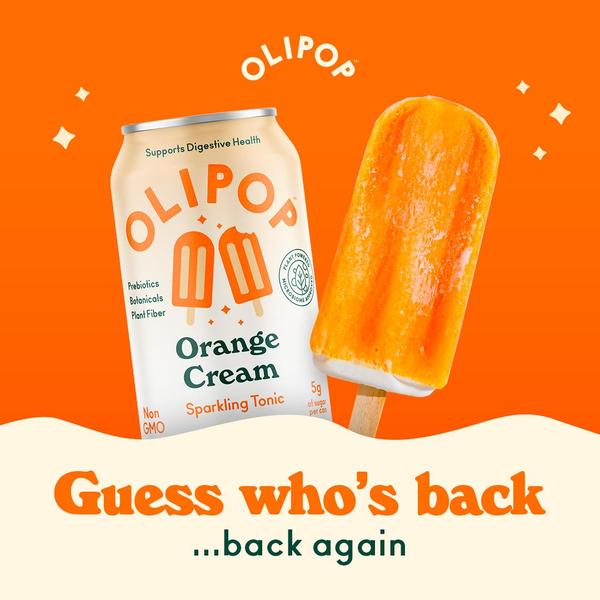
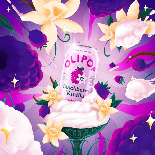
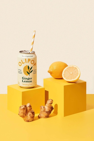
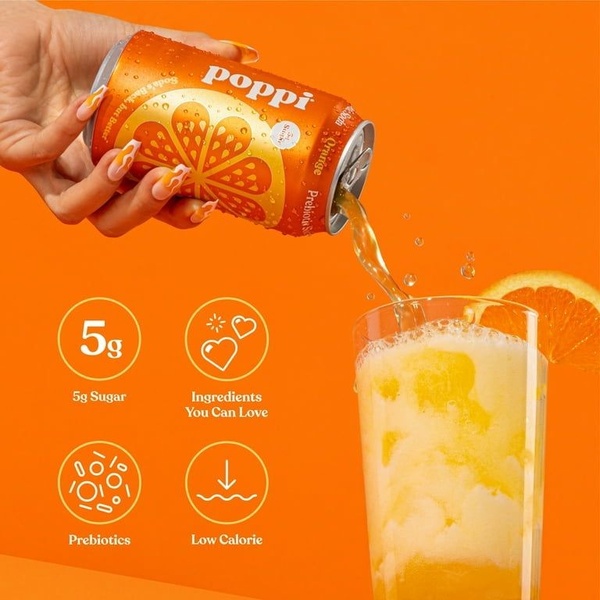
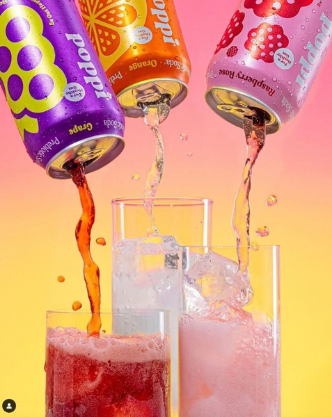
The vibrant color stack of this sparkling soda creative works by leveraging symmetry and high-contrast color theory to capture immediate attention in a busy feed. By isolating the product against a clean, monochromatic background, the composition removes all distractions to force a singular focus on the product's packaging and branding elements.
This approach helps Promer AI users highlight product variety through a structured, repeatable layout that feels premium and intentional. For most teams, using a consistent, balanced, and aesthetically pleasing hero shot builds immediate brand trust and recognition, especially when the product itself features bright, recognizable label designs.
Great ads start from a deliberate structural decision, creating a visual rhythm that makes your product impossible to ignore.
Pro tip
When stacking your products, focus on color harmony to ensure the visual progression feels natural rather than cluttered. If your packaging is busy, use a slightly desaturated background color to keep the focus entirely on your brand's core product design.









Promer helps you find the pattern, adapt it to your product, and create your own version in minutes.