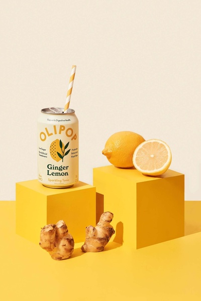
This creative showcases a ginger lemon sparkling tonic can alongside fresh ingredients on minimalist yellow blocks, focusing on clean composition and brand visibility.
Free credits included. No card required
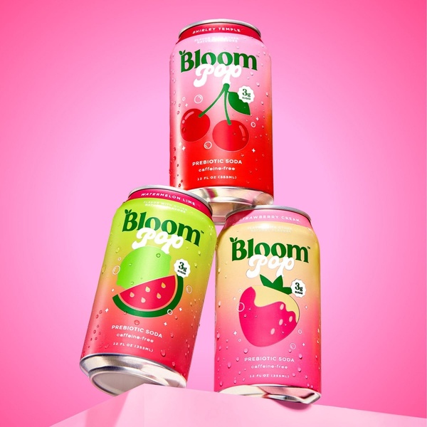
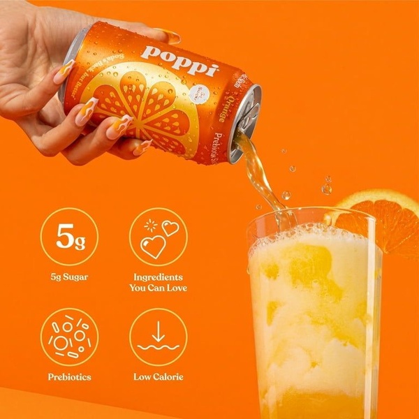
This sparkling tonic creative utilizes a minimalist visual strategy to emphasize product clarity and ingredient freshness. The use of geometric symmetry and high-contrast yellow tones creates a powerful, clutter-free hook that stops the scroll by focusing entirely on the physical product. By isolating the beverage against a clean, monochromatic background, the brand ensures that the product packaging remains the absolute focal point of the composition.
For most ecommerce brands, this clean approach helps eliminate decision fatigue and builds premium brand perception. Using Promer AI to replicate this structured layout allows you to test various product placements and color palettes without needing a full-scale studio session. While this style is visually effective, its performance typically depends on high-quality product assets that convey the freshness of the ingredients.
Great ads are built on a foundation of intentional composition, where every element serves to elevate the product experience.
Pro tip
When adopting this minimalist style, ensure your product label is perfectly readable in the final crop. Even in clean compositions, the text on the can must communicate the benefit immediately to the viewer.






Promer helps you find the pattern, adapt it to your product, and create your own version in minutes.