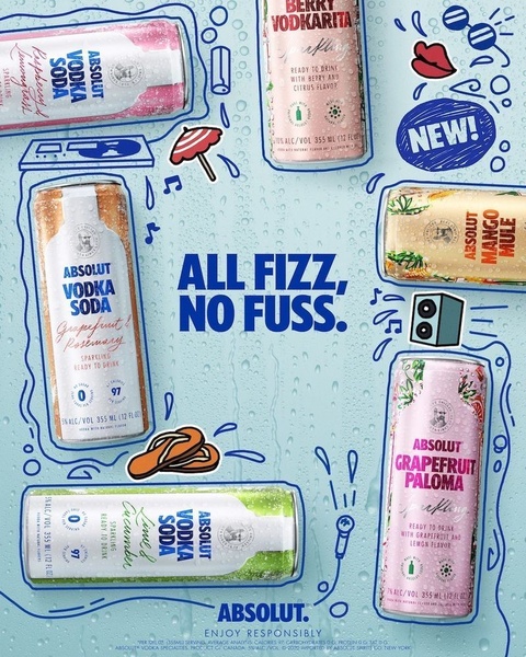
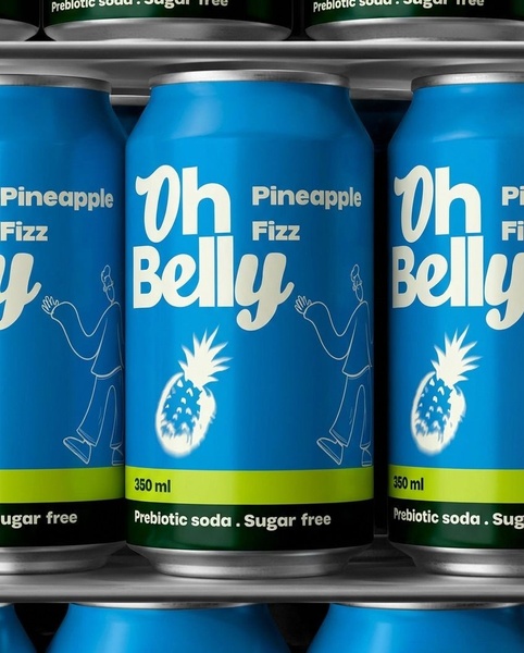
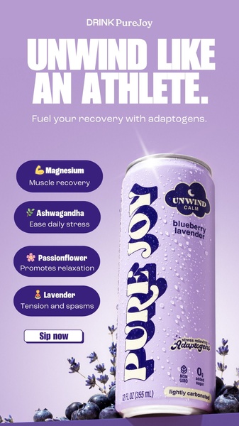
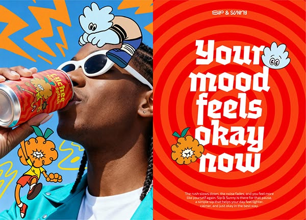
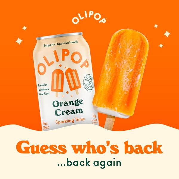
A high-density grid showing dozens of different soda cans, visually emphasizing variety and flavor abundance.
Free credits included. No card required
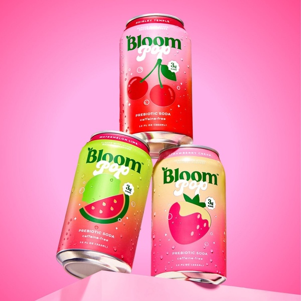
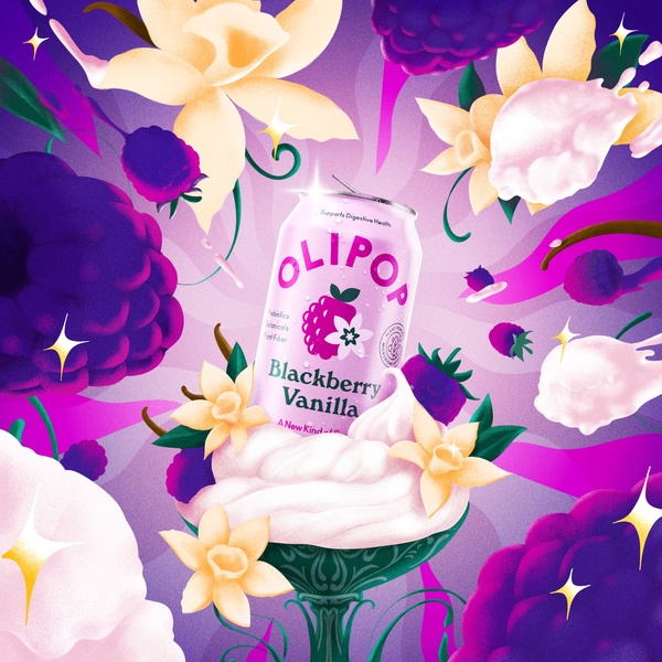
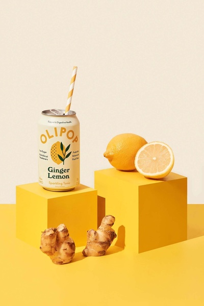
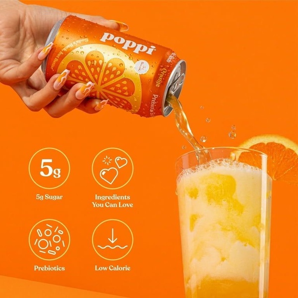
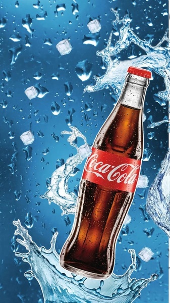
This soda grid uses a high-density visual arrangement to stop the scroll through sheer variety and color saturation. By placing multiple flavors within a single frame, the brand creates an atmosphere of abundance and playfulness that appeals to impulse-driven consumers. The core strategy here is to leverage visual volume to position the brand as the ultimate destination for flavor exploration.
For most ecommerce teams looking to scale, Promer AI provides a way to systematize this approach by organizing your product catalog into similar high-impact creative layouts. When you aggregate your offerings visually, you reduce the time a customer spends searching, allowing them to instantly see the full breadth of your value proposition while maintaining a consistent aesthetic across all products.
Visual abundance in creative acts as a catalog and a promise of variety simultaneously, effectively capturing attention in high-velocity social feeds.
Pro tip
When using a grid layout, ensure your best-selling or most visually striking product is placed in the center or top-left position. This anchors the viewer's gaze and provides a clear point of entry into the visual collection before they scan the remaining items.




Promer helps you find the pattern, adapt it to your product, and create your own version in minutes.