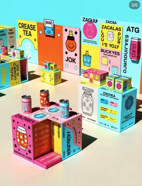
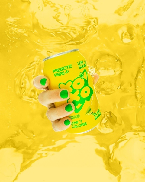
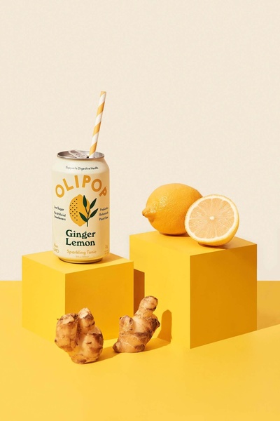
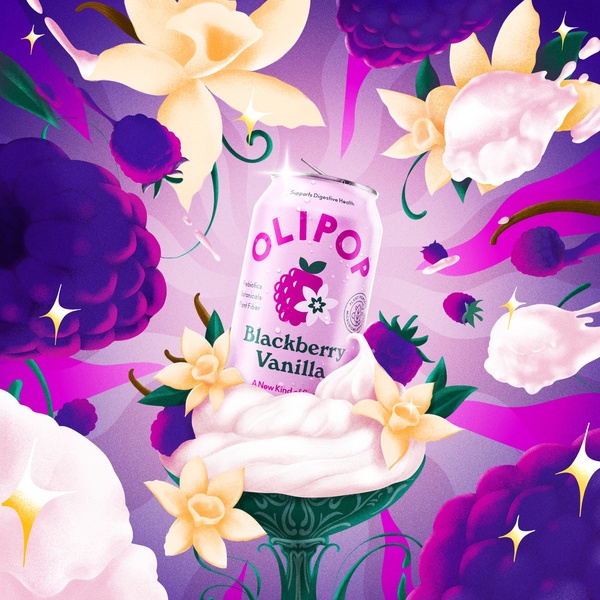
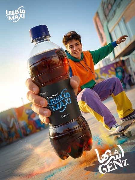
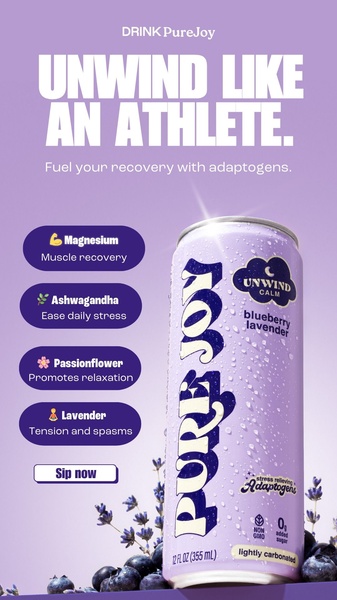
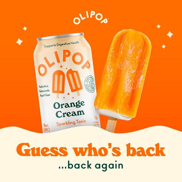
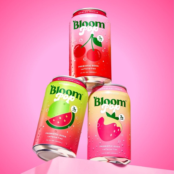
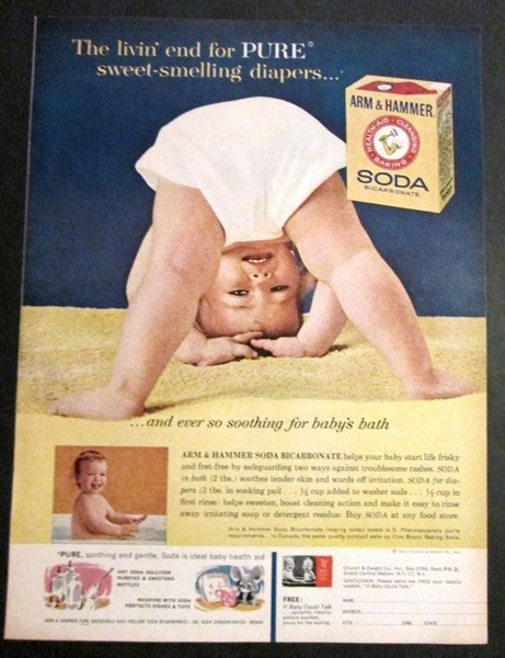
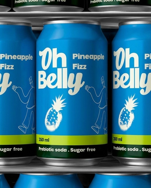
This creative utilizes a vibrant, grid-based aesthetic to display multiple product variations, using bold color blocking and playful typography to stop the scroll.
Free credits included. No card required
This canned beverage ad creative leverages a hyper-organized grid layout to transform standard product shots into a compelling visual pattern. By prioritizing high-contrast color blocking and playful, minimalist graphic overlays, the creative forces the eye to pause and scan the variety of offerings within a single frame.
For most ecommerce teams looking to scale a product catalog, this approach effectively communicates variety without cluttering the display. You can replicate this structural precision using Promer AI to maintain your brand identity while testing how different product groupings influence click-through rates.
Great ads are built on visual patterns that organize complex product catalogs into a single, digestible narrative.
Pro tip
When using a grid-based hook, ensure your primary hero product is placed in a spot of visual focus, such as the bottom-left or center. This directs the user's eye naturally across the rest of the array, increasing the time spent engaging with the creative.
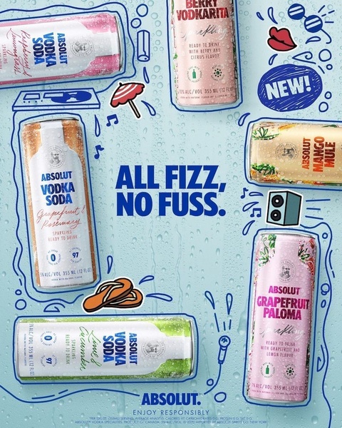
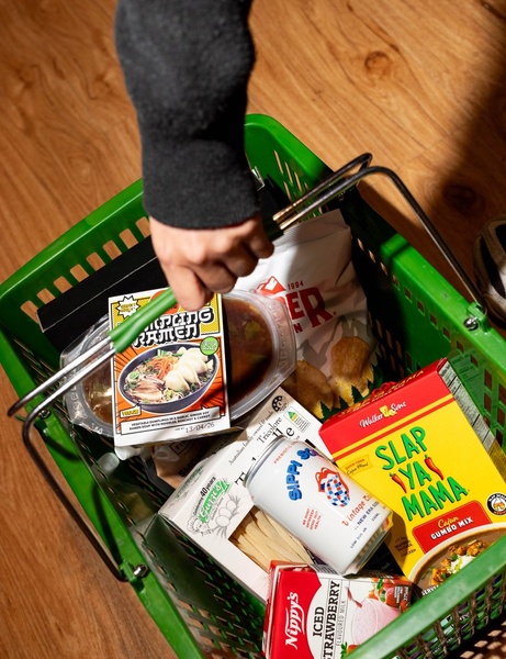
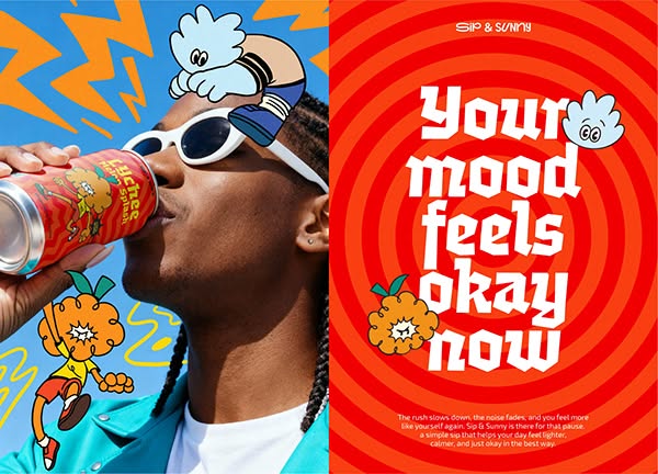






Promer helps you find the pattern, adapt it to your product, and create your own version in minutes.






