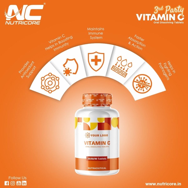
A clean, symmetrical product showcase that uses descriptive iconography and text callouts to map out the primary health benefits of oral dissolving tablets.
Free credits included. No card required
This Vitamin C supplement ad creative leverages a symmetrical benefit map to distill complex health claims into immediate, digestible visual cues. By placing the product at the center of an arced icon array, the design instantly aligns the supplement with tangible immune-boosting outcomes without forcing the viewer to hunt for information within dense blocks of text.
This structural clarity works because it reduces cognitive load for potential customers, allowing them to scan from the central product to specific functional benefits seamlessly. By using Promer AI to analyze similar high-performing product layouts, teams can replicate this clear, icon-heavy approach to emphasize their unique value proposition while maintaining a clean, professional aesthetic that builds consumer trust.
Great visual ads start from a clear structural idea, organizing information so effectively that the product benefit becomes self-evident.
Pro tip
When building an icon-map layout, ensure the icons are stylistically consistent and that the text is kept to two lines or fewer. This maintains the visual balance, preventing the 'arc' from feeling crowded or unreadable on small mobile screens.




















Promer helps you find the pattern, adapt it to your product, and create your own version in minutes.






