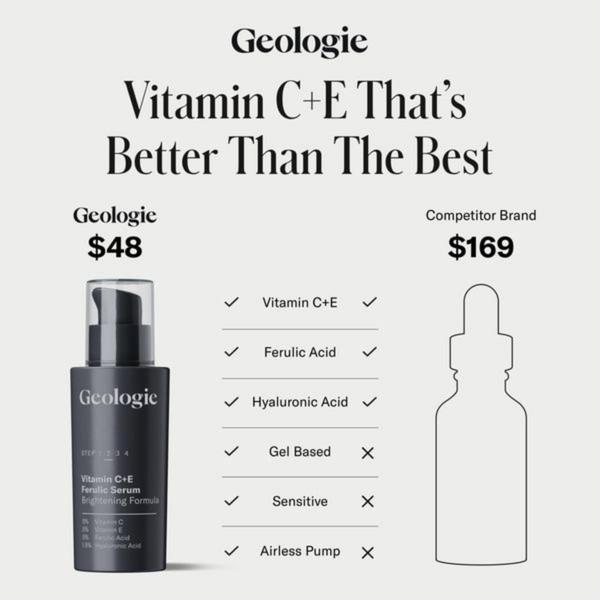
A square-formatted comparison chart that contrasts the Geologie serum against a competitor by price and six distinct product benefits.
Free credits included. No card required
This Vitamin C+E serum ad creative uses a clinical, comparison-based structure to instantly communicate value by contrasting price against technical product specifications. By placing the brand's product side-by-side with a more expensive competitor, it frames the purchase as a logical, data-driven decision rather than an emotional one.
This analytical framework works because it removes ambiguity, allowing potential customers to see exactly what they gain for less money. For those looking to replicate this conversion-focused layout, Promer AI provides the structural foundation to build high-performance product comparisons that highlight your specific unique selling propositions.
A comparison chart doesn't just list facts; it creates a logical bridge between your product's performance and the buyer's financial hesitation.
Pro tip
When building your own comparison table, be selective with the features you choose to highlight. Ensure that every item in your checklist directly addresses a major pain point or objection associated with the category to maximize the impact of your 'checkmarks'.




















Promer helps you find the pattern, adapt it to your product, and create your own version in minutes.






