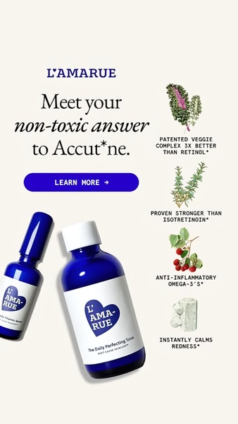
This vertical ad pairs a bold anti-Accutane hook with a clear ingredient breakdown to highlight a safe, plant-based alternative to harsh chemical treatments.
Free credits included. No card required
This skincare toner ad creative captures attention by positioning a natural product as a direct, non-toxic alternative to a well-known pharmaceutical treatment. By framing the brand as the solution to a specific, high-intent problem, it immediately filters the audience for those currently seeking an alternative to harsh medical-grade topicals. The visual hierarchy utilizes a clean, clinical layout that builds trust and authority without relying on aggressive marketing jargon. The core effectiveness of this design lies in its ability to translate complex ingredient benefits into a simple, scannable list that validates the promise made in the headline.
For most ecommerce teams, this structure works well because it creates a clear narrative arc: identify a pain point, present a cleaner alternative, and back it up with evidence. You can easily replicate this high-converting format by using Promer AI to analyze the visual weight of your own product against your key selling points. Keep in mind that when using comparative claims, performance typically depends on your ability to substantiate your benefits with clear, accessible copy as shown in this example.
A powerful ad creative does not need to shout, it only needs to present the most compelling evidence at the right moment.
Pro tip
When creating comparison ads, ensure your benefit bullets are as visually distinct as they are textually clear. Experiment by swapping static ingredient icons for macro photos of your product's raw textures to further increase the premium, tactile feel of your creative.




















Promer helps you find the pattern, adapt it to your product, and create your own version in minutes.






