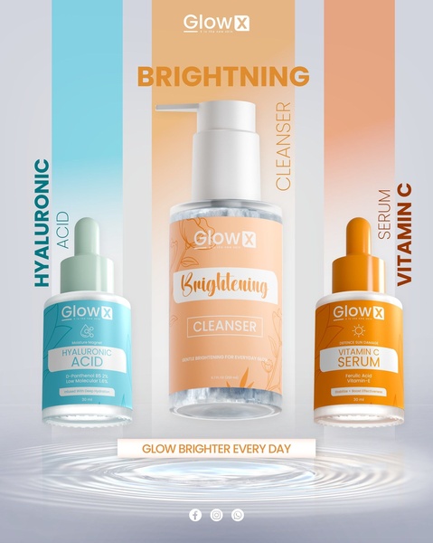
A vertical 4:5 ad layout showcasing three distinct skincare products against color-coordinated backgrounds to communicate a comprehensive routine.
Free credits included. No card required
This skincare serum ad creative succeeds by using a rigid, color-coded structure to establish an immediate sense of organization and product efficacy. By anchoring three different items within their own specific color zones, the brand creates a visually intuitive path for the viewer that minimizes cognitive load while showcasing the full range at a single glance. The core effectiveness of this ad stems from its disciplined use of negative space and color psychology to separate distinct skincare benefits.
For most ecommerce teams managing multiple SKUs, this layout approach serves as an excellent template for driving product education. By using Promer AI to maintain this level of structural consistency, you can present a cohesive routine rather than overwhelming potential buyers with separate, disconnected ads. This pattern is particularly powerful for cross-selling when the products are visually distinct yet share a common aesthetic thread.
A clean, color-blocked lineup transforms a collection of products into a structured, persuasive routine.
Pro tip
To maximize engagement with this layout, ensure that the background colors match the dominant hues of your product packaging. This reinforces brand identity and makes the products appear as part of a single, well-considered system rather than a random assortment.




















Promer helps you find the pattern, adapt it to your product, and create your own version in minutes.






