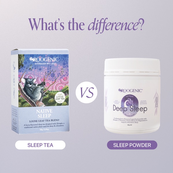
A split-screen comparison creative using a neutral background to contrast two different product formats for the same wellness goal.
Free credits included. No card required
The ad uses a clear, direct question to frame a comparison between two different formats of a sleep aid. By placing the loose leaf tea and the wellness powder side-by-side on a clean, soft-purple background, the design creates an immediate visual distinction that forces the viewer to consider which product best fits their specific lifestyle needs. This strategy works because it simplifies the decision-making process for the customer by presenting two clear paths to the same end goal.
For most brands, this approach establishes authority and clarity without relying on aggressive sales tactics. By using Promer AI to standardize your product imagery and layout, you can quickly test different comparison angles to see which product format resonates more with your target demographic. This method typically performs well because it respects the customer's intelligence while effectively guiding them through your catalog.
Great ads start from a clear structure that guides the consumer toward a decision, not just a pretty design.
Pro tip
When running comparison ads, ensure that the benefits listed under each product are directly tied to a specific customer pain point. Using a clear 'This vs That' logic allows you to educate the user on your brand's unique value proposition while reducing purchase hesitation.




















Promer helps you find the pattern, adapt it to your product, and create your own version in minutes.






