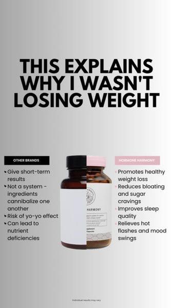
A vertical comparison graphic that contrasts general market shortcomings with the specific benefits of a branded health supplement.
Free credits included. No card required
This weight loss supplement ad creative utilizes a clear comparative structure to isolate the pain point of failed dieting, effectively creating a logical gap for the consumer to fill with your product. By placing the brand directly against a generic 'other brands' category, it positions the product as the missing system that solves common issues like bloating and cravings.
A strong ad uses a comparison structure to turn the audience's existing skepticism into an educational moment for your specific brand.
Pro tip
When using a comparative hook, ensure your 'Other' category remains vague enough to apply to generic market alternatives, not specific competitors. This prevents legal friction and keeps the focus strictly on the limitations of the status quo versus the unique benefits of your formulation.




















Promer helps you find the pattern, adapt it to your product, and create your own version in minutes.






