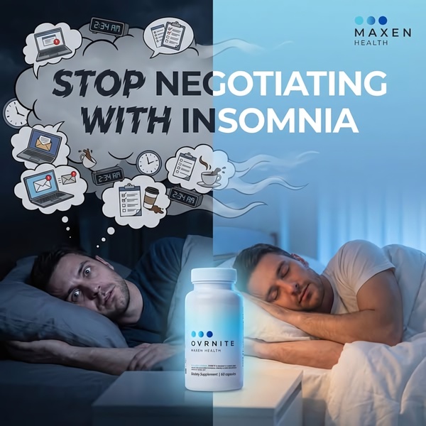
A split-screen comparison showing a restless night of work on the left and a peaceful night of sleep on the right, centered by the supplement bottle.
Free credits included. No card required
This sleep supplement ad creative utilizes a classic split-screen visual structure to immediately anchor the viewer in a recognizable pain point. By juxtaposing a chaotic, stressful nighttime work environment against a serene, restful sleep setting, the creative forces an instant comparison that validates the customer's struggle with insomnia before offering the product as the bridge to tranquility. The core effectiveness lies in the visceral contrast between the anxious 'before' state and the peaceful 'after' state, which allows the product to function as the clear catalyst for change.
For most ecommerce teams, this pattern works because it bypasses technical feature lists in favor of immediate emotional resonance. You can replicate this high-converting layout using Promer AI to replace the central product with your own solution while maintaining the successful visual contrast that stops the scroll. Adopting this binary framing is a reliable way to communicate value to a cold audience without overloading them with complex information.
Effective advertising is built on the transformation you provide, not just the features of your product.
Pro tip
To boost engagement, match your color temperature to the mood on each side of the split. Use cooler, desaturated tones for the 'problem' side to signal discomfort, and transition to warmer or more soothing light for the 'solution' side.




















Promer helps you find the pattern, adapt it to your product, and create your own version in minutes.






