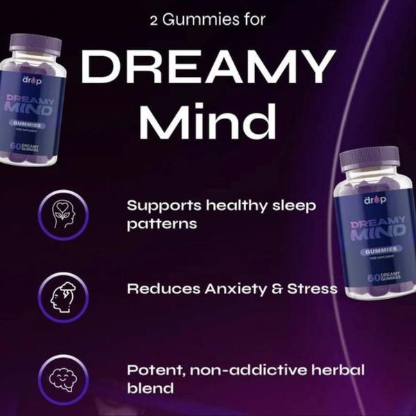
A square-ratio ad showing two bottles of Dreamy Mind gummies flanking a list of three core product benefits using clear, descriptive iconography.
Free credits included. No card required
This sleep gummy ad creative leverages a clean, symmetrical layout to communicate benefits instantly. By pairing the product bottles with concise, icon-supported value propositions, the design removes mental friction for the viewer, guiding them immediately to the primary reasons for purchase without unnecessary clutter or long-form copy. Utilizing a dark, sophisticated color palette creates a sense of trust and tranquility, which aligns perfectly with the intended sleep-support use case.
For most ecommerce teams, this structured approach is highly effective because it treats the ad as a functional information piece. You can easily replicate this high-conversion layout using Promer AI to replace the product and text while maintaining the balanced composition. In most cases, ads that prioritize visual clarity over artistic complexity perform better because they respect the user's need to quickly understand what they are looking at while scrolling.
Great ads start from an idea, a feeling, or a structure, not a blank design.
Pro tip
When using a benefits-first layout, ensure your icons are not just decorative but functional. The icons should act as visual signposts that summarize the text to the right, helping the user absorb your core value proposition even if they do not read the full sentences.




















Promer helps you find the pattern, adapt it to your product, and create your own version in minutes.






